xSV% is a better predictor of goaltending performance than existing models

This piece is co-authored between DTMAboutHeart and asmean.

Analysis of goaltending performance in hockey has traditionally relied on save percentage (Sv%). Recent efforts have improved on this statistic, such as adjusting for shot location and accounting for goals saved above average (GSAA). The common denominator of all these recent developments has been the use of completed shots on goal to analyze and predict goaltender performance.

Continue reading

Why Possession and Zone Entries Matter: Two Quick Charts

As some of you know, the NHL tracked offensive zone time for two seasons, 2000-01 and 2001-02, then inexplicably stopped. As some of you also know, I have a lot of historical game data, and that includes all the zone time from these seasons. Taking those performances, and focusing on the first two periods to avoid any major score effects (or “protecting the lead“), I charted every single game alongside 2pS%, the historical possession metric.

It’s pretty clear that the spread in shots-for in these games was quite a bit greater than the spread in zone times. Curious, I decided to do a distribution plot, the one that you see leading this piece (2pS% and offensive zone time % in the x-axis, percentage of total performances in the y-axis). Zone time, or generally speaking the flow of the game, has a tighter, much more normal distribution that the distribution of shots. What does this mean? This means that things like how you enter the zone (zone entries), and how you control the puck in the zone (possession, or passing) can make a pretty big difference in how you generate scoring opportunities.

Note: The data I used for these quick graphs were from home team’s perspective, hence why our distribution was a bit north of 50. Keeping that in mind, the 60-40 Rule we established here a year ago looks pretty good for assessing game flow, but there are ways within that flow that can tip the scale.

Will the 2015-16 Calgary Flames follow the 2014-2015 Colorado Avalanche?

Odds are, a team that performs like the 2014-2015 Calgary Flames in shots, possession, and chances will miss the playoffs. The odds also indicate if they do make it they are more likely going to be eliminated in the first round. Calgary beat the odds, though, and pushed into the second round until their eventual elimination at the hands of the Anaheim Ducks.

Odds are not destiny; out-shot teams make the playoffs all the time.

Just last season the 2013-2014 Colorado Avalanche finished the season with 112 points and were favorites to falter in the 2014-2015 season by the analytical community. This has led to comparisons between the 2014-15 Flames and the 2013-14 Avalanche.

How similar are the two teams? Let’s take a look.

Continue reading

The NHL Playoffs and Penalties

Image courtesy of WikiMedia

Not long ago, we researched hit and face off differentials and their relationship with playoff performance, in both the same statistic and in goal performance.

As a fan of the Winnipeg Jets, who lead the league for worst penalty differential for much of the season, I find it a very interesting topic to research. More power plays and less penalty kills means a better team goal differential over the course of a season, by a significant amount.

Let’s take a look after the jump.

Continue reading

Friday Quick Graphs: Are the 2014-15 Buffalo Sabres the Worst Team of All-Time?

This is part-opportunity to finally explore this question, and part-opportunity to tout some existing and upcoming data visualizations for HG. Travis Yost has been following the absolutely terrible Sabres season all year, and has raised some questions about whether it’s an all-time worst team. He’s only been able to reach back to the admittedly bad early 2000s Atlanta Thrashers, but the historically bad team by which all others need to be measured is the 1974-75 Washington Capitals squad. Using an historical metric like 2pS%, or a team’s share of all on-ice shots-for in the first 2 periods (expressed as a percentage), we can bring the 2014-15 Sabres together with the 74-75 Caps to see where both teams stand. Note: I used the cumulative version of the measure below, and added lines for one standard deviation below league-average in both seasons.

For as bad as Buffalo has been, they haven’t quite matched the futility of the 74-75 Capitals…nor should they. The Capitals were an expansion team that year, and unlike in other years the NHL did not really reach out to ensure the expansion teams in 1974-75 were given a good base to build from. These were also the peak years of the World Hockey Association, which made professional level talent even more diffuse than normal. The other expansion team in 74-75, the Kansas City Scouts, lasted two years before moving to Colorado to become the Rockies (the team subsequently moved to New Jersey in 1982-83 and changed their name to the Devils).

I included the standard deviations for the leagues in 1974-75 and 2013-14 (I haven’t compiled the data for 2014-15 yet, but this should be close enough), and even by those markers the Capitals compared markedly worse to their league than did the Sabres. But once again, the Capitals had a reasonable excuse, while the Sabres have walked into this situation with eyes wide open.

For those interested, I also put together 2-period shots-for and shot-against rates (and stretched them out to per 60 minutes) to get a rough sense of offense-versus-defense for both teams.

I added a couple extra filters to the charts, league-averages and standard deviations as well as 20-game moving averages in all the measures I used, which you can select by clicking on the grey “Team” bars and clicking on “Filter.”

Trading Off: How Much Possession Can My Team Surrender and Still Win?

Photo by Michael Miller, via Wikimedia Commons; altered by author

Photo by Michael Miller, via Wikimedia Commons; altered by author

Within the continuing discussions over the value of possession metrics, and the veracity of shot quality or shooting talent measures, there’s a point that seems to have slipped through the cracks. While there’s a spectrum of attitudes about possession and shot quality/talent, neither entirely refutes the importance of the other – and with that thinking, it’s worth considering how much you can sacrifice in one and still maintain success by the other. Put more simply, how little can a team possess the puck and still expect to shoot their way to success?
Continue reading

Adjusted Possession Measures

A little while ago I wrote an article at SensStats discussing score effects and suggesting a new formula which we might use to compute score-adjusted Fenwick. This article addresses several interesting questions and new avenues that were suggested to me by various commenters.

  1. The method in the above-linked article simultaneously adjusts for score and for venue (that is, home vs away). It’s interesting to estimate the relative importance of these two factors. As we’ll see, it turns out that adjusting for score effects is dramatically more important than adjusting for venue effects.
  2. We might consider adjusted corsi instead of adjusted fenwick; it turns out that adjusted corsi is a better predictor of future success than adjusted fenwick at all sample sizes.
  3. Most interestingly, we might consider how score effects vary over time, and see if we can create a score-adjusted possession measure that takes this variation into account. We find here that performing such adjustments is indistinguishable in predictivity from the naive score-adjustments already considered.

Several people have pointed out that score effects have a strong time-dependence. At least as far back as 2011, Gabriel Desjardins (@behindthenet) noted the effect and readers with keener memories than me will no doubt remember still earlier examples. Just last week, Fangda Li (@fangdali1) wrote an article arguing that score effects play virtually no role outside of the third period. This article will show that, while score effects are magnified as the game wears on, time-adjustment for possession calculations is not justified. Continue reading

Re-examining Fenwick and Playoff Success

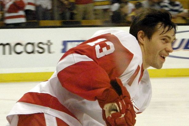
Pavel Datsyuk

Pavel Datsyuk and the best Fenwick team in recent history lifted the Cup in 2008

Image from Dan4th Nicholas via Wikimedia Commons

Back in April of 2013, Chris Boyle presented his study of the relationship between a team’s Fenwick percentage in close-score situations and their eventual success in the Stanley Cup playoffs. Since then, there’s been two Stanley Cup playoffs played. Also the previous 2007-08 start point for shot attempt data was extended two years backwards thanks to War on Ice. All told, it’s an another four seasons of data added to the five Boyle examined.

Worth another look, in my opinion.

Continue reading

The Day David Staples Killed Corsi Because…Taylor Hall

File:Taylor Hall.JPG

Photo by Alexiaxx, via Wikimedia Commons

I’ve been following the story of Taylor Hall as the season progresses, particularly through Tyler Dellow’s attempts to un-vex the vexing year Hall is having (Parts IIIIIIIV). In Tyler’s second part, he notes three differences between this year and last year: fewer zone entries with a carry, poorer retrieval of dump-ins, and a lower shots-per-carry total. The latter, Tyler notes, is likely symptomatic of a larger emphasis on dumping-in, wherein a player carries to just inside the blue line before dumping. He quotes Dallas Eakins as suggesting that Hall, in-particular, seems to take this dumping-in approach to heart. I’d add that there’s a possibility that this is abbreviating potential offensive zone possession time, as overall Hall and the other Edmonton Oilers have dropped from nearly 50 seconds per shift to 47 seconds. Further to that point, Tyler noticed in the fourth part that the Oilers have seemed to adopt a tip-in dump-in, wherein the player in the neutral zone either redirects or chips, while standing in place, the puck into the offensive zone. Just based on the video evidence Tyler provided, this looks like an extraordinarily passive approach to the dump, equivalent to dumping and getting off the ice. In that latter scenario, you are unequivocally giving up possession. In the tip-in approach, you take your active close player and leave them in-place, in favor of a later-to-the-game forechecker. It would seem to me that you’d benefit from an active dump-and-chase forechecker.

There are a couple of others irons you can put in the fire, including variance of CF% (a 5% swing is not unheard-of, particularly moving from a 48 to a 56-game sample), potential fatigue from increased playing time (he’s taken on some penalty kill minutes and more even-strength minutes this year), and the swapping out of Ales Hemsky as a linemate (for Sam Gagner). The tougher competition, for me, is essentially washed out by a bump up in offensive zone starts. I don’t see evidence of recording bias, either. I suspect a couple potential, additional things: 1) the drop-off is right there with the Ovechkin-Dale Hunter drop-off, so there might be some player vs. system aggravation, and 2) some fatigue issues related to the early-season knee injury. Injuries aren’t just about pain, they can also compromise strength and endurance. A guy like him, who has had injury issues in the past, does not want the “soft” label (you’ve seen what that’s done to Hemsky’s time in Edmonton), and might not want to admit it to the media or himself.

Up to this point, you’ve seen Dellow’s and my own introspection into what appears to be a poor possession season from Taylor Hall. Enter David Staples.

Continue reading