Exploring the Impact of New NHL Coaches and GMs

With Todd Richards being let go after a disastrous 0-7 start by the Blue Jackets, and Bruce Boudreau on the hot seat (heck, he might be out of a job by the time I finish writing this), coaching is once again in the spotlight. After Richards was fired, I went on a mini rant about how I believe having a good GM is more important than having a good coach, and while I still believe this is true, I wouldn’t be a data person unless I tried to prove it.

This project has many parts to it. The first, which I’ll be doing here, is just looking at the breakdown of Scoring Chances For% compared to Coaches and GMs in the early days of their tenure, i.e. right after being hired. Scoring Chances, to simplify things, are basically “more dangerous shots” (click here for a more rigorous definition).

To start, I needed data. I pulled all 30 teams from 2006/07 to 2015/16, and coded each season by what kind of organizational changes happened within. This gave me 331 data points, as there were often midseason coaching or GM hirings to account for.

The states broke down like this:

1) No Change – 64%
2) Hired a new Coach – 21.5%
3) Hired a new GM – 7.3%
4) Hired a new Coach & new GM – 7.3%

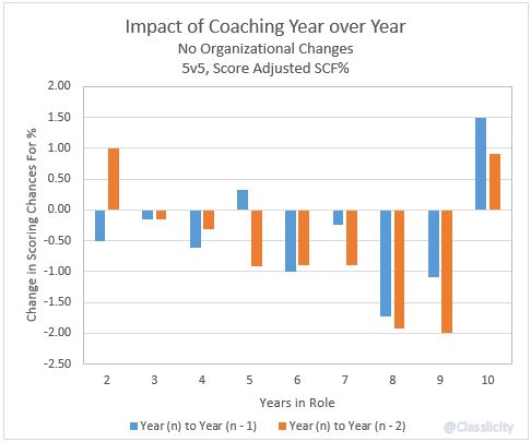
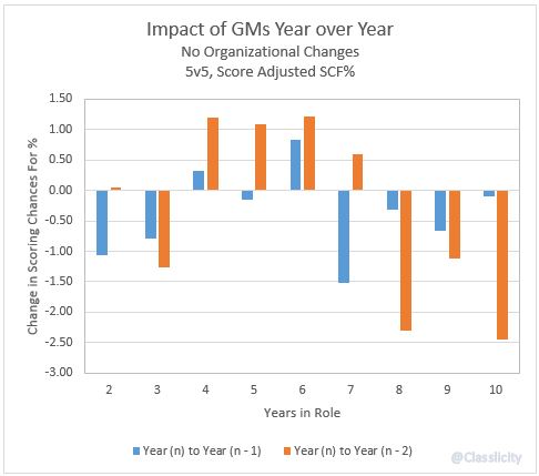
In looking at the data, some patterns quickly emerged. The first two years of tenure in either role were where the most change, for better or worse, happened.

Because I had so much data in the No Change category, I wanted to see if there was any sort of trend year over year for the control group.

No Changes - Coaches SCF Delta YoY

No Changes - GMs SCF Delta YoY

Continue reading

Exceeding Pythagorean Expectations: Part 5

“Bryz-warmup” by Arnold C. Licensed under Public Domain via Commons.

Bryz-warmup” by Arnold C. Licensed under Public Domain via Commons.

This is the fifth part of a five part series. Check out Part 1, Part 2, Part 3, Part 4 here. You can view the series both at Hockey-Graphs.com and APHockey.net.

To quickly recap what I’ve covered in the first four parts of this series, I have updated the work that’s been done on Pythagorean Expectations in hockey, and am looking to find out whether teams that have the best lead-protecting players are able to outperform those expectations consistently.

The first step is to figure out how to assess a player’s ability to protect leads. To do this, for every season, I isolated every player’s Corsi Against/60, Scoring Chances Against/60, Expected Goals Against/60 (courtesy of War-On-Ice) and Goals Against/60 when up a goal at even strength. I then found a team’s lead protecting ability for the year in question by weighting those statistics for each player by the amount of ice time they winded up playing that year. For players that didn’t meet a certain threshold, I gave them what I felt was a decent approximation of replacement level ability. For example, here was the expected lead protecting performance of the 2014-2015 Anaheim Ducks in each of those categories.

Screen Shot 2015-09-12 at 4.04.51 PM

Now let’s look a little closer at our Pythagorean Expectation — derived through PythagenPuck.

Continue reading

Why Possession and Zone Entries Matter: Two Quick Charts

As some of you know, the NHL tracked offensive zone time for two seasons, 2000-01 and 2001-02, then inexplicably stopped. As some of you also know, I have a lot of historical game data, and that includes all the zone time from these seasons. Taking those performances, and focusing on the first two periods to avoid any major score effects (or “protecting the lead“), I charted every single game alongside 2pS%, the historical possession metric.

It’s pretty clear that the spread in shots-for in these games was quite a bit greater than the spread in zone times. Curious, I decided to do a distribution plot, the one that you see leading this piece (2pS% and offensive zone time % in the x-axis, percentage of total performances in the y-axis). Zone time, or generally speaking the flow of the game, has a tighter, much more normal distribution that the distribution of shots. What does this mean? This means that things like how you enter the zone (zone entries), and how you control the puck in the zone (possession, or passing) can make a pretty big difference in how you generate scoring opportunities.

Note: The data I used for these quick graphs were from home team’s perspective, hence why our distribution was a bit north of 50. Keeping that in mind, the 60-40 Rule we established here a year ago looks pretty good for assessing game flow, but there are ways within that flow that can tip the scale.

Increasingly in the NHL, the Best Defense is a Good Offense

Photo by Lisa Gansky, via Wikimedia Commons; altered by author

Photo by Lisa Gansky, via Wikimedia Commons; altered by author

While preparing statistics for a few upcoming posts on on-ice contributions, I decided to do a quick study on the share of on-ice shot attempts taken by defensemen versus forwards. The metric I’m using, which is a spin-off of an old one whose name doesn’t quite capture it right, is what I’m calling on-ice shooting proportion, or OSP. The results were quite interesting, and I decided that I should test the data a little further and see what we could find.

Continue reading

Will the 2015-16 Calgary Flames follow the 2014-2015 Colorado Avalanche?

Odds are, a team that performs like the 2014-2015 Calgary Flames in shots, possession, and chances will miss the playoffs. The odds also indicate if they do make it they are more likely going to be eliminated in the first round. Calgary beat the odds, though, and pushed into the second round until their eventual elimination at the hands of the Anaheim Ducks.

Odds are not destiny; out-shot teams make the playoffs all the time.

Just last season the 2013-2014 Colorado Avalanche finished the season with 112 points and were favorites to falter in the 2014-2015 season by the analytical community. This has led to comparisons between the 2014-15 Flames and the 2013-14 Avalanche.

How similar are the two teams? Let’s take a look.

Continue reading