Matt Hunwick, Martin Marincin and Quality of Competition

Embed from Getty Images

During the offseason, the Toronto Maple Leafs made two small additions to their blueline that were lauded by many in the analytics community. At the draft they traded a fourth round pick and a low-tier prospect for Martin Marincin and on the first day of free agency they signed Matt Hunwick to a low money two-year deal.

Both players had very similar trajectories over the previous three seasons. Marincin had a relative shots percentage of +4.3 while playing 15.7 minutes per night while Hunwick landed at +2.8 percent playing 15.3 minutes. Looking at just the 2014-15 season, Hunwick had the edge at +5.1 in 14.3 minutes to Marincin’s +2.4 in 16.1 minutes. Basically, the Leafs acquired two decent and under-appreciated defensemen who have shown ability to push play in the right direction and for a relatively low cost too.

Flash forward to the culmination of their first seasons as Leafs and opinions of the two couldn’t be more different. Marincin is praised regularly while Hunwick is seen as a proverbial boat anchor.

So what’s changed exactly?

Continue reading

The Shift: Breaking Down The L.A. Kings’ Secrets To Success

k8

By virtue of their 5vs5 shot differential, the Los Angeles Kings are the best team in hockey. As of Saturday night, the Kings are rolling along at 56.1% Corsi – #1 in the NHL by a long shot. In fact, the 3% gap between the Kings and the No. 2 Anaheim Ducks is the same as the one between the Ducks and the No. 15 Philadelphia Flyers.

So why are the King so good?

The simple answer is that they have good players executing a sound game plan developed by a good coaching staff. But how exactly does this manifest itself?

On March 26th, the Kings were beating up on the Edmonton Oilers in the middle of the second period when, in the span of 45 seconds, they put together – in my mind – a perfect, representative shift of everything that makes them a superior hockey team.

Continue reading

Can We Accurately Predict Which PK Units Will Score Shorthanded?

Embed from Getty Images

Last week I went on Montreal radio and talked about how dangerous the Ottawa Senators’ penalty kill units are. Led by speedy forwards like Curtis Lazar, Jean-Gabriel Pageau and Mark Stone, and with help from puck moving genius Erik Karlsson, the team has feasted on opposing power plays this year to the tune of the highest GF/60 minutes shorthanded in the league since at least 2007-2008. When considering the team’s league worst GA/60 — mixed with a little bit of film — it becomes clear that the Senators yield chance against in exchange for opportunities for on the break. It may not have been intentional at first, but once the team started capitalizing on its rushes, it seems likely coach Dave Cameron gave his players the green light to go, to try and come out on top on aggregate. The result? While being last in GA/60 shorthanded, the Senators are third in GF%. The problem with GF% when it comes to special teams though is that volume matters more when the ice is tilted. Two goals for and Eight goals against isn’t the same as Four goals for and 16 goals against. So goal differential per 60 is a more accurate measure of success on special teams. The Sens are 30th in GD/60 shorthanded, so it’s hard to say the strategy has been that much of a positive for the team (unless, say they’re down a goal and shorthanded near the end of a game).

Continue reading

Does aggressive play on the penalty kill pay off?

Embed from Getty Images

Late last week, Arik Parnass pointed out a particular peculiarity about the Ottawa Senators’ penalty killing so far this year.

While the Sens may be an extreme example, their numbers tell the story of a constant struggle that teams are faced with when killing a penalty: do you focus solely on your own end and do whatever it takes to prevent a goal, or do you allow your forwards to take the play to your opponents, trying for a shorthanded goal and forcing them to defend in a situation where they may not be expecting it.

This risk-reward question is one that’s central to the value of hockey analytics. It’s very easy to make decisions based on personal experience which is so often dominated by memories of things that are out of the ordinary – a coach will likely remember watching his winger get caught deep trying for a shorthanded goal, while forgetting the 2-on-1 opportunity he generated earlier in the game. It’s just as easy, however, for a fan to complain that his favourite team won’t put out their best forwards to aim for a go-ahead shorthanded goal without any data to back up their argument. The challenge for analysts then is to dig through the available data to figure out what past experience has taught us about the overall net impact of playing for a goal on the penalty kill, so that we can make an informed judgement as to what the potential costs and benefits are.

Continue reading

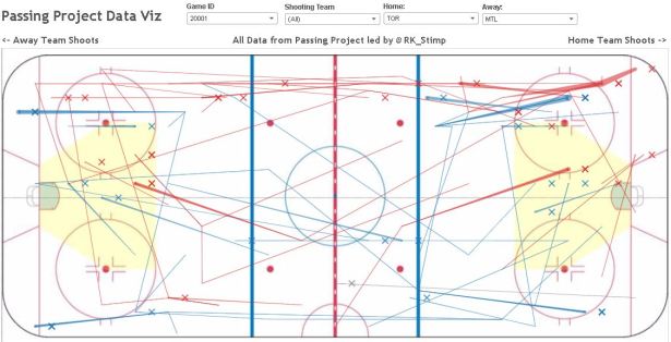
A New Passing Project Data Visualization

Image

Back when the season started, I started playing around with the idea of how best to visualize our passing data. There will be plenty of time to arrange it in a viz to evaluate players like we did last season (Forwards, Defensemen), but there’s another way to present this data and that is within the realm of tactics and opposition analysis. Last December, I wrote a little preview of what we can do with this data by focusing on tendencies of how and where teams generate offense. If you haven’t yet, I encourage to read these pieces (all are linked in the beginning of that piece I just linked) for the background of what I’ve been imagining for this data since I added in lane concepts last summer.

We already know that passing is a skill and an important one at that, so there is always the importance for the descriptive and predictive levels of analytics (what has happened, what will happen), but one we don’t often discuss is the prescriptive level (what should we do). Combining data visualization of these events and video analysis is the best way forward. In this post, I’ll go over exactly how to use our new viz to pinpoint areas of the game to analyze. If you simply want to go to the viz, scroll to the bottom of this piece.

Continue reading

Shot quality and save percentage revisited, again…

Embed from Getty Images

Listen; I get it. Some people are sick and tired of this supposed debate that’s been ongoing for over ten years now. But what really is the actual debate all about? What is it we are arguing on Twitter over? What should we be aware of?

Continue reading

Looking back at the NHL trade deadline

Embed from Getty Images


On Monday, fans tuned into one of the quieter NHL trade deadlines in recent memory. Despite the slow pace of movements, Matt Cane (@cane_matt) and I set about making visuals to give our takes on each trade.

Here, we’ll look back on a few of our takes from the trade deadline. We’ll focus ourselves with three categories – a trade where we had a similar take, a trade we disagreed on, and our favourite viz from the day.

Continue reading

Making Better Hockey Graphs

Visualization seems pretty easy, so it’s often left as an afterthought. But visuals can be an immensely effective—or destructive—form of communication. To that end, many, if not most, people fail to tap into its power because of they make prominent mistakes. (Sorry for the ego blow, homies.).

But that need not be the case. Although visualization is a process, not a result, once you know what to look for, you can easily cut down on those big mistakes and make graphs that—while not perfect—will be consistently good.

Here are a few things to keep in mind for hockey bloggers, adapted from Andy Kirk as well as Dieter Rams’ 10 principles of good design.

For our purposes, they can be summed up as “think about your readers while recognizing your practical limitations.”

Continue reading