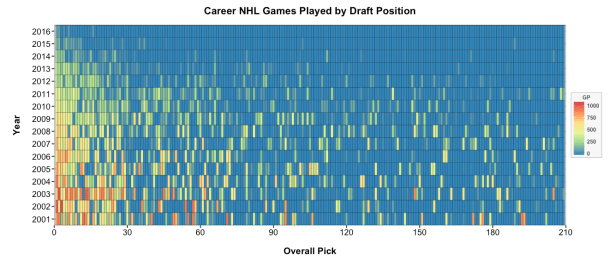
It’s time for (another) draft day! Whether your team has the 2nd or 20th overall pick in the NHL entry draft, it’s always a useful exercise to look at past outcomes and modify your expectations accordingly.

This series is dedicated to simple graphs that tell important (albeit abbreviated) stories.
It’s time for (another) draft day! Whether your team has the 2nd or 20th overall pick in the NHL entry draft, it’s always a useful exercise to look at past outcomes and modify your expectations accordingly.
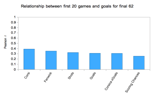
The above graph is a slight variation of the method employed by JLikens (Tore Purdy) six years ago, almost to the day. The variation being the method I used was extremely simplified. All I did was look at the correlation between each metric for the first 20 games with goals for the next 62 games in the season, with both variables being 5v5 and adjusted for score and home/road venue. I also skipped the lockout shortened season for insufficient games.
Injuries are an inevitable part of the NHL. An 82 game schedule guarantees that all teams are going to deal with injuries during the season but not all teams deal with them equally. Quantifying the impact of injuries is difficult. The introduction of better individual player impact stats gives us some new tools with which to approach this concept. In particular, DTMAboutHeart‘s Goals Above Replacement stat seems a useful place to start because it allows for estimating how many goals above replacement a team loses while a player is injured.
All injury data in this post comes from NHL Injury Viz. GAR data comes via DTMAboutHeart. Games played data comes from Corsica and standings data is via Hockey-Reference.
If you’ve ever read a little math, you likely know the dangers of binning continuous data when testing relationships between two variables. It is one of the easiest and most common mistakes that an amateur statistician might make, largely because, intuitively, it seems like it should make sense.
But it doesn’t, and here’s why.
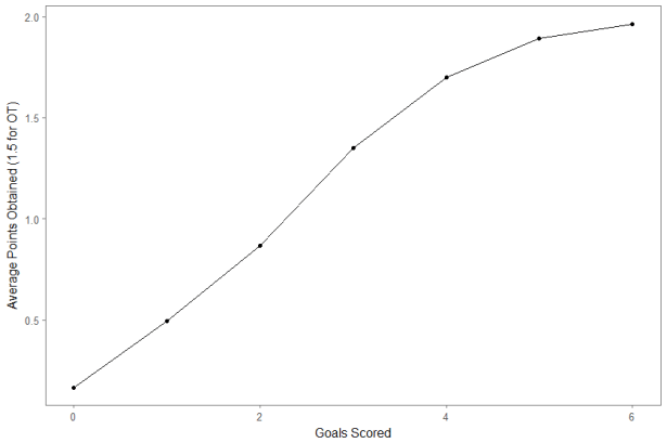
In my last post, I based some work on The Numbers Game by Chris Anderson and David Sally. It was a fun book about analytics in soccer even though I do not have much of a background in soccer. There was one other section of the book I found particularly applicable to hockey. They created a few charts on the expected number of points a team gets depending on how many goals they score in that game. I went through every regular season game from 2007 – 2016 to produce the below version for the NHL:
This year’s trade deadline was uneventful. March 1st was filled with a bunch of small trades that we probably made a bigger deal out of than we should have. However, just a little over two weeks have gone by and people are already looking for a winner. As a follower of analytics, it would be unfair of me to decide less than ten games in who won the deadline. Mainstream media gets a ton of clicks for those posts though, so let’s evaluate them.
A post from Sportsnet found that the last trade of the deadline held the most value. The Bruins traded a 6th round pick to the Jets for Drew Stafford. Stafford has had the worst season of his career. His -3.38 rel CF% is by far the worst of his career, his all situations 1.74 points per 60 is below career average, and he has suffered from the second lowest shooting percentage of his career. The question is: where is the value in Drew Stafford?
The All-Star break is now in the past. The trade deadline is less than two weeks away. Teams across the NHL have a pretty good idea of who they are. They know their strengths and weaknesses. The possible outcomes for their seasons are narrowing. Some teams are already locked into playoff spots and only have to worry about positioning. Others will have to slowly accept the reality that this isn’t their year and consider how that impacts their approach at the deadline. This is a perfect time to take a high-level view of the league and look at each team using a series of simple metrics to help get a grasp on where all thirty teams are sitting.
This week, the long-speculated dismissal of Boston Bruins’ coach Claude Julien finally happened. After 759 games, 419 wins, a Stanley Cup, and a Jack Adams trophy over his almost 10-year run in Boston, Julien is a free agent coach, free to mull options like the Vegas Golden Knights, the New York Islanders, and a slew of other head coach positions that are almost certain to be offered to him as the season goes on.
Every coach gets fired sometime. Julien, great as he was, wouldn’t escape this fate either.
But the fallout since his dismissal has been intriguing. The Bruins led the NHL in adjusted Corsi for percentage under Julien this season but sunk to 28th in the in team shooting percentage and 24th in team save percentage this week.
How can we reconcile these contrasting stats?
In anticipation of the NWHL All-Star Game (Feb 11-12), I wanted to look at which NWHL players contribute the highest % of their team’s shots on goal. This is simply the number of shots the player has taken, divided by the number of shots the player’s team has taken.
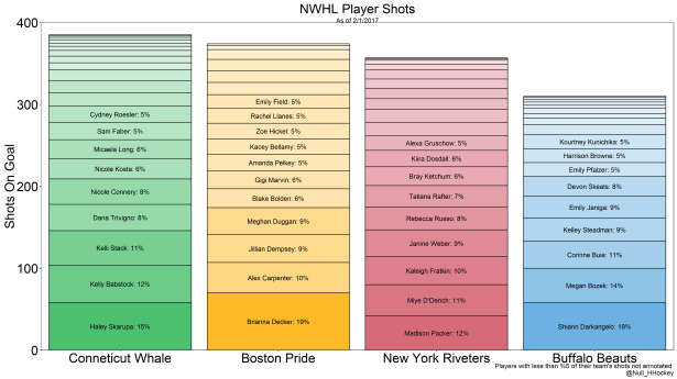
As the graph shows, Brianna Decker and Shiann Darkangelo lead the league in % of team shots at 19% each. Haley Skarupa, a rookie, leads the Conneticut Whale at 15% of the team’s shots. This is doubly impressive, as the Whale also lead the league in shots. Madison Packer leads the New York Riveters at 12%.
The code for this graph can be found on my Github page.
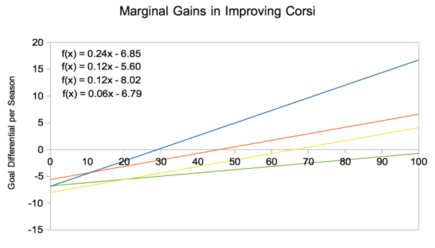
How many goals is improving a team’s first line worth versus your fourth line?
The above graph shows the number of goals over a season a team should expect in improving their player’s shot differential talent, here described in percentiles of talent.
The blue line is first liners with 2nd, 3rd, and 4th liners falling next with red, yellow, and green.
The blue line is the steepest, suggesting that moving from a 55th percentile player to 60th percentile player on the top line will improve a team’s goal differential by about twice that of a 2nd or 3rd line player. (This is not to be confused with improving from a 55% Corsi player to a 60% Corsi player)
What is interesting is that the marginal gains in improving a 2nd line player and 3rd line player is about equal.
The next question one should ask is: what are the costs in salary and cap hit for making said improvements?
Method:
