Why Possession and Zone Entries Matter: Two Quick Charts

As some of you know, the NHL tracked offensive zone time for two seasons, 2000-01 and 2001-02, then inexplicably stopped. As some of you also know, I have a lot of historical game data, and that includes all the zone time from these seasons. Taking those performances, and focusing on the first two periods to avoid any major score effects (or “protecting the lead“), I charted every single game alongside 2pS%, the historical possession metric.

It’s pretty clear that the spread in shots-for in these games was quite a bit greater than the spread in zone times. Curious, I decided to do a distribution plot, the one that you see leading this piece (2pS% and offensive zone time % in the x-axis, percentage of total performances in the y-axis). Zone time, or generally speaking the flow of the game, has a tighter, much more normal distribution that the distribution of shots. What does this mean? This means that things like how you enter the zone (zone entries), and how you control the puck in the zone (possession, or passing) can make a pretty big difference in how you generate scoring opportunities.

Note: The data I used for these quick graphs were from home team’s perspective, hence why our distribution was a bit north of 50. Keeping that in mind, the 60-40 Rule we established here a year ago looks pretty good for assessing game flow, but there are ways within that flow that can tip the scale.

The Pressures of Parity

File:Balanced scale of Justice (blue).svg

Two nights ago, when no one was looking, I tweeted out a telling statistic to understand how teams have reacted to the salary cap post-lockout.

Boulerice wasn’t the only one scraping the bottom of the barrel in 2005-06; Colton Orr was nearby with his 2:49 per game, and you didn’t have to look much further to see Andrew Peters (3:15) and Eric Godard (3:27). In fact, 19 skaters played over 20 games that season and recorded even-strength TOI/G lower than Peluso’s from this year. Teams have realized that, in a salary-capped league, even league-minimum dollars can’t justify players who cannot be trusted with regular minutes.

This was a fairly stark evolution of player usage, but it led me to wonder if there were any other things we could see by looking at finer-grained data from 2005-06 to the present. The salary cap was a game-changer because it pushed teams at the top and bottom closer together, and that compelled teams to stop employing players they couldn’t trust at evens; what are some other areas we see the pressure of parity?

Continue reading

Friday Quick Graph: How the Possession Battle Stabilizes

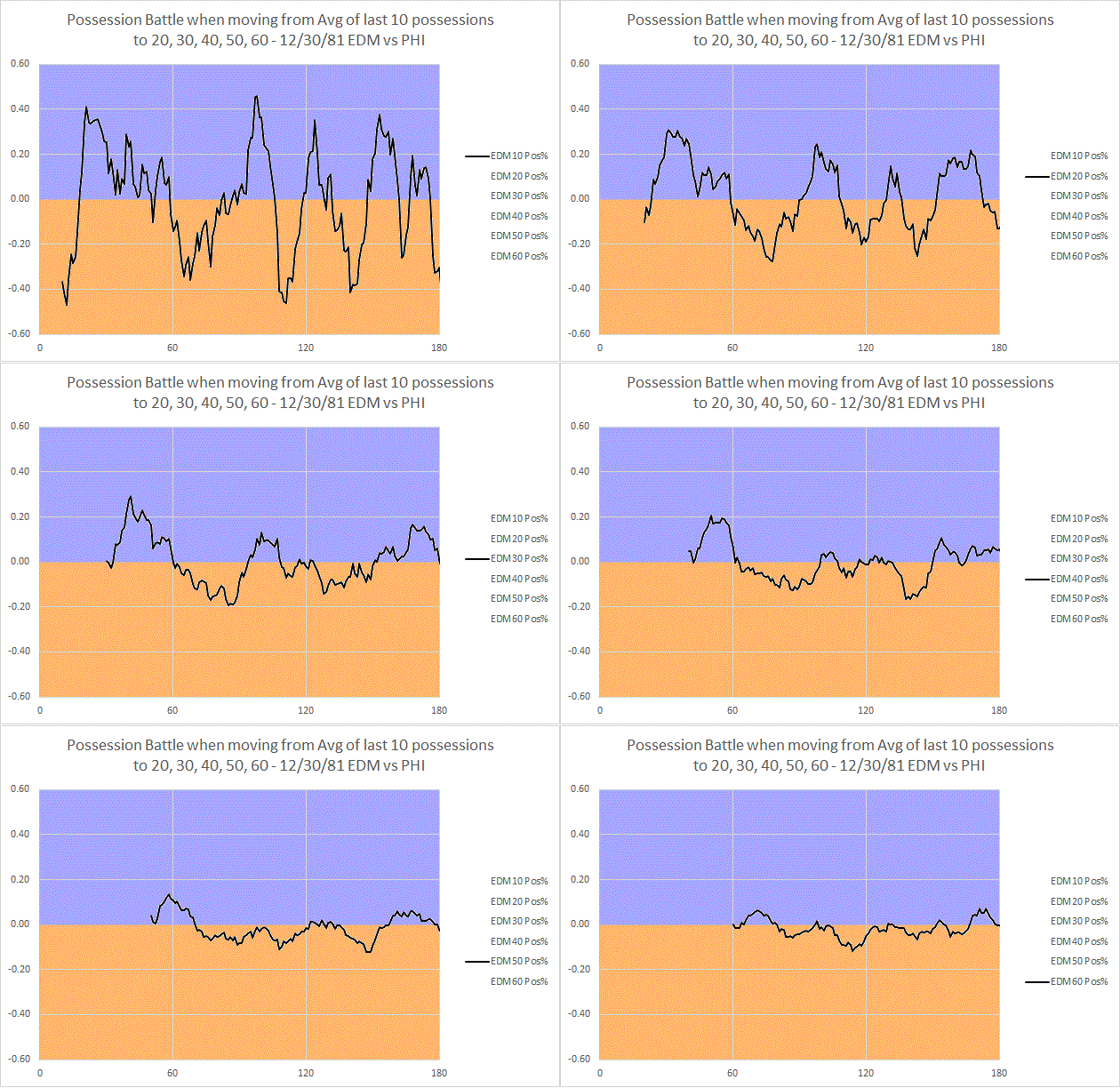
Surely you’ve been exhausted with graphs from this December 30th, 1981 Oilers-Flyers game, but allow me one more. I wanted to demonstrate both how many possessions it took for the possession battle to grant us a clear picture, and also further speak to the value of 2pS%. The chart above demonstrate what happens when I establish a rolling possession-for % (as indicated by the y-axis, possession-for % is done from the perspective of Edmonton) using the last 10 possessions, then the last 20 possessions, and so on to 60 possessions. I stop there because we then arrive at a point where we are primarily measuring (in 60-120 on the x-axis) the 1st and 2nd period in-tandem. What we see is that, by that point, our possession battle has calmed down much closer to something that resembles the final battle (a 52% to 48% victory for Philadelphia). The y-axis shows how far above or below .500 (or 50% possession) the battle went; once again, this was measured from Edmonton’s perspective, so below the line is Philadelphia winning the battle, above is Edmonton (hence the color-coding). We also see, then, that the battle doesn’t calm down to a spread below the 60-40 possession benchmark until 40 possessions…which means it doesn’t really reach the likelihood of truly reflecting demonstrated possession talent until that point. For this reason, I think we can derive confidence in the signal that two-periods provide us with regards to possession battles. Additionally, it speaks to the potential problem with focusing on single periods of data.

A Rule of 60-40: Thoughts on Individual Player Possession Metrics

Image

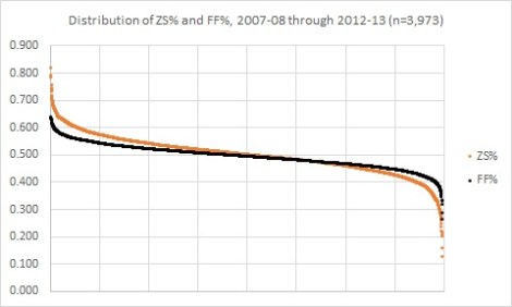
The image above is the distribution of individual offensive zone start percentage (or the percentage of times a player started their shift in the offensive zone) and the distribution of individual Fenwick percentages (shots-for and shots-missed for that player’s team divided by all shots-for and shots-missed, both teams, all tabulated when that player is on the ice). I specifically targeted player season performances wherein the player participated in at least 20 or more games, as that’s roughly around the number of games it takes before these measures start to settle down.

These distributions tell us a few important things for understanding possession, deployment, and how we might analyze the game. Most importantly, after the jump I have a modest proposal, a 60-40 Rule, that might help us in the chase for those elusive, all-encompassing player value metrics.

Continue reading