Exceeding Pythagorean Expectations: Part 1

Screen Shot 2015-09-13 at 9.13.44 PM

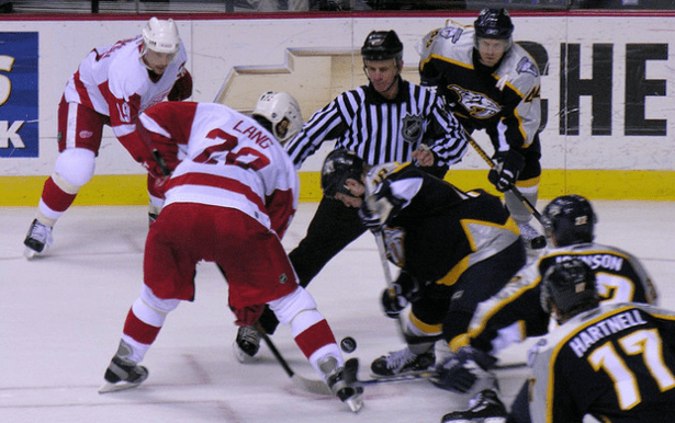
Nashville Predators vs Detroit Red Wings, 18. April 2006” by Sean Russell. Licensed under Public Domain via Commons. The 2006 Red Wings may have been the best hockey team since the lost season.

This is the first part of a five part series. Check out Part 2, Part 3, Part 4, Part 5 here. You can view the series both at Hockey-Graphs.com and APHockey.net.

The 2015-2016 NHL season is almost here, and our sport has come upon a new phase — arguably the third — in its analytics progression.

Continue reading

NHL Analytic Teams’ State of the Union

Pure-mathematics-formulæ-blackboard

Fandom means a lot of different things to different people. But one thing unites us all: we hope our favorite team will win, and spend a great deal of time thinking how they can.

For those of us who dig a little deeper on the “how” side and use analytics, we hope that our work will eventually make its way to a front office. In some ways, it already has: numerous “hockey bloggers” hirings have been made recently.

But how many and for which teams?

With some research, I’ve culled a working document on all analytics hires for NHL teams and how they may be using analytics. The following descriptions comes from a variety of sources including Craig Custance’s Great Analytics Rankings [Paywall], fellow bloggers from across the internet, media reports, word of mouth and anonymous insiders.

It should be noted that just because a team has made an “analytics hiring”, it doesn’t necessarily mean that they value their input or use the analysis provided properly. In fact, hires can be made simply for PR reasons, and some teams may even give analytics tasks as secondary duties to staff members who do not posses any formal background in the subject. Teams may also have hired private firms providing proprietary data, which in reality may not provide any tangible, verifiable value than what is free and readily available online.

Continue reading

Why Possession and Zone Entries Matter: Two Quick Charts

As some of you know, the NHL tracked offensive zone time for two seasons, 2000-01 and 2001-02, then inexplicably stopped. As some of you also know, I have a lot of historical game data, and that includes all the zone time from these seasons. Taking those performances, and focusing on the first two periods to avoid any major score effects (or “protecting the lead“), I charted every single game alongside 2pS%, the historical possession metric.

It’s pretty clear that the spread in shots-for in these games was quite a bit greater than the spread in zone times. Curious, I decided to do a distribution plot, the one that you see leading this piece (2pS% and offensive zone time % in the x-axis, percentage of total performances in the y-axis). Zone time, or generally speaking the flow of the game, has a tighter, much more normal distribution that the distribution of shots. What does this mean? This means that things like how you enter the zone (zone entries), and how you control the puck in the zone (possession, or passing) can make a pretty big difference in how you generate scoring opportunities.

Note: The data I used for these quick graphs were from home team’s perspective, hence why our distribution was a bit north of 50. Keeping that in mind, the 60-40 Rule we established here a year ago looks pretty good for assessing game flow, but there are ways within that flow that can tip the scale.

Sunday Quick Graph: Distribution of EA NHL Player Overall Ratings, from NHLPA Hockey ’93 to NHL 05

Out of curiosity, and having access to some of the data, I decided I could chart the distribution of player overall ratings in the EA NHL series in its first decade of existence (the first of the series and NHL 99 being the exception). Knowing full well that, by 2005, there was a popular gripe that “anybody could get a 70 overall rating,” it seemed like it would be fun to see how we arrived to that point. As you can see, the ’93 version was remarkable in its near-even distribution; most famously, Tampa Lightning defenseman Shawn Chambers received an overall rating of 1. The subsequent games never attempted a similar approach; there were marked divergences for the ’96 and ’04 versions, the latter essentially bringing us to the place where it seems anyone can get a 70 rating. I’d be interested hear your comments suggesting theories and/or evidence why we saw this kind of movement.

At this point I’m inclined to say, as an NHLPA-approved product, it probably wasn’t enjoyable for the players to have low ratings, and thus have that opinion of them reflected to thousands of young fans. More importantly, those fans probably didn’t get much of a kick out of playing with poorer players (playing against them, on the other hand…). I’d also guess that, when you are rating a player’s numerous attributes, it’s hard to end up with a 1 overall unless you had negative values (which they didn’t) or a very low weighting for multiple attributes (which they mostly didn’t).

Why would I even bother looking at this anyway? Well, for two reasons. One, after boxcar statistics (goals, assists, points) and +/-, video game ratings were really the next attempt to derive a publicly-consumed statistic for player talent and value. Whole generations observed, and potentially internalized, the way these games conceptualized important and unimportant elements of the game. Understanding hockey should be as much an understanding of society as it is an understanding of the technical components of the game.

Postscript: I plan on breaking down this data in a more complex fashion in future posts, so stay tuned…

Postscript II: Best theory I’ve seen so far, from Reddit user “DavidPuddy666” — that the inclusion of CHL and other leagues raised this bar. For the most part, though, I recall the international rosters and European leagues following these distributions. In other words, you didn’t have a bunch of sub-50 overalls buried on international rosters. The European leagues were even worse for this; top players in Euro leagues are still rated as if they would be top NHL players. As for the CHL leagues and the AHL, Puddy might have a point — but the AHL didn’t appear till NHL 08, and the CHL leagues till NHL 11. In fact, the international teams theory also has this chronological issue, as only the best international teams make their appearance first in NHL 97, before an additional 16 international teams are added for NHL 98.
Increasingly in the NHL, the Best Defense is a Good Offense

Photo by Lisa Gansky, via Wikimedia Commons; altered by author

Photo by Lisa Gansky, via Wikimedia Commons; altered by author

While preparing statistics for a few upcoming posts on on-ice contributions, I decided to do a quick study on the share of on-ice shot attempts taken by defensemen versus forwards. The metric I’m using, which is a spin-off of an old one whose name doesn’t quite capture it right, is what I’m calling on-ice shooting proportion, or OSP. The results were quite interesting, and I decided that I should test the data a little further and see what we could find.

Continue reading

Another Shot Quality Quandary: League Variance, Evolution, Error

File:Alberti-Young-Hockey-Players-alb11bw.jpg

Young Hockey Players” by Piotr Alberti, via Wikimedia Commons

Hockey statistical analysis isn’t really capturing all of hockey, or seeking to package it; it’s about getting as close we can to the essence of the thing. All the ideas, conclusions, best practices that we’ve cobbled together over the years give us an approximation of the actions a team, a player, or a fan could make going forward to better grasp the game.

Within this fact lies the greatest bone of contention for the hockey stats crowd, and the frequent refrain of critics who can only chirp from the sidelines. “Have you considered measuring this? Have you considered measuring that? Have you removed the games when the Rangers lacked sufficient compete level? Have you adjusted for Hamburglar’s pre- and post-lifetime gift certificate to McDonald’s?” While some of these adjustments may be worthy, and others utterly ridiculous, “shot quality” has been a persistent critique of the use of all shot attempts.

Admittedly, there are some interesting developments in Ryan Stimson’s work on puck movement, which might shed some light on an area yet explored. Though it’s not necessarily his focus, I think his data can give us an idea of how possession is maintained effectively. The remainder of shot quality, or at least the way it’s being conceptualized, lies in these remaining areas: type of shot, where shot is located on net, screened/tipped/direct/clear-look shot data, shooting talent, and where on the ice the shot is taken from. The former two, according to Gabe Desjardins, didn’t really demonstrate themselves when he came across the data (nor when I asked him a month ago). Shot location has already died a partial death by Desjardins, who found it seems to have minimal impact on save percentage, though he also found a team talent component, to the tune of differences ranging up to 0.7 feet.

Let me put the location stuff to bed the rest of the way.

Continue reading

When the Trade Market and Draft Market intersect and how to exploit them

Image Courtesy of WikiMedia Commons

The biggest incentive for teams to employ analytics is exploiting market inefficiencies. Whenever you can exploit an inefficiency in a market it gives your team a comparative advantage over the others. In other words, you raise your team’s chances of being a successful club.

I took a look at previous work from Eric Tulsky and Michael Schuckers on draft pick value and used them to show how one may use statistical analysis to take advantage of market inefficiencies.

Let’s take a look.

Continue reading

The NHL Systems Argument: Comparing Bruce Boudreau, Alain Vigneault, & Lindy Ruff

Bruce-Alain Ruff. Looks like the ghost of Gene Hackman. You're welcome for the nightmares.  Composite of images by

“Bruce-Alain Ruff. Looks like the ghost of Gene Hackman. You’re welcome for the nightmares.” Composite of images by “DSCF1837” (Vigneault), Michael Miller (Boudreau), and Arnold C. (Ruff), via Wikimedia Commons*

Systems are without question the most elusive, yet most important, part of our understanding of hockey and the application of analytics. What works and what doesn’t? To what degree can a coach or team apply a strategy?

This led me to think about where we might most convincingly see evidence of a system at work. In the past, we here at HG have had a lot of skepticism about a number of elements of a “system.” For example, Garik’s pieces on competition-matching lines (here and here) and the use of the “defensive shell” to protect a lead, neither of which presented themselves as particularly effective ways of looking at or implementing systems. I have shown in the past that attempts to use extreme deployment in terms of zone starts doesn’t move the needle beyond a 60-40 range of possession, the range of shooting shares for forwards and defensemen haven’t seemed to change much over the last 20-25 years, and a plotting of even-strength shots-for with top and bottom possession teams do not suggest a major difference in shot location.

So where to go from there? Eventually, I decided that we need to get to an extreme enough situation, with robust enough data, where a team might have the best opportunity to dictate a system — in other words, we need to look at the powerplay. The most ideal opportunity for comparison, given the workable data for me, comes from the coaching careers since 2008-09 of Bruce Boudreau, Lindy Ruff, and Alain Vigneault. They all provide at least a couple of seasons with different teams, in addition to a robust set of coaching data from 2008 to the present. Let’s see what we can see…

Continue reading

Friday Quick Graphs: Total Player Charts, Revived

Bringing back an older concept…a few years ago, I was spurred by Tom Awad’s “Good Player” series to put together these radar charts of player ice-time. I’d always felt, for fantasy hockey purposes, it is important to know the boxcars (goals, assists, points) come from the ice-time as much as anything, and so the initial creation of what I called “Total Player Charts,” or TPCs, was to portray precisely that. It ended up that they gave intriguing portrayals of players that we felt had strong seasons. See Jamie Benn’s above; an Art Ross Trophy, sure, and much of it came from near the top share of playing time at evens and on the powerplay, league-wide. You can also get a sense of just how valuable a defenseman like T.J. Brodie is:

Continue reading

Grantland Features: Knuckles vs. Numbers

Sometimes, I hear questions float around about whether the analytics movement has changed the NHL all that much. I wrote about this a bit in my most recent post, looking at player usage, but there’s more to be said. Thankfully, I had a great opportunity to contribute to a documentary for Grantland and ESPN called “Knuckles vs. Numbers,” which focused on the influence of analytics on the reduction of the role of the enforcer. Including myself, you’ll also see interviews with Sean McIndoe (@DownGoesBrown), Steve Burtch, Paul Bissonnette, Colton Orr, and Brian McGrattan. Check it out, get the word out, it’s worth your time.

Now that you’ve enjoyed that, I have some behind-the-scenes anecdotes and information from the experience that are worth mentioning.
Continue reading