
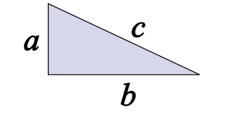
“Pythagorus Algebraic Separated” by John Blackburne. Licenced under Public Domain via Commons. The 2006 Red Wings may have been the best hockey team since the lost season.
This is the third part of a five part series. Check out Part 1, Part 2, Part 4, Part 5 here. You can view the series both at Hockey-Graphs.com and APHockey.net.
Since the last post was getting a little long, I decided to hold off on releasing the full Pythagorean results.
Linked you will find a table of every team since the lost season, sorted by the difference between its adjusted point total and its Pythagorean expectation. Essentially, the teams that have the highest numbers in the right-most column are likely to have been the most fortunate, and those at the bottom were possibly unlucky. If you look at the 2014-2015 results below, you will see which teams should be a little bit worried about their chances, and those which may be ready for a rebound. Tomorrow, I will address what the point of this whole study was, and we’ll look at some more data.


How can 27 teams from last season exceeded expectation? Does this suggest that your model is too pessimistic or were there a tonne more overtime games than predicted?