Exceeding Pythagorean Expectations: Part 1

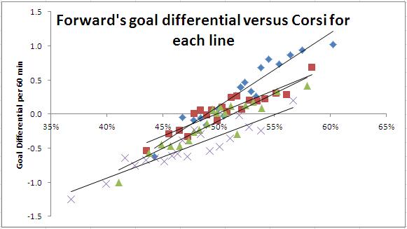
Screen Shot 2015-09-13 at 9.13.44 PM

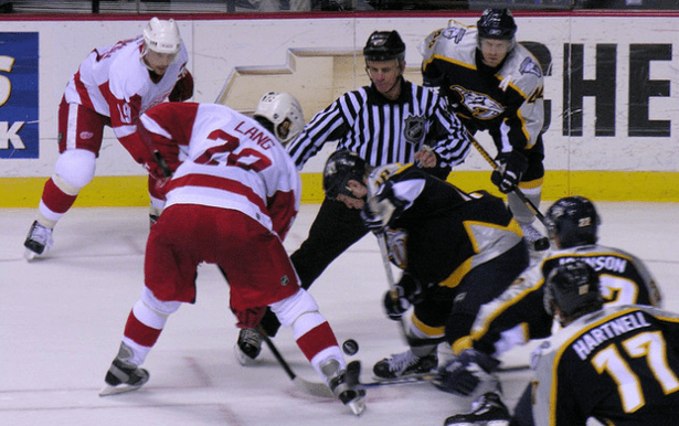
Nashville Predators vs Detroit Red Wings, 18. April 2006” by Sean Russell. Licensed under Public Domain via Commons. The 2006 Red Wings may have been the best hockey team since the lost season.

This is the first part of a five part series. Check out Part 2, Part 3, Part 4, Part 5 here. You can view the series both at Hockey-Graphs.com and APHockey.net.

The 2015-2016 NHL season is almost here, and our sport has come upon a new phase — arguably the third — in its analytics progression.

Continue reading

The Art of Tanking: The Pittsburgh Penguins in 1983-84

While tanking is a hot topic in this year’s NHL, the act of tanking is as old as the idea of granting the worst teams a shot at the #1 pick in the draft. Case in-point: the 1983-84 Pittsburgh Penguins, routinely considered the most overt of tankers in NHL history. The graph above is just one example of their tank, and man is that bad. The yellow and grey lines indicate one standard deviation above and below league-average historical possession (using 2-Period Shot Percentage, or 2pS%, explained here). The blue line is a 20-game moving average (the orange is cumulative), and you’re seeing that right; a team close to the middle of the pack dropped nearly two standard deviations, or from near the top to near the bottom of the league. That graph, and all the ones below, are just some examples of the kind of tinkering you can do with our new interactive graphs, which I highly recommend you check out.

Continue reading

Friday Quick Graph: Player Career Charting by Percentage of Team Shots, 1967-68 to 2012-13

Embedding interactive graphs into blog posts, especially blogs with a narrow runner like ours, is frequently an awkward process. Just about the time things look good, you tinker with it and it looks bad. Nevertheless, I had a bunch of old data I put together, once upon a time, and I wanted to get it out there in a form that you could tinker with. Basically, in the past I have used the percentage of team shots in the games a player participated (%TSh; explanation here) as a way to capture a player’s contribution to the shot load; I also think it strongly implies a player’s involvement and contribution to team offense overall.

In the case of today’s graph, I took %TSh and looked at aging curves with a multitude of players from 1967-68 through 2012-13 (like I said, the data is a little old). I prepared this with a selected group of players available for the filter, the majority of whom are stronger, more familiar players of the years covered. I also included some players that struggled by the metric, for the sake of comparison. To filter, click on the “Name” bar, click on “Filter,” and let your imaginations run wild. Feel free to download if you wish.

Note: I believe I set the cut-off at 20 GP before I would record the point of data. It’s old. I’m old. We’re all getting older.
NHL Forwards vs. Defensemen Height & Weight, 1917-18 to 2014-15

Photo by Eric Kilby, via Wikimedia Commons

Photo by Eric Kilby, via Wikimedia Commons

Building on my post from last week on overall skater height going back to 1917-18, I wanted to dig a little further into the the complexity of the data to see if there were any interesting takeaways. This included breaking the data into forward and defense data, to see if there was every any substantial increase in defenseman size or any other allusions to an attitude change in terms of size trends and preferences. While there are some slight differences, most interesting to me was, for as many changes as the NHL has undergone, there seems to be a uniform attitude about size when looking at forwards and defensemen.
Continue reading

Trading Off: How Much Possession Can My Team Surrender and Still Win?

Photo by Michael Miller, via Wikimedia Commons; altered by author

Photo by Michael Miller, via Wikimedia Commons; altered by author

Within the continuing discussions over the value of possession metrics, and the veracity of shot quality or shooting talent measures, there’s a point that seems to have slipped through the cracks. While there’s a spectrum of attitudes about possession and shot quality/talent, neither entirely refutes the importance of the other – and with that thinking, it’s worth considering how much you can sacrifice in one and still maintain success by the other. Put more simply, how little can a team possess the puck and still expect to shoot their way to success?
Continue reading

Goaltender Performance vs Rest

Photo by Michael Miller, via Wikimedia Commons

Photo by Michael Miller, via Wikimedia Commons

I couldn’t find this data (if it’s out there, please point me to it), so I went back to 1987 and pulled goaltender performance vs games rest. We knew goalies did poorly in the second game of a back-to-back pair, but I’m surprised to see such a large gap for two and three games. (The overall dataset is roughly 40000 games.)

Days between Games % of Games Mins (G1) Mins (G2) Shots Vs (G1) Shots Vs (G2) Sv% (G1) Sv% (G2) W% (G1) W% (G2)
1 9.5 54.7 55.0 28.9 29.7 0.905 0.897 0.498 0.421
2 35.6 57.0 56.8 28.7 28.7 0.908 0.901 0.522 0.486
3 19.2 57.1 56.7 29.0 29.0 0.905 0.900 0.514 0.481
4 12.1 56.7 56.3 29.2 28.7 0.899 0.898 0.477 0.487
5 7.2 55.4 55.2 29.0 28.8 0.892 0.899 0.440 0.448

There are lots of systematic issues here (e.g. most back-to-back games are on the road) but simplistically, this would mean goalie rest obscures the bulk of a goaltender’s value. That seems implausible and worth looking at in more detail…

2014-15 Preview: The Central Divison

Image from Matt Boulton via Wikimedia Commons

If you’re a fan of a Central Division team that doesn’t employ Ondrej Pavelec, you’re probably feeling optimistic as we approach the upcoming season. And you should: this is clearly the best division in the NHL, and all six of its non-Manitoban clubs have legitimate playoff hopes.

Of course, not all six will reach that milestone; at least one will join Winnipeg on the outside looking in. At this time, however, few can agree on how the standings will shake out. The Stars have been projected anywhere from second to fifth; the Avalanche have been slotted everywhere but last. Some are high on the Blues, others are sick of them constantly disappointing.

This uncertainty should make for an exciting year in “Conference III.” Below is a team-by-team breakdown of the league’s toughest division:

Continue reading

Save Percentage vs the Experts: Do shots against inflate a goaltender’s save percentage?

Curtesy of Wikipedia Commons

I’ve seen many statistical articles look at different ways to determine whether or not shot volume inflates a goaltender’s save percentage; however, I’ve never been satisfied with the methods used, regardless of the outcomes. So, I finally went and looked at the data myself.

It’s been seven months since I’ve written anything on save percentage. With all that wait, you’d think I’d give you a big, long, and in-depth article… but I won’t. 

I had one planned, but accidentally lost all my data. Of course, errors always come in clumps. Instead of recovering the lost data, I ended up permanently removing it. To make matters worse, extraskater.com going black made the information a hassle to manually extract again. I probably could write a code (or get someone else) to draw up the information again… but I still have one piece remaining from the original data: the graph.

What is this graph of? What does it mean? Continue reading

More on “Corsi & Context”, with some added predictive modelling

Corsi

INTRODUCTION

I have always been of the opinion that Corsi is part of the larger puzzle in trying to gain greater understanding of the game and how a player can affect their team’s chance to win.  Like all statistics though, it needs appropriate sample size and context, and will never tell you everything. Teammates, opponents, luck, system, strategy and what moments a coach deploys a player will always effect results… although, there can also be times where context is overly stressed. While Corsi does tend to need less context than many other hockey statistics, there are some things that need to be kept in mind in how two players with the same Corsi% are not always created equally.

Tyler Dellow wrote a piece on context that is definitely worth a read. In the article Dellow used two tables showing how Corsi changes dependent on ice time for the 2011-12 season.

We will revisit this article using a larger sample and look at both forwards and defensemen.
Continue reading