Defensive defensemen are struggling in the playoffs

It has been said that a “stay-at-home” defensive defenseman’s value expands in the post season. The theory behind this supposes that the looser rules regarding physical force and obstruction play into these defender’s strengths. However, this is not always the case.

Thus far, we have seen some of the larger names in the business struggle in their roles.

Continue reading

2013-14 Stanley Cup Preview

Untitled

40-60% is the normal typical spread in the NHL

Later today the Los Angeles Kings will be facing off against the New York Rangers. The Los Angeles Kings have been the heavy favourite both throughout the mainstream media and the fancystats blogger community, with talk of the Kings winning in 4 or 5 with ease.

Is this valid?

Let’s look together do some very surface level analysis.

Continue reading

What’s the deal with Andrew MacDonald: Why do the statistics suggest he’s terrible?

Did you really think I was going to miss the opportunity to post the AMac with chains gif again? You thought wrong.

Islander Defenseman Andrew MacDonald is one of the hot names being bounced around during the trade deadline.  On one hand, this makes sense: He’s making basically nothing on his current contract, he’s one of the time on ice leaders in the NHL this year and has handled top level competition for a few years now.

On the other hand, his conventional fancystats show a well…..massive decline:

AMacThreeYear

Yikes.  That 2013-2014 number is downright terrible, dropping MacDonald into the bottom tier of defensemen.  And no zone starts and certainly not competition (see this article for an analysis of AMac vs various levels of competition) does not account for this.  If you believed the fancystats, AMac isn’t just not a top tier DMan, but not even a 2nd or 3rd pairing guy who could help any team at all.  Yet teams seem to believe he’s worth a high pick?  So what’s going on?  Is the conventional thought completely wrong here?

Continue reading

The Day David Staples Killed Corsi Because…Taylor Hall

File:Taylor Hall.JPG

Photo by Alexiaxx, via Wikimedia Commons

I’ve been following the story of Taylor Hall as the season progresses, particularly through Tyler Dellow’s attempts to un-vex the vexing year Hall is having (Parts IIIIIIIV). In Tyler’s second part, he notes three differences between this year and last year: fewer zone entries with a carry, poorer retrieval of dump-ins, and a lower shots-per-carry total. The latter, Tyler notes, is likely symptomatic of a larger emphasis on dumping-in, wherein a player carries to just inside the blue line before dumping. He quotes Dallas Eakins as suggesting that Hall, in-particular, seems to take this dumping-in approach to heart. I’d add that there’s a possibility that this is abbreviating potential offensive zone possession time, as overall Hall and the other Edmonton Oilers have dropped from nearly 50 seconds per shift to 47 seconds. Further to that point, Tyler noticed in the fourth part that the Oilers have seemed to adopt a tip-in dump-in, wherein the player in the neutral zone either redirects or chips, while standing in place, the puck into the offensive zone. Just based on the video evidence Tyler provided, this looks like an extraordinarily passive approach to the dump, equivalent to dumping and getting off the ice. In that latter scenario, you are unequivocally giving up possession. In the tip-in approach, you take your active close player and leave them in-place, in favor of a later-to-the-game forechecker. It would seem to me that you’d benefit from an active dump-and-chase forechecker.

There are a couple of others irons you can put in the fire, including variance of CF% (a 5% swing is not unheard-of, particularly moving from a 48 to a 56-game sample), potential fatigue from increased playing time (he’s taken on some penalty kill minutes and more even-strength minutes this year), and the swapping out of Ales Hemsky as a linemate (for Sam Gagner). The tougher competition, for me, is essentially washed out by a bump up in offensive zone starts. I don’t see evidence of recording bias, either. I suspect a couple potential, additional things: 1) the drop-off is right there with the Ovechkin-Dale Hunter drop-off, so there might be some player vs. system aggravation, and 2) some fatigue issues related to the early-season knee injury. Injuries aren’t just about pain, they can also compromise strength and endurance. A guy like him, who has had injury issues in the past, does not want the “soft” label (you’ve seen what that’s done to Hemsky’s time in Edmonton), and might not want to admit it to the media or himself.

Up to this point, you’ve seen Dellow’s and my own introspection into what appears to be a poor possession season from Taylor Hall. Enter David Staples.

Continue reading

Friday Quick Graph: How the Possession Battle Stabilizes

Surely you’ve been exhausted with graphs from this December 30th, 1981 Oilers-Flyers game, but allow me one more. I wanted to demonstrate both how many possessions it took for the possession battle to grant us a clear picture, and also further speak to the value of 2pS%. The chart above demonstrate what happens when I establish a rolling possession-for % (as indicated by the y-axis, possession-for % is done from the perspective of Edmonton) using the last 10 possessions, then the last 20 possessions, and so on to 60 possessions. I stop there because we then arrive at a point where we are primarily measuring (in 60-120 on the x-axis) the 1st and 2nd period in-tandem. What we see is that, by that point, our possession battle has calmed down much closer to something that resembles the final battle (a 52% to 48% victory for Philadelphia). The y-axis shows how far above or below .500 (or 50% possession) the battle went; once again, this was measured from Edmonton’s perspective, so below the line is Philadelphia winning the battle, above is Edmonton (hence the color-coding). We also see, then, that the battle doesn’t calm down to a spread below the 60-40 possession benchmark until 40 possessions…which means it doesn’t really reach the likelihood of truly reflecting demonstrated possession talent until that point. For this reason, I think we can derive confidence in the signal that two-periods provide us with regards to possession battles. Additionally, it speaks to the potential problem with focusing on single periods of data.

Wayne Gretzky vs. Bobby Clarke, December 1981: A Micro-Analysis

Image

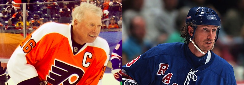
Left image by “Centpacrr“, Right image by “Hakandahlstrom” via Wikimedia Commons, both altered by author

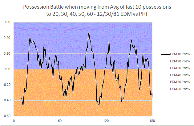
On December 30th, 1981, Wayne Gretzky’s Edmonton Oilers and Bobby Clarke’s Philadelphia Flyers met in a Wednesday night tilt rich with symbolism. Clarke, 32, was a couple of years away from retirement; two of his three remaining teammates from the Cup years, Reggie Leach and Bill Barber (defenseman Jimmy Watson was the third), were themselves out of the league in two years (Leach due to talent drop-off, Barber due to injury). Ironically, there was little indication in 1981 that this was going to happen – all were around 30, all were near point-per-game scorers playing all minutes. Whatever the case, they were the last of the Broad Street Bullies, and were now mentoring a new generation of “Bullies” like Ken Linseman, Tim Kerr, and Brian Propp, who seemed at times more annoying than dangerous. Though in transition, Philadelphia was still a great possession team (4th in the league in 2pS%, an historical possession metric), but fought the percentages all year to squeak into the playoffs. Edmonton, on the other hand, was romping through the league at record pace, and by December 30th held a comfortable lead over 2nd place Minnesota in the old Campbell Conference. Gretzky, of course, was at the heart of this surge, and by game 39 he had 45 goals.

The 1980s Oilers were the next step in NHL offense, really a Canadian version of the 1970s Soviet style of hockey. They didn’t need to bully their way to victories – they let the other team take the penalties, and skated all over them. I should say, that’s what Edmonton would eventually do; on this night they lined Gretzky up with Dave Lumley and Dave Semenko, as they had done most of the year. More on that later.

As I said before, though, the Flyers were a great possession team, as they always had been when Clarke and Barber were in their prime (they averaged, averaged, 55% 2pS% in the years 1973-74 through 1981-82, placing them consistently among the top 5 in the NHL). They were fast and calculating with their puck movement; the grit was just extra work – and who knows, maybe it contributed to Clarke, Barber, and Leach’s early retirement. The Bully when met with the Oilers, though, learned that the box was the bigger enemy.

Continue reading

Friday Quick Graphs: Shooting and Playmaking Contributions, 1967-68 through 2012-13

I’ve just finished a pretty massive dataset, so I’m geeking out a bit over what I can do with it. Just the beginning, above…this is the distribution of %TSh (player shots divided by estimated team shots in games they played) and %TA (same equation, but with assists) season performances, 20+ GP, from 1967-68 through 2012-13. Per recent arguments about Ovechkin, I’ve added lines showing where his best season (2008-09) and most recent full season (2012-13) fall on the list; his current season would fall approximately in the same place as last season.

Those of you who’ve been following me on Twitter know that I’ve put together a pretty substantial dataset, and I’ve been working through the data with a metric I’ve used for a while. %TSh is a player’s shots divided by his team’s estimated shot total in games they played (Team Shots / Team GP, multiplied by player GP). The measure gives us an idea of the player’s shooting contribution to the team’s offense. It moves outside the pesky variance of shooting percentage and gets closer to a stable indicator of offensive role. I’ve done the same with %TA, which is the same equation for assists. The reason for estimated team totals is we don’t yet have good macro-data on specific games that players played before 1987-88, but the metric runs essentially in lock-step with the real thing and I want to provide a useful, historical point of comparison. Doing this allows us to look 20 years further back.

The distribution above includes over 23,000 player seasons over 20 GP; the orange distribution is %TA, and black is %TSh. I used the marks to connect back to the previous week’s bizarre flame war over Ovechkin’s value and approach to the game; the top one shows Ovechkin’s peak year, 2008-09 (20%), which also happens to be the highest %TSh of all-time. The bottom mark is Ovechkin’s 2012-13 (16.3%), which I’m using because his current season is just slightly higher – it would be good for 16th best in NHL history.

I also did a second graph, wanting to look at the relationship of %TSh to %TA, to see just how much they ran together:

Related to the previous post, I decided to see if the relationship between TSh% and %TA was too close to tell me anything. %TSh is on the x-axis, and %TA is on the y. As you can see, they do run together, which is okay, because rebounds can result in assists for the shooter, and players with a lot of shots will generally be engaged in the offense in all ways. That being said, it’s not so close that they aren’t distinctive. The plot above does look scattered enough for these two metrics to tell us something apart from one another.

In the graph above, the x-axis is %TSh, and the y-axis %TA. Intuitively, these run together a fair amount, as shots create rebounds that can be counted as assists, and a player that shoots a lot is likely to be more heavily involved in the entire offense. That said, they don’t run nearly so close together as to render either measure moot. I think %TA can be a valuable counter-weight for assessing defensemen. Anyway, this is the tip of an enormous iceberg of data, so don’t be surprised to see me refer to and use %TSh and %TA again.

Input versus Output: An Ongoing Battle that No One Knows About

XKCD comics is written by Randall Munroe, a physicist who probably doesn’t know what  hockey underlying numbers (ie: #fancystats or advance statistics) even are, let alone supports them… yet – for the most part – he gets it.

Mainstream sports commentary is full of poor analysis when it comes to using numbers appropriately. Most of this comes from a lack of understanding between the difference between inputs versus outputs and how much a player can control certain factors. (It should be noted that this is a broad generalization; not everyone falls into this category).

Benjamin Wendorf displayed a bit of these factoids in his recent article Why The Hockey News’ Ken Campbell is Wrong About Alex Ovechkin, but Campbell still didn’t get it.

What happened:

For those that do not know, here is a quick summary of Campbell’s article:
Continue reading

Why The Hockey News’ Ken Campbell is Wrong About Alex Ovechkin

File:Defense.gov photo essay 080220-F-6684S-642.jpg

Photo by Adam M. Stump via Wikimedia Commons

You know, there was a time when I relished The Hockey News, and really any hockey writing I could get my hands on. I grew up in the sticks in Wisconsin, where you can’t find jack about hockey, and so to convince your parents to buy a THN magazine was a real treat. I’ve never forgotten that feeling, and I want those old reporting institutions to continue, but it isn’t going to happen with haphazard attempts at analysis like Ken Campbell’s piece on Ovechkin from today. In it, he tries to argue that Ovechkin is going to have the worst 50-goal season in NHL history because his plus-minus isn’t good. After the jump, let’s take a look at some of these gems.

Continue reading