A New Way To Measure Deployment – Expected Faceoff Goal Differential

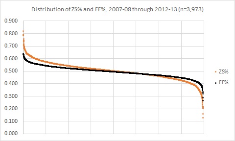
Zone starts are not that great of a metric. Although certain players do tend to be put out almost exclusively for offensive or defensive purposes, the reality is that for most players’ zone starts have a relatively small effect on a player’s performance. And yet, many hockey writers still frequently qualify a player’s performance based on observations like “they played sheltered minutes” or “they take the tough draws in the defensive zone”. Part of the problem is that we’ve never really developed a good way of quantifying a player’s deployment. With many current metrics, such as both traditional and true zone starts, it’s difficult to express their effect except in a relative sense (i.e. by comparing zone starts between players). So when a pundit says that a player had 48% of his on-ice faceoffs in the offensive zone, it’s difficult to communicate to most people what that really means.

Going beyond that, even if we know that 48% would make a player one of the most sheltered skaters in the league, the question that we should ask is so what? Simply knowing that a player played tough minutes doesn’t give us any information that’s useful to adjust a player’s observed results, which is really the reason that we care about zone starts. We know that if you start your shifts predominantly in the defensive zone, you’ll likely see worse results, but zone start percentages don’t tell us how much worse they should be. Traditional deployment metrics are too blunt of a tool – they provide a measurement, but not one that gives any context to the performance numbers that we really care about.

Continue reading

The Pressures of Parity

File:Balanced scale of Justice (blue).svg

Two nights ago, when no one was looking, I tweeted out a telling statistic to understand how teams have reacted to the salary cap post-lockout.

Boulerice wasn’t the only one scraping the bottom of the barrel in 2005-06; Colton Orr was nearby with his 2:49 per game, and you didn’t have to look much further to see Andrew Peters (3:15) and Eric Godard (3:27). In fact, 19 skaters played over 20 games that season and recorded even-strength TOI/G lower than Peluso’s from this year. Teams have realized that, in a salary-capped league, even league-minimum dollars can’t justify players who cannot be trusted with regular minutes.

This was a fairly stark evolution of player usage, but it led me to wonder if there were any other things we could see by looking at finer-grained data from 2005-06 to the present. The salary cap was a game-changer because it pushed teams at the top and bottom closer together, and that compelled teams to stop employing players they couldn’t trust at evens; what are some other areas we see the pressure of parity?

Continue reading

How Do Teams Use Their Top Defensemen

The following is a guest article written by Rob Vollman of Hockey Abstract and Hockey Prospectus fame. Enjoy!

Other than the goalie, a team’s top defensemen are arguably the most important players on the teams. Great ones like Nicklas Lidstrom, Scott Niedermayer and Chris Pronger can completely alter the outcome of an entire season almost single-handedly. Who were the top pairing defensemen this year, how will they used, and how effective were their teams when they were on the ice?
Continue reading

What’s the deal with Andrew MacDonald: Why do the statistics suggest he’s terrible?

Did you really think I was going to miss the opportunity to post the AMac with chains gif again? You thought wrong.

Islander Defenseman Andrew MacDonald is one of the hot names being bounced around during the trade deadline.  On one hand, this makes sense: He’s making basically nothing on his current contract, he’s one of the time on ice leaders in the NHL this year and has handled top level competition for a few years now.

On the other hand, his conventional fancystats show a well…..massive decline:

AMacThreeYear

Yikes.  That 2013-2014 number is downright terrible, dropping MacDonald into the bottom tier of defensemen.  And no zone starts and certainly not competition (see this article for an analysis of AMac vs various levels of competition) does not account for this.  If you believed the fancystats, AMac isn’t just not a top tier DMan, but not even a 2nd or 3rd pairing guy who could help any team at all.  Yet teams seem to believe he’s worth a high pick?  So what’s going on?  Is the conventional thought completely wrong here?

Continue reading

A Rule of 60-40: Thoughts on Individual Player Possession Metrics

Image

The image above is the distribution of individual offensive zone start percentage (or the percentage of times a player started their shift in the offensive zone) and the distribution of individual Fenwick percentages (shots-for and shots-missed for that player’s team divided by all shots-for and shots-missed, both teams, all tabulated when that player is on the ice). I specifically targeted player season performances wherein the player participated in at least 20 or more games, as that’s roughly around the number of games it takes before these measures start to settle down.

These distributions tell us a few important things for understanding possession, deployment, and how we might analyze the game. Most importantly, after the jump I have a modest proposal, a 60-40 Rule, that might help us in the chase for those elusive, all-encompassing player value metrics.

Continue reading

Overemphasizing Context – A mistake just as poor as explaining context in the first place.

AMac Context

The only context that can explain Andre MacDonald’s performance is if he’s actually wearing these chains under his uniform.

Eric Tulsky frequently points out on twitter that common critiques of analytics people (whether it be hockey or any other sports analytics) tend to act as if those involved with analytics are kind of stupid and have ignored the obvious.  For example, people tend to respond to arguments involving corsi and possession by bringing up the obvious subject of context – “Sure he has a bad corsi, but he gets tough minutes!”  And the general response of course is, yes we have, and we wouldn’t be making these assertions had we not done so.   Hockey Analytics has come up with a multitude of statistics to measure context – Behind The Net alone has 3 metrics for quality of competition and 3 metrics for quality of teammates, plus a measure of zone starts – HA has multiple different measures for the same thing and so does now Extra Skater (with Time on Ice QualComp and QualTeam).

Continue reading