NHL Systems, NHL History, and Forward vs. Defense Shooting

Photo by “ravenswing” via Wikimedia Commons

“It’s a matter of systems,” “They don’t have a good system,” “There is no system there”…we hear phrases much like this frequently, and I wonder just how much weight we give the word “system” in a game that flows and relies on instinct and reflex. Teams have some kind of system, no doubt, but it’s funny how the actions of any kind of system pale in comparison to the number of times we notice the classic breakout, setting up of the zone, or cycle. What I’m trying to say is, might we be putting too much emphasis on system, when the results are not clearly resulting in different shot quality? Might we be overstating the role of something practiced for a couple of months, maybe a year or two, versus 15-30 years of playing experience, and all the instincts, common tactics, and reflexes?

In my mind, systems are important in-and-of themselves, because their organization principles are intuitive. Cover the man or take away the passing lanes, apply forecheck pressure or trap in the neutral zone…these base ideas probably need to be there to keep things from devolving into pickup hockey. And you all know that game, where everyone’s a superstar forward and nobody backchecks. Seriously, no wonder you guys can’t ever find two goalies.

Anyway, with my current treasure trove of game-by-game, player-by-player data going back to 1987-88 (thanks to Hockey Reference’s excellent Play Index), I wanted to see just how much the game has evolved since the late 1980s, particularly in regards to defensemen involvement in the offense. We already know that the difference in shots-for per team, per game is 30.4 in 1987-88 to 29.1, so not a heck of a lot has changed in shot generation, and the goals/game per team has changed drastically, from 3.71 in ’87-’88 to 2.75 today. This information alone should suggest we probably haven’t improved too much in regards to what we might call offensive systems. Has defensemen involvement increased, and driven the scoring down? Have teams attempted more forward involvement to improve scoring? Will Guy Boucher ever convince us he has the key to better offense again?

I took data from about 30,000 individual player performances in 1987-88 and about 26,000 in 2012-13; I compared the player’s shot totals to their team totals in those games and derived my %TSh, or percentage of team shots metric, previously used in my piece on Career Charting.

Continue reading

Friday Quick Graph: Possessing the Puck in 1969, 1981, and 2013

Hextall OnIce.jpg

Photo by Jim Tyron, via Wikimedia Commons

Just finished tracking possession times in a November 15th, 1969 game between the Flyers and the Leafs. This game, when compared to the games from this post, fits virtually in-between them, which is interesting because, unlike with the other two games, the Flyers and Leafs were two teams on the lower end of the spectrum in the league (8th and 9th in 2pS% in a 12-team NHL). Maybe that also contributes to their average possession time of 6.08 sec (n=349) compared to the 1981 game’s 6.15 (n=364) and 2013 game’s 6.17 (n=360). Another observation among these games: the standard deviation for the 1969 and 1981 games is right around 4 seconds, where it’s right at 5 seconds for the 2013 game. I’ll save any deeper ruminations until I have a larger sample, but it’s food for thought.

Not too long ago, I decided I wanted to try out tracking time of possession in historical games, with the hope of eventually having enough data to look into things. I realized it’s going to be a little difficult to get large enough samples of singular teams, but I also realized that we could potentially compare the game as a whole in different eras. I’ve always been of the mind that the game has evolved somewhat, but at its core there are a number of best practices that have kept it pretty much the same game from around the time that the red line was introduced in 1943. I wanted to test that as far back as I could go, though, so with this possession tracking I actually tracked each individual possession rather than just a total time of possession. For this chart, I displayed all those individual possessions as a distribution, longest possessions to the shortest. These three games, the Philadelphia Flyers vs. Toronto Maple Leafs in 1969 (Toronto won 4-2), Edmonton Oilers vs. Philadelphia Flyers in 1981 (Edmonton won 7-5), and Los Angeles Kings vs. St. Louis Blues (St. Louis won 4-2), had some surprising results when compared. As you can see above, the distribution is actually quite close, with the 1981 game seeming to have shorter possessions but then moving above the others in the middle of the line. The 1969 game actually seems like a trendline of the 2013 and 1981 games. The average possession time? 1969: 6.08 seconds, 1981: 6.15 seconds, and 2013: 6.17 seconds. Obviously, I need (and want) more data, but it is a really intriguing start.

The “possession battle” results?

All Situations Possession

  • PHI (47.1%) vs. TOR (52.9%), 1969
  • EDM (53.4%) vs. PHI (46.6%), 1981
  • LAK (51.7%) vs. STL (48.3%), 2013

Possession, Score Close

  • PHI (41.3%) vs. TOR (58.7%)
  • EDM (48.7%) vs. PHI (51.3%)
  • LAK (51.2%) vs. STL (48.8%)

A Rule of 60-40: Thoughts on Individual Player Possession Metrics

Image

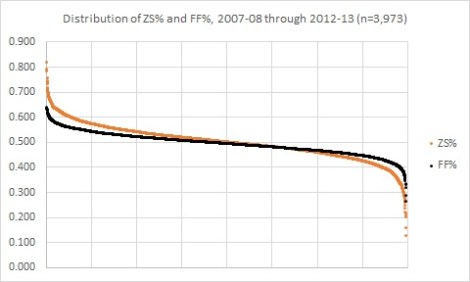
The image above is the distribution of individual offensive zone start percentage (or the percentage of times a player started their shift in the offensive zone) and the distribution of individual Fenwick percentages (shots-for and shots-missed for that player’s team divided by all shots-for and shots-missed, both teams, all tabulated when that player is on the ice). I specifically targeted player season performances wherein the player participated in at least 20 or more games, as that’s roughly around the number of games it takes before these measures start to settle down.

These distributions tell us a few important things for understanding possession, deployment, and how we might analyze the game. Most importantly, after the jump I have a modest proposal, a 60-40 Rule, that might help us in the chase for those elusive, all-encompassing player value metrics.

Continue reading

A Nice Tool to Have: BehindtheNet.ca Player Name Converter, plus Age and Position, 07-08 through 13-14

Those of you who have worked with Behind the Net data would be the first to say it’s a great, important site. I feel the same way, but I also know that anybody that’s worked with it close enough knows that there is a bit of a pain-in-the-ass there, with the different name spellings. Also, there are some position discrepancies and, for those that like to look into that sort of thing, player ages aren’t on there. Well, because I just brought the data together for something else I’m working on, I decided to share what I had for those problems. This link is to a Google doc that has the Season, regular Player Name, their age and position that season, and their BTN name for that season.

The players include all players that played a season from 2007-08 up to last week Thursday, 2013-14. Let me know if the link below doesn’t work:

BehindtheNet.ca Player Name Converter, plus Age and Position, 2007-08 through 2013-14

Hope this helps, happy researching!

Friday Quick Graphs: Toronto Maple Leafs, Chicago Blackhawks, Edmonton Oilers, and Boston Bruins Shot Distributions, 5 Years

What you see above are the even-strength shots-for locations for the near-indisputable top team of the last five seasons (Chicago Blackhawks) versus the near-indisputable worst team of the last five seasons. This is a sort of visual anti-shot quality argument, a demonstration of why, across these five seasons, the indisputable #1 team would shoot 9.9% while the indisputable #30 team would shoot 9.6%. Notice the horseshoe design, about where defensemen normally sit, then jump up into the play. Notice the dense cluster around the high slot. All teams make these plays, try to make them, the difference being some are better at possessing and moving the puck to make the shot. What’s the primary difference above? The amount of shots.

None of the above charting is possible without Greg Sinclair’s awesome site, Super Shot Search. Bookmark it, use it, love it.

Oh, hey, what if I was to look at the teams with the best and worst save percentage these last five years? Would they look different in even-strength shots-against? Well, let’s see, Toronto and Boston:

There is a difference here, I think. I mean, the initial difference are the numbers, Boston’s SV% (92.1%) versus Toronto’s (89.5%). Another difference is it seems the two charts maintain roughly the same shot distributions, but flip ends of the rink. Not much to dwell on there. One thing I will say, that could relate to the SV% discrepancy, is that it doesn’t appear that Toronto records many, if any, shots from right along the boards. Now, I don’t know if this is a recorder’s error or not; it seems to me it’s pretty hard to get a shot from right tight along the boards. Maybe one recorder does it based on where the body of the skater was located, I don’t know. Or…Toronto does allow shooters to come in a little tighter, and Boston owns the center ice a bit better. Could that explain a near-3% discrepancy? I don’t think so; we know Toronto’s had worse goaltending. But it might’ve “helped.”

NHL Team History, Possession, and Winning the Stanley Cup

Photo by “JulieAndSteve”, via Wikimedia Commons

Gabe Desjardins dropped a comment over at my Tumblr awhile ago, asking me if I could put together a graph expanding on a metric I came up with, 2-Period Shot Percentage (or 2pS%). 2pS% is an historical possession metric that takes shots-for and shots-against in just the first two periods of a game and expresses it as a percentage for the team being analyzed. The idea was that I was trying to get a rough possession measure from the period that would avoid score effects, or the tendency for teams with a lead to sit on the lead and thus give up shots late in the game. Having recently completed a database of period-by-period shot data going back to 1952-53, I have been able to test this metric a bit and the results were good for 2pS% as a possession measure. Returning to Gabe’s request, he wanted to know if I could chart the 2pS% data from year-to-year, with one line following the league leader in the metric and the other line following the Stanley Cup winner. I’d been curious about this myself; certainly there are a number of different ways to express the value of the metric, but this particular one could be interesting because it toes the line between what the Old and New Guard feel is important in this kind of analysis.

Well, I was right that it would be interesting:
Continue reading

Should the Winnipeg Jets Hold On to Paul Maurice?

Photo by “Krazytea” via Wikimedia Commons

Mark Chipman, Kevin Cheveldayoff, & Co. took a huge step yesterday, firing their first choice in the new Winnipeg Jets coaching history, Claude Noel. Noel has the unfortunate (no, scratch that, earned) legacy of mediocre results, questionable lineup decisions, and the uncanny ability to look like nothing’s going on while standing in a tire fire. Whatever the case, the Jets decided to turn away from the new-coach idea towards a very-seasoned veteran in Paul Maurice. With 1,137 NHL games of coaching experience, and one trip to the Cup Finals (with Carolna in 2002), Maurice is definitely a smart choice if a team’s trying to find itself and build up from the relocation identity.

It’s also significant that Maurice has already endured the relocation process. First breaking into the league at the helm of the Hartford Whalers, he helped that team build up from a series of dismal years and a move from Hartford to North Carolina. Though he’d be fired before he could enjoy the ultimate prize of those efforts (the ‘Canes would win the Cup the year after he left), there is little doubt he has the experience for those that prize that sort of thing.

But that leaves a few hanging questions: is he a good coach? Can he make this a better team? Is there any way we can find answers to those questions?

We can, and we will.

Continue reading

Friday Quick Graph: The Evolution of an NHL Forward’s Time On-Ice

Friday Quick Graphs are (initially) intended to revisit some of the better, potentially more-significant work I’ve posted over the past year on my Tumblr page (if you want to beat me to some of them, take a look at benwendorf.tumblr.com).

I did a similar GIF one week ago, using defensemen, in an effort to understand how a player’s playing time evolves over their career. Taking NHL player data from 2007-08 through 2011-12 and identifying year-t0-year change, I’m able to create a hypothetical forward that plays from age 18 to age 40, and how that player’s ice time would change.

For frame of reference, the hypothetical player is the dark blue triangle, the light, dotted triangle is the league average across the player population, and the light blue triangle is the league high in each situation.

There are some similarities to the defensemen GIF, primarily that player’s are given powerplay minutes early, but grow into penalty kill minutes. Unlike defensemen, though, forward TOI decreases uniformly at all strengths, whereas defensemen tend to retain some of their penalty kill time.

As with the previous post, it’s worth pointing out that a player playing from age 18 to age 40 would be a pretty unique, talented player, so this model is really just to demonstrate change.

NHL Career Charting: The Pre-BTN Era and What We Can Still Do With Historical Data

File:BrendanShanahan.jpg

Photo by “IrisKawling”, via Wikimedia Commons

Hockey statistics have always been fairly historically limited; most of the so-called “fancy stats” have only been tracked (and easily track-able league-wide) back through the 2007-08 season. The prior years have a veil of fog over them, though there is fairly decent shot data going all the way back to the 1952-53 season (thanks to the Hockey Summary Project; I’ve been able to bring the data together), good game-by-game individual player data going back to 1987-88 (thanks to Hockey Reference via Dan Diamond & Associates), and gradually-improving TOI data going back to 1997-98 (thanks to NHL.com and Hockey Reference). Unfortunately, this has lead to a relative dearth of research into the years of the “Pre-BTN” Era, so-called because 2007-08 was the first year we received in-depth, league-wide data from Gabe Desjardins’ Behind the Net stats site and Vic Ferrari’s timeonice.com.

Having a background in history, and also having grown up as a fan of the league in this grey statistical era, I have spent the last couple years trying to compile and present statistics from the Pre-BTN Era in ways that can help provide a window into those years (and possibly inform our understanding of the present-day game). I’m somewhat indebted to Iain Fyffe, a guy who’s been doing similar yeoman’s work much longer than myself at Hockey Prospectus, though more recently he’s been sharing his work at his own site, Hockey Historysis.

The fact of the matter is that there is actually an enormous amount of information out there, and more importantly with graph work we can really do some interesting things. First case in-point is what I call “career charting;” essentially, charting a player’s shots in a game relative to their team’s shots in those same games. Using the metric %TSh, or percentage of team shots, this provides an interesting glimpse into player contributions, workload, and development in the Pre-BTN Era. Adding some artistic (and informational flourish), I present to you Pierre Turgeon:

Continue reading

Journalism in the Prairie Provinces: Gary Lawless Goes for Dustin Byfuglien’s Jugular

Image

Photo by John Slipec, via Wikimedia Commons

In case you missed it at 1 am this morning, Gary Lawless of the Winnipeg Free Press decided to add to a chapter in his future collection, Gary Lawless Gets Tough – Online Version (CD of Lawless Gets Tough – Radio Version coming soon!), by declaring Claude Noel needs to reduce Dustin Byfuglien’s minutes. The chapter, titled “Black Players,” is the longest of the book, filled with relentless reminders of how the players in-question aren’t anything like Gary Lawless.

The spark for the uproar, uproar being a requisite thing in the sports talk world where blowhards and mittenstringers are made to look hard-hitting and important, was an admittedly bad weekend for Byfuglien, who made a few costly errors that contributed to Jets losses. I get that “admission” from Byfuglien himself, as he’s quoted in the Lawless column: “Not playing my top. Something I have to figure out myself. Slow down and play the game I should be. Keep it simple. I might be playing a little too fast for myself right now. Tighten it up.”

That explanation, for Lawless, is “a refusal to be responsible with the puck.” But that’s just the beginning.

Continue reading