Bringing back an older concept…a few years ago, I was spurred by Tom Awad’s “Good Player” series to put together these radar charts of player ice-time. I’d always felt, for fantasy hockey purposes, it is important to know the boxcars (goals, assists, points) come from the ice-time as much as anything, and so the initial creation of what I called “Total Player Charts,” or TPCs, was to portray precisely that. It ended up that they gave intriguing portrayals of players that we felt had strong seasons. See Jamie Benn’s above; an Art Ross Trophy, sure, and much of it came from near the top share of playing time at evens and on the powerplay, league-wide. You can also get a sense of just how valuable a defenseman like T.J. Brodie is:
Friday Quick Graphs
This series is dedicated to simple graphs that tell important (albeit abbreviated) stories.
Friday Quick Graphs: Are the 2014-15 Buffalo Sabres the Worst Team of All-Time?
This is part-opportunity to finally explore this question, and part-opportunity to tout some existing and upcoming data visualizations for HG. Travis Yost has been following the absolutely terrible Sabres season all year, and has raised some questions about whether it’s an all-time worst team. He’s only been able to reach back to the admittedly bad early 2000s Atlanta Thrashers, but the historically bad team by which all others need to be measured is the 1974-75 Washington Capitals squad. Using an historical metric like 2pS%, or a team’s share of all on-ice shots-for in the first 2 periods (expressed as a percentage), we can bring the 2014-15 Sabres together with the 74-75 Caps to see where both teams stand. Note: I used the cumulative version of the measure below, and added lines for one standard deviation below league-average in both seasons.
For as bad as Buffalo has been, they haven’t quite matched the futility of the 74-75 Capitals…nor should they. The Capitals were an expansion team that year, and unlike in other years the NHL did not really reach out to ensure the expansion teams in 1974-75 were given a good base to build from. These were also the peak years of the World Hockey Association, which made professional level talent even more diffuse than normal. The other expansion team in 74-75, the Kansas City Scouts, lasted two years before moving to Colorado to become the Rockies (the team subsequently moved to New Jersey in 1982-83 and changed their name to the Devils).
I included the standard deviations for the leagues in 1974-75 and 2013-14 (I haven’t compiled the data for 2014-15 yet, but this should be close enough), and even by those markers the Capitals compared markedly worse to their league than did the Sabres. But once again, the Capitals had a reasonable excuse, while the Sabres have walked into this situation with eyes wide open.
For those interested, I also put together 2-period shots-for and shot-against rates (and stretched them out to per 60 minutes) to get a rough sense of offense-versus-defense for both teams.
I added a couple extra filters to the charts, league-averages and standard deviations as well as 20-game moving averages in all the measures I used, which you can select by clicking on the grey “Team” bars and clicking on “Filter.”
Spread of NHL Team Shooting Performances, Year-to-Year 1952-53 through 2013-14
Sort of a mid-week quick graph…I’ve been compiling data for a different project and curiosity got the best of me to see what the spread in team shooting percentages was in NHL history. We all know that shooting percentage in the NHL went up substantially during the 1980s, but what you’re seeing above is one of the reasons why we theorize that shot quality and team shooting talent might have figured more greatly in outcomes in the 1980s than it does today. With some exceptions, the standard deviation seems to have settled from about 1996-97 to the present at just under 1%, which suggests our expectations from one year to the next should only allow a team that much of a bump above or below league-average. It’s worth noting that sample will affect this measure, hence why our line is so spiky during the Original Six era, and why 1994-95 and 2012-13 might have not been as characteristic of a trend. Incidentally, this is shooting percentage for all situations.
Note: As mentioned by a reader, increased scoring is going to work together with this standard deviation to accentuate the differences between teams. League-wide, the shooting percentage and standard deviation move well enough together to cause this effect, usually portrayed by coefficient of variance, to regress heavily from 1965 to the present. The exceptions, though muted, would be the early 1980s and the more recent years of Dead Puck, so the standard deviation fairly accurately represents our variance above. CoV data:
Continue reading
Friday Quick Graph: Player Career Charting by Percentage of Team Shots, 1967-68 to 2012-13
Embedding interactive graphs into blog posts, especially blogs with a narrow runner like ours, is frequently an awkward process. Just about the time things look good, you tinker with it and it looks bad. Nevertheless, I had a bunch of old data I put together, once upon a time, and I wanted to get it out there in a form that you could tinker with. Basically, in the past I have used the percentage of team shots in the games a player participated (%TSh; explanation here) as a way to capture a player’s contribution to the shot load; I also think it strongly implies a player’s involvement and contribution to team offense overall.
In the case of today’s graph, I took %TSh and looked at aging curves with a multitude of players from 1967-68 through 2012-13 (like I said, the data is a little old). I prepared this with a selected group of players available for the filter, the majority of whom are stronger, more familiar players of the years covered. I also included some players that struggled by the metric, for the sake of comparison. To filter, click on the “Name” bar, click on “Filter,” and let your imaginations run wild. Feel free to download if you wish.
Note: I believe I set the cut-off at 20 GP before I would record the point of data. It’s old. I’m old. We’re all getting older.
NHL Player Size From 1917-18 to 2014-15: A Brief Look

Image by Erich Schutt, via Wikimedia Commons
As any person interested in hockey stats should do, I’ve been gradually building my own personal database of player information that I can use when Y3K robs my future post-human self of cloud data for 3 seconds. To that end, player size wasn’t a huge priority but I knew eventually I’d want to have it, if only to think about how normal-sized I’d be in the 1920s NHL. In the process of bringing in all that data, I decided to do a little demographic work on player height and weight. We all know the players are bigger now than they were before, but by how much? And is there greater variance in size now or in the past?
Continue reading
Friday Quick Graph: Does puck possession affect penalty differentials?
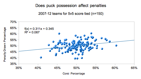
Using data from War-On-Ice.com, I grabbed the penalty and Corsi differentials for all teams for 5v5 score tied minutes. The whole point was to look at whether or not possession plays a role in a team’s penalty differential.
Above we see a weak but real relationship, with about 6.7% of penalty differentials being explained via possession.
From the regression curve, we estimate the average impact difference between a top and bottom possession team is about 11 penalties drawn per a season for 5v5 score-tied minutes. Of course, there is the opportunity to draw penalties for other team strengths and score situations. (The bottom/top difference is using the 40-60 rule)
How Are Players Affected Financially By Buy-Outs?

photocred Wikimedia Commons
I compiled the data for all the players bought out by their teams since the 2005 lock-out (excluding this year’s buy-out class) and examined how much of the the money lost to the buy-out they made back over the years that were bought out. When players are bought-out, they get a portion of their previous contract, and are given an opportunity to re-enter the free agent market. Potentially, they could end up a net winner from the process.
Friday Quick Graph: NHL 5v5 TOI Peak at 24, 25 Years Old
Some of you already know this, but I enjoy distributions, and I think they get sorely under-used in analysis (although, in the end, they are the basis of predictive work). This piece is a bit old (the data is across all skaters, 2007-08 through 2011-12, n = 3,334), but it shows the number of skaters with 200+ minutes of 5v5 time at each age grouping. The peak is clearly at 24 or 25 among this group, but we should be clear with what “peak” means. Although even-strength time can be a pretty good indicator of overall player talent, it’s still a shaky signal (c’mon, we know not all coaches put the “right” guys out there sometimes). Further, powerplay time can sometimes be a drag on better players’ energy for even-strength time, which can also compromise this signal. Nevertheless, if you were to sort all players into even-strength time groupings (say, forwards in 4 groups by ESTOI, and defensemen in 3 groups by ESTOI) you’d see that the top would generally perform better possession and offense-wise than the second, and so on down.
With that in mind, “peak” is also about health. Though we’ve not had much research into it (hint, hint), we have reason to suspect that injuries might drag on possession measures a bit. That said, 24-25 can also be a performance peak for the reason that players are less likely to have major injuries until that age or later.
I plan on digging into this data again (now that I have my ES data back to 1997-98) and splitting into forward and defense groups, but this is a good start.
Friday Quick Graph: How the Possession Battle Stabilizes
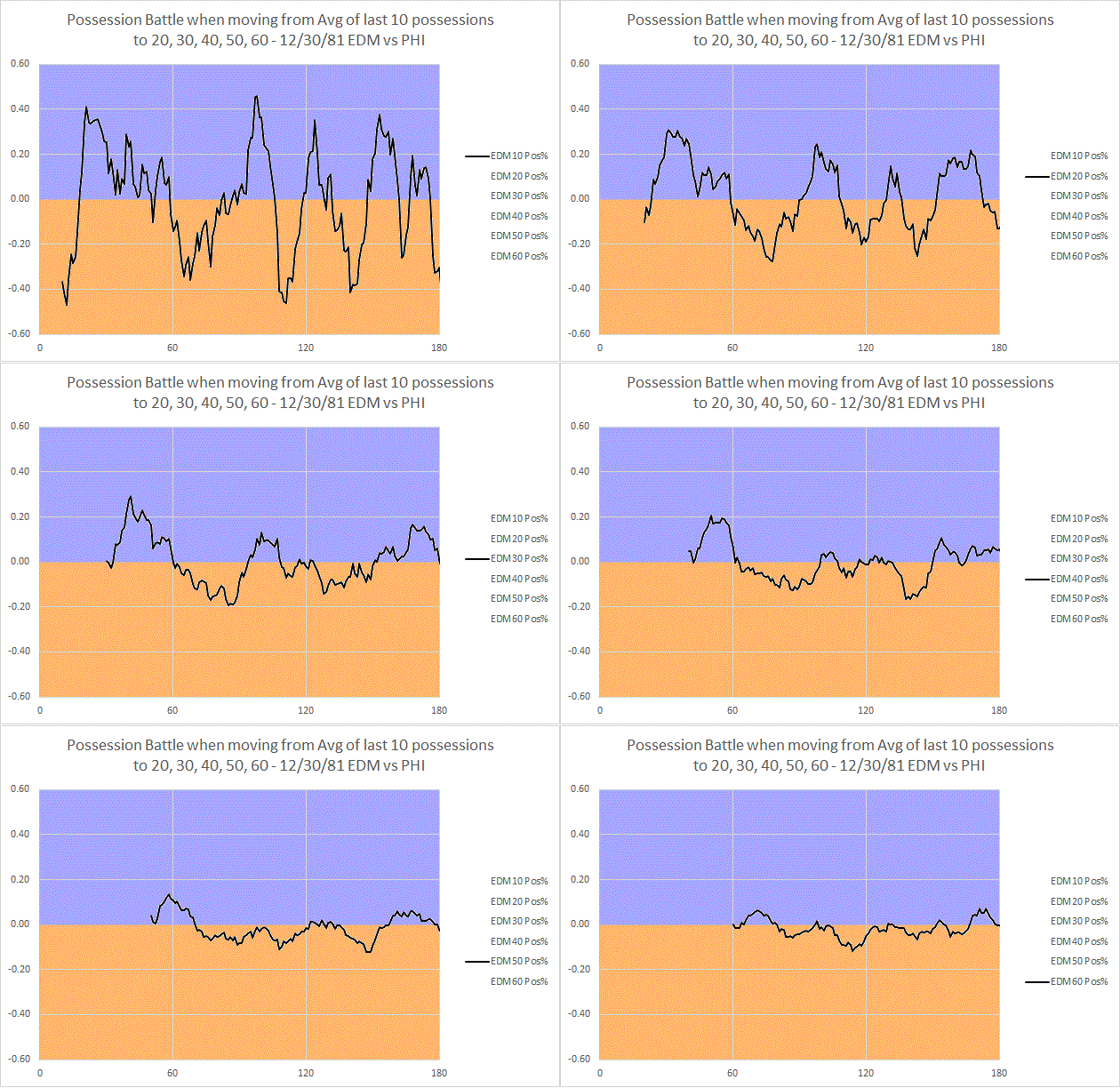
Surely you’ve been exhausted with graphs from this December 30th, 1981 Oilers-Flyers game, but allow me one more. I wanted to demonstrate both how many possessions it took for the possession battle to grant us a clear picture, and also further speak to the value of 2pS%. The chart above demonstrate what happens when I establish a rolling possession-for % (as indicated by the y-axis, possession-for % is done from the perspective of Edmonton) using the last 10 possessions, then the last 20 possessions, and so on to 60 possessions. I stop there because we then arrive at a point where we are primarily measuring (in 60-120 on the x-axis) the 1st and 2nd period in-tandem. What we see is that, by that point, our possession battle has calmed down much closer to something that resembles the final battle (a 52% to 48% victory for Philadelphia). The y-axis shows how far above or below .500 (or 50% possession) the battle went; once again, this was measured from Edmonton’s perspective, so below the line is Philadelphia winning the battle, above is Edmonton (hence the color-coding). We also see, then, that the battle doesn’t calm down to a spread below the 60-40 possession benchmark until 40 possessions…which means it doesn’t really reach the likelihood of truly reflecting demonstrated possession talent until that point. For this reason, I think we can derive confidence in the signal that two-periods provide us with regards to possession battles. Additionally, it speaks to the potential problem with focusing on single periods of data.
Friday Quick Graphs: When did “Score Effects” Emerge in NHL History?
Back in 2009, Tyler Dellow first elaborated on the idea of what we now call “score effects,” or how teams with a lead will go into a “defensive shell” and purposely withdraw from the possession battle to preserve their score. Score effects are the primary reason the go-to possession stat is “Fenwick Close” today – the “close” implies the importance of looking at possession measures when teams still have a reason to engage. The limits of historical shot recording, and the possibility of score effects, are precisely why I’ve advocated the use of 2pS% (shot-differential percentage from the first two periods) as an historical possession measure.
The one thing I never completely took for granted was that score effects had always existed in the NHL. To test this, I broke down each game into individual period shot battles, and looked separately at the correlation* of 1st, 2nd, or 3rd period shots-for percentages to final goals-for percentages. The result above clearly shows that the 3rd period SF% begins to drop away drastically after 1977 or so, after a quarter-century of running pretty close to the others. It does seem possible, then, that the re-introduction of overtime in 1983-84 (gone since 1943-44) had an impact on the growth of score effects (although I’m not sure how); on the other hand, the introduction of the “loser point” in 1999-2000 doesn’t seem to have had any effect. We can also do a similar graph of correlations to goals-for percentage to validate the use of 2pS%:
As you can see, score effects have essentially become the norm, much to the detriment of overall shot differential. At any rate, whomever put two-and-two together back in the 1970s probably had the right idea; I’d forward the hypothesis that the 1970s NHL was ripe for change and innovation (a lot of competition; growth of league = increase in decision-makers and opportunities to exploit market inefficiencies). In that kind of environment, protecting the lead quickly became a best practice, and it steadily grew to a league-wide practice by the mid-1990s or so.
* Or a -1.0 to +1.0 relationship of the variance in one variable to the variance in another; positive means as one goes up, the other tends to go up, suggesting a positive relationship or correlation. A negative correlation suggests that, as one goes up, the other tends to go down. The closer to 0.0, the less likely the variables have any relationship at all.