These days, everyone and their mother is going to tell you to learn to code if you want to jump into sports analytics. And while I’m not going to say “don’t do it,” I am a petty betch who really hates being told what to do (see: my on-going resistance to yoga).
Also, I’m busy, and learning to code is a whole thing that takes time. You are also probably busy, or maybe just starting to dip your toe into sports analytics as a hobby. Maybe you’ve tried learning to code and it just doesn’t make sense to you.
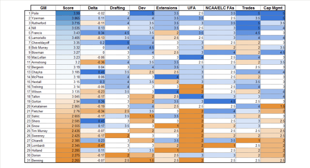
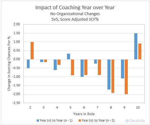
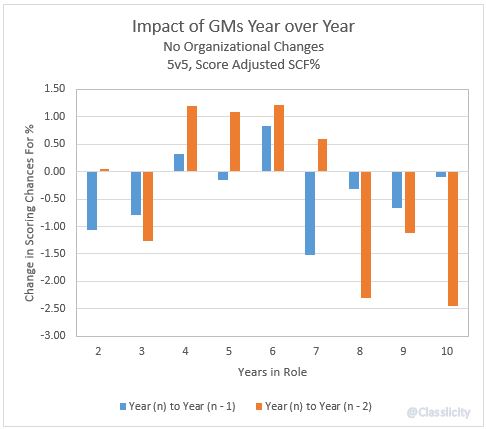
None of that should discourage you from playing around with hockey data and writing up what you find. In fact, there’s a perfectly good tool you can use to visualize most of the basics. Excel!
Excel gets made fun of for many reasons, but what I see most often is cutting comments about its basic visualization tools. To put it nicely, they’re…rough.
But making pleasing, easy-to-understand viz with Excel is possible! I’ve done it! Multiple times!
So, I’ve written down some of my best tips, most of which are applicable when you’re using a more powerful program, too.


