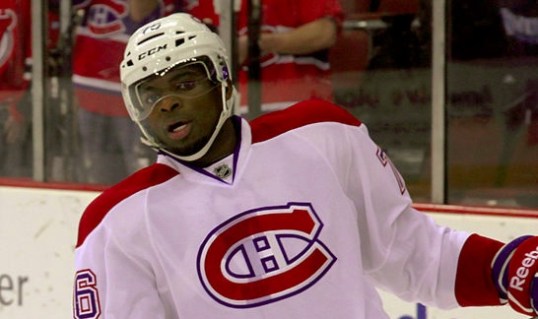
Increasingly in the NHL, the Best Defense is a Good Offense

Photo by Lisa Gansky, via Wikimedia Commons; altered by author

Photo by Lisa Gansky, via Wikimedia Commons; altered by author

While preparing statistics for a few upcoming posts on on-ice contributions, I decided to do a quick study on the share of on-ice shot attempts taken by defensemen versus forwards. The metric I’m using, which is a spin-off of an old one whose name doesn’t quite capture it right, is what I’m calling on-ice shooting proportion, or OSP. The results were quite interesting, and I decided that I should test the data a little further and see what we could find.

Continue reading

Another Shot Quality Quandary: League Variance, Evolution, Error

File:Alberti-Young-Hockey-Players-alb11bw.jpg

Young Hockey Players” by Piotr Alberti, via Wikimedia Commons

Hockey statistical analysis isn’t really capturing all of hockey, or seeking to package it; it’s about getting as close we can to the essence of the thing. All the ideas, conclusions, best practices that we’ve cobbled together over the years give us an approximation of the actions a team, a player, or a fan could make going forward to better grasp the game.

Within this fact lies the greatest bone of contention for the hockey stats crowd, and the frequent refrain of critics who can only chirp from the sidelines. “Have you considered measuring this? Have you considered measuring that? Have you removed the games when the Rangers lacked sufficient compete level? Have you adjusted for Hamburglar’s pre- and post-lifetime gift certificate to McDonald’s?” While some of these adjustments may be worthy, and others utterly ridiculous, “shot quality” has been a persistent critique of the use of all shot attempts.

Admittedly, there are some interesting developments in Ryan Stimson’s work on puck movement, which might shed some light on an area yet explored. Though it’s not necessarily his focus, I think his data can give us an idea of how possession is maintained effectively. The remainder of shot quality, or at least the way it’s being conceptualized, lies in these remaining areas: type of shot, where shot is located on net, screened/tipped/direct/clear-look shot data, shooting talent, and where on the ice the shot is taken from. The former two, according to Gabe Desjardins, didn’t really demonstrate themselves when he came across the data (nor when I asked him a month ago). Shot location has already died a partial death by Desjardins, who found it seems to have minimal impact on save percentage, though he also found a team talent component, to the tune of differences ranging up to 0.7 feet.

Let me put the location stuff to bed the rest of the way.

Continue reading

The NHL Systems Argument: Comparing Bruce Boudreau, Alain Vigneault, & Lindy Ruff

Bruce-Alain Ruff. Looks like the ghost of Gene Hackman. You're welcome for the nightmares.  Composite of images by

“Bruce-Alain Ruff. Looks like the ghost of Gene Hackman. You’re welcome for the nightmares.” Composite of images by “DSCF1837” (Vigneault), Michael Miller (Boudreau), and Arnold C. (Ruff), via Wikimedia Commons*

Systems are without question the most elusive, yet most important, part of our understanding of hockey and the application of analytics. What works and what doesn’t? To what degree can a coach or team apply a strategy?

This led me to think about where we might most convincingly see evidence of a system at work. In the past, we here at HG have had a lot of skepticism about a number of elements of a “system.” For example, Garik’s pieces on competition-matching lines (here and here) and the use of the “defensive shell” to protect a lead, neither of which presented themselves as particularly effective ways of looking at or implementing systems. I have shown in the past that attempts to use extreme deployment in terms of zone starts doesn’t move the needle beyond a 60-40 range of possession, the range of shooting shares for forwards and defensemen haven’t seemed to change much over the last 20-25 years, and a plotting of even-strength shots-for with top and bottom possession teams do not suggest a major difference in shot location.

So where to go from there? Eventually, I decided that we need to get to an extreme enough situation, with robust enough data, where a team might have the best opportunity to dictate a system — in other words, we need to look at the powerplay. The most ideal opportunity for comparison, given the workable data for me, comes from the coaching careers since 2008-09 of Bruce Boudreau, Lindy Ruff, and Alain Vigneault. They all provide at least a couple of seasons with different teams, in addition to a robust set of coaching data from 2008 to the present. Let’s see what we can see…

Continue reading

2015 NHL Stanley Cup 2nd Round Predictions: As Good As SAP

File:SAP Arena.jpg

“85% accuracy, y’all.” Photo by Matthias S., via Wikimedia Commons.

The first round has come and gone, and as we expected before a game had been played, brackets were not going to be fun for everyone. Most people leaning on statistical models saw their brackets chewed up by the vagaries of the playoff sample; SAP, if you’ll remember, hailed their overfit model and its “prediction” of 85% of the past 15 years of playoff series — and proceeded to do no better than a coin flip (they missed all the Eastern teams, and got all the Western matchups). An exception to the #fancystats slaughter was Nicholas Emptage, who went 6-2, which is a good thing if your site is called Puck Prediction. Not even Nicholas was a match for the gut of Steve Simmons, though, who went 8-0 in the first round. It’s the Simmons Hockey League, y’all, and he’s just sliding into our DMs.

But the big question is how our brackets, built on the tried and tested virtues of truculence, size, and experience, fared in this ultimate battle of wits and twits?

Continue reading

Friday Quick Graphs: Total Player Charts, Revived

Bringing back an older concept…a few years ago, I was spurred by Tom Awad’s “Good Player” series to put together these radar charts of player ice-time. I’d always felt, for fantasy hockey purposes, it is important to know the boxcars (goals, assists, points) come from the ice-time as much as anything, and so the initial creation of what I called “Total Player Charts,” or TPCs, was to portray precisely that. It ended up that they gave intriguing portrayals of players that we felt had strong seasons. See Jamie Benn’s above; an Art Ross Trophy, sure, and much of it came from near the top share of playing time at evens and on the powerplay, league-wide. You can also get a sense of just how valuable a defenseman like T.J. Brodie is:

Continue reading

Grantland Features: Knuckles vs. Numbers

Sometimes, I hear questions float around about whether the analytics movement has changed the NHL all that much. I wrote about this a bit in my most recent post, looking at player usage, but there’s more to be said. Thankfully, I had a great opportunity to contribute to a documentary for Grantland and ESPN called “Knuckles vs. Numbers,” which focused on the influence of analytics on the reduction of the role of the enforcer. Including myself, you’ll also see interviews with Sean McIndoe (@DownGoesBrown), Steve Burtch, Paul Bissonnette, Colton Orr, and Brian McGrattan. Check it out, get the word out, it’s worth your time.

Now that you’ve enjoyed that, I have some behind-the-scenes anecdotes and information from the experience that are worth mentioning.
Continue reading

The Pressures of Parity

File:Balanced scale of Justice (blue).svg

Two nights ago, when no one was looking, I tweeted out a telling statistic to understand how teams have reacted to the salary cap post-lockout.

Boulerice wasn’t the only one scraping the bottom of the barrel in 2005-06; Colton Orr was nearby with his 2:49 per game, and you didn’t have to look much further to see Andrew Peters (3:15) and Eric Godard (3:27). In fact, 19 skaters played over 20 games that season and recorded even-strength TOI/G lower than Peluso’s from this year. Teams have realized that, in a salary-capped league, even league-minimum dollars can’t justify players who cannot be trusted with regular minutes.

This was a fairly stark evolution of player usage, but it led me to wonder if there were any other things we could see by looking at finer-grained data from 2005-06 to the present. The salary cap was a game-changer because it pushed teams at the top and bottom closer together, and that compelled teams to stop employing players they couldn’t trust at evens; what are some other areas we see the pressure of parity?

Continue reading

NHL Player Physical Peak Estimation

File:Hockey. Canadiens. Mosdell . Getliffe . Filion BAnQ P48S1P12151.jpg

Probably want to keep that middle guy out for the next shift. Photo by Conrad Poirier, via Wikimedia Commons

Determining NHL player peaks has frequently focused on production and, occasionally, wrinkles are added to account for the steeper fall-off for goal-scoring as opposed to playmaking. Generally, the peak appears to be around the ages 23-25, with some skills like shooting exhibiting fairly early peaks and others a bit later.

Poking around some spreadsheets, I came across data that I’ve always meant to get to: time per shift. The NHL has been keeping a measure of average time per shift for players going back to 1997-98, so I licked my chops over the robust data set. The “Why?” for looking at it, I think, takes us to an interesting place. To some degree, time per shift can allude to a player’s stamina and overall physical fitness; it can also allude to the coaching staff’s assessment of their performance — though there are plenty of shifts ended on the fly in a hockey game. What’s more, we simply haven’t had a lot of player peak estimations using time on-ice, and when done carefully, I think we can capture something like a total physical peak for players.

Continue reading

2015 NHL Stanley Cup 1st Round Predictions: Too Cool For School

Uploaded by "ali", via Wikimedia Commons; altered by author

Uploaded by “ali”, via Wikimedia Commons; altered by author

I don’t like to predict the playoffs, in part because it makes plenty of people look like geniuses that probably aren’t, and makes geniuses look pretty dumb. And really, that’s because the stakes are high but the influence of luck is pretty drastic — not surprising when a team can advance by only winning 4 of 7 (i.e. barely successful enough to make the playoffs in the first place). Lastly, given a flood of predictions and contests in the wake of the Summer of Analytics, nobody who “wins” their predictions is going to look a lot better than the other person who almost “won.” So I’m exercising my right to fart around.

Continue reading

A Tank Battle in Pictures: Toronto Maple Leafs, Edmonton Oilers, Arizona Coyotes, & Buffalo Sabres in 2014-15

Having just added the 2014-15 season to our historical comparison charts, now was a good time to revisit (as I promised in my posts here and here on Pittsburgh’s 1983-84 tank battle) this season’s battle between Arizona, Toronto, Edmonton, and Buffalo. To do this, I tracked the progression of each teams shots-for percentage across two periods (or 2pS%), a possession proxy I developed for historical data that can help us compare teams back to 1952. As you can see above, the perception of the tank battle among these four teams wasn’t quite accurate to their results; Edmonton and Buffalo did not seem to have a marked drop-off in the final quarter-season.

Arizona and Toronto, on the other hand, did noticeably drop, and in Arizona’s case to a level below the hapless Sabres. Ultimately, the fight was more to maintain their improved odds, because Buffalo managed to hold at rock bottom. As I asked when I wrote about the topic with Pittsburgh in mind, it still gives rise to an interesting question: is it more wrong to tank than to maintain a low level all year? In some cases, a team that’s already laid low doesn’t need to tank deliberately…but on the flip side, I suppose that team also assumes risk in losing support and fans by not appearing competitive all season.

How did the Coyotes and Maple Leafs compare to what I’ve christened the “gold standard” for tanks, the 1983-84 Pittsburgh Penguins’ tank for Mario Lemieux? Well, the nice thing is that the plus- and minus-one standard deviations in 2pS% were virtually identical in 1983-84 and 2014-15, so I didn’t have to tinker with them:

While Pittsburgh had probably the starkest, earliest drop-off, both Arizona and Toronto were able to reach the same kinds of lows by the end of the season. To their credit, while the Coyotes and Leafs were, at best, in the lower half of the league in possession, they certainly did their best in the race to the bottom. You could question the wisdom of this kind of thing, since Pittsburgh was guaranteed the top pick if they reached the cellar, while this year’s tanks were struggling for a higher probability.