Friday Quick Graph: How the Possession Battle Stabilizes

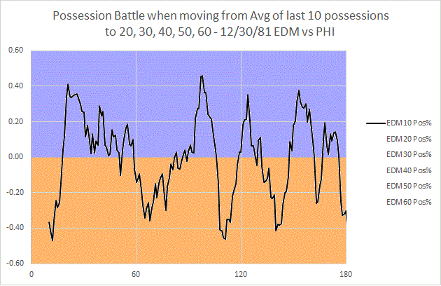
Surely you’ve been exhausted with graphs from this December 30th, 1981 Oilers-Flyers game, but allow me one more. I wanted to demonstrate both how many possessions it took for the possession battle to grant us a clear picture, and also further speak to the value of 2pS%. The chart above demonstrate what happens when I establish a rolling possession-for % (as indicated by the y-axis, possession-for % is done from the perspective of Edmonton) using the last 10 possessions, then the last 20 possessions, and so on to 60 possessions. I stop there because we then arrive at a point where we are primarily measuring (in 60-120 on the x-axis) the 1st and 2nd period in-tandem. What we see is that, by that point, our possession battle has calmed down much closer to something that resembles the final battle (a 52% to 48% victory for Philadelphia). The y-axis shows how far above or below .500 (or 50% possession) the battle went; once again, this was measured from Edmonton’s perspective, so below the line is Philadelphia winning the battle, above is Edmonton (hence the color-coding). We also see, then, that the battle doesn’t calm down to a spread below the 60-40 possession benchmark until 40 possessions…which means it doesn’t really reach the likelihood of truly reflecting demonstrated possession talent until that point. For this reason, I think we can derive confidence in the signal that two-periods provide us with regards to possession battles. Additionally, it speaks to the potential problem with focusing on single periods of data.

NHL Defensemen and Shooting Contributions back to 1967-68

File:Defenseman Ray Bourque 1979.jpg

Photo by Dave Stanley via Wikimedia Commons

I have kicked around this data in the past, most prominently in my theoretical post on offensive systems, but I really wanted to get further into the intricacies of defensemen and their historical place in team shooting (among other offensive contributions). By looking at how much a defenseman contributes to a team’s shot generation (expressed as a percentage of team shots in the games a player played, or %TSh), we can draw some interesting comparisons across NHL eras, but I haven’t yet explored how the role of the defenseman has (or hasn’t) evolved from the Expansion Era to the present, nor have I taken a look at some of the more exceptional defense shooting teams. Let me correct that now.

Continue reading

Wayne Gretzky vs. Bobby Clarke, December 1981: A Micro-Analysis

Image

Left image by “Centpacrr“, Right image by “Hakandahlstrom” via Wikimedia Commons, both altered by author

On December 30th, 1981, Wayne Gretzky’s Edmonton Oilers and Bobby Clarke’s Philadelphia Flyers met in a Wednesday night tilt rich with symbolism. Clarke, 32, was a couple of years away from retirement; two of his three remaining teammates from the Cup years, Reggie Leach and Bill Barber (defenseman Jimmy Watson was the third), were themselves out of the league in two years (Leach due to talent drop-off, Barber due to injury). Ironically, there was little indication in 1981 that this was going to happen – all were around 30, all were near point-per-game scorers playing all minutes. Whatever the case, they were the last of the Broad Street Bullies, and were now mentoring a new generation of “Bullies” like Ken Linseman, Tim Kerr, and Brian Propp, who seemed at times more annoying than dangerous. Though in transition, Philadelphia was still a great possession team (4th in the league in 2pS%, an historical possession metric), but fought the percentages all year to squeak into the playoffs. Edmonton, on the other hand, was romping through the league at record pace, and by December 30th held a comfortable lead over 2nd place Minnesota in the old Campbell Conference. Gretzky, of course, was at the heart of this surge, and by game 39 he had 45 goals.

The 1980s Oilers were the next step in NHL offense, really a Canadian version of the 1970s Soviet style of hockey. They didn’t need to bully their way to victories – they let the other team take the penalties, and skated all over them. I should say, that’s what Edmonton would eventually do; on this night they lined Gretzky up with Dave Lumley and Dave Semenko, as they had done most of the year. More on that later.

As I said before, though, the Flyers were a great possession team, as they always had been when Clarke and Barber were in their prime (they averaged, averaged, 55% 2pS% in the years 1973-74 through 1981-82, placing them consistently among the top 5 in the NHL). They were fast and calculating with their puck movement; the grit was just extra work – and who knows, maybe it contributed to Clarke, Barber, and Leach’s early retirement. The Bully when met with the Oilers, though, learned that the box was the bigger enemy.

Continue reading

Friday Quick Graphs: When did “Score Effects” Emerge in NHL History?

Back in 2009, Tyler Dellow first elaborated on the idea of what we now call “score effects,” or how teams with a lead will go into a “defensive shell” and purposely withdraw from the possession battle to preserve their score. Score effects are the primary reason the go-to possession stat is “Fenwick Close” today – the “close” implies the importance of looking at possession measures when teams still have a reason to engage. The limits of historical shot recording, and the possibility of score effects, are precisely why I’ve advocated the use of 2pS% (shot-differential percentage from the first two periods) as an historical possession measure.

The one thing I never completely took for granted was that score effects had always existed in the NHL. To test this, I broke down each game into individual period shot battles, and looked separately at the correlation* of 1st, 2nd, or 3rd period shots-for percentages to final goals-for percentages. The result above clearly shows that the 3rd period SF% begins to drop away drastically after 1977 or so, after a quarter-century of running pretty close to the others. It does seem possible, then, that the re-introduction of overtime in 1983-84 (gone since 1943-44) had an impact on the growth of score effects (although I’m not sure how); on the other hand, the introduction of the “loser point” in 1999-2000 doesn’t seem to have had any effect. We can also do a similar graph of correlations to goals-for percentage to validate the use of 2pS%:

As you can see, score effects have essentially become the norm, much to the detriment of overall shot differential. At any rate, whomever put two-and-two together back in the 1970s probably had the right idea; I’d forward the hypothesis that the 1970s NHL was ripe for change and innovation (a lot of competition; growth of league = increase in decision-makers and opportunities to exploit market inefficiencies). In that kind of environment, protecting the lead quickly became a best practice, and it steadily grew to a league-wide practice by the mid-1990s or so.

* Or a -1.0 to +1.0 relationship of the variance in one variable to the variance in another; positive means as one goes up, the other tends to go up, suggesting a positive relationship or correlation. A negative correlation suggests that, as one goes up, the other tends to go down. The closer to 0.0, the less likely the variables have any relationship at all.

Why NHL Stats and Scouting Must Work Together

File:2006nhldraft-stage.jpg

Photo by Arnold C, via Wikimedia Commons

I think it’s fair to say that people familiar with hockey scouting and stats analysis know that there is a bit of a rift between the two (not unlike what exists in baseball). The former, as in baseball, has a long history as the standard in hockey analysis, being at-or-near the forefront of drafting, trading, and free agency decisions for teams. The latter is expanding its reach exponentially into league offices, and has many a pro-stats person questioning the abilities of scouts to analyze players (and vice versa). There are at least preliminary attempts to reach out, on the part of Corey Pronman at Hockey Prospectus (and ESPN), but scouting and stats analysis both have a lexicon, methods, and best practices, and devotees of one probably don’t have much time to develop proficiency in the other.

Yet, therein lies a problem and a solution. There is a common thread between these two groups, the desire to usefully analyze hockey players. They each have their own approach, but neither necessarily contain such complicated concepts that they cannot be read by a conscientious analyst. But most importantly, they have something to offer one another that could improve both areas of analysis.
Continue reading

The Top “Young Guns” in NHL History

File:Orr Trip.jpg

Photo by “Djcz” via Wikimedia Commons

I don’t think we engage the idea of the place in history that many of today’s best players hold, and I partly attribute that to the difficulty of finding points of comparison across generations. Simply using raw scoring data doesn’t do the best job because a.) everyone knows Gretzky wins, and b.) we know that scoring fluctuated drastically in the 1980s, and it wasn’t because all the best shooters and passers were playing then. With that in mind, I’ve stewed over ways to bring these different generations together, in such a way that we can be comfortable comparing them. It’s led me to build a couple of metrics that move a little bit away from the counting statistics (G, A, PTS) and towards some metrics that demonstrate a player’s share of their team’s results.

The two metrics I’m focusing on for these young guns both relate to offensive measures, but I think that generally they also allude to a player’s importance to play overall. I tend to agree with Vic Ferrari’s assertion (see his third comment here) that forwards and only a select number of defensemen play much of a role in driving offense, and recalling some of the player types implicated in Steve Burtch’s work over at Pension Plan Puppets on Shut-Down Index, I’d propose that players that drive possession (forwards and defense) more generally will return some signals in regards to shooting or playmaking. Whether that simply means, in the future, we’ll get more from simply looking at passes and shots (or robots will do the whole darn thing and save me the trouble), I can’t say. For now, though, I created %TSh, or percentage of team shots, which expresses the proportion of team shooting a player does (in games they played), and %TA, which does the same exercise with team assists. While the issue of whether this expresses positive possession players is ripe for debate, it’s indisputable that players strong in these metrics will be drivers of offense for their teams.

In that spirit, I wanted to delve into some nifty historical data; I’ve been able to go all the way back to 1967-68 with data on %TSh and %TA, and it returns some fascinating studies on NHL legends vis-à-vis today’s stars. For this piece, I’m focusing on the players that get everyone excited, so-called “young guns,” or players under 25 that have already demonstrated their ability at the top level. How do contemporary young guns measure up all-time?

Continue reading

Friday Quick Graphs: Shooting and Playmaking Contributions, 1967-68 through 2012-13

I’ve just finished a pretty massive dataset, so I’m geeking out a bit over what I can do with it. Just the beginning, above…this is the distribution of %TSh (player shots divided by estimated team shots in games they played) and %TA (same equation, but with assists) season performances, 20+ GP, from 1967-68 through 2012-13. Per recent arguments about Ovechkin, I’ve added lines showing where his best season (2008-09) and most recent full season (2012-13) fall on the list; his current season would fall approximately in the same place as last season.

Those of you who’ve been following me on Twitter know that I’ve put together a pretty substantial dataset, and I’ve been working through the data with a metric I’ve used for a while. %TSh is a player’s shots divided by his team’s estimated shot total in games they played (Team Shots / Team GP, multiplied by player GP). The measure gives us an idea of the player’s shooting contribution to the team’s offense. It moves outside the pesky variance of shooting percentage and gets closer to a stable indicator of offensive role. I’ve done the same with %TA, which is the same equation for assists. The reason for estimated team totals is we don’t yet have good macro-data on specific games that players played before 1987-88, but the metric runs essentially in lock-step with the real thing and I want to provide a useful, historical point of comparison. Doing this allows us to look 20 years further back.

The distribution above includes over 23,000 player seasons over 20 GP; the orange distribution is %TA, and black is %TSh. I used the marks to connect back to the previous week’s bizarre flame war over Ovechkin’s value and approach to the game; the top one shows Ovechkin’s peak year, 2008-09 (20%), which also happens to be the highest %TSh of all-time. The bottom mark is Ovechkin’s 2012-13 (16.3%), which I’m using because his current season is just slightly higher – it would be good for 16th best in NHL history.

I also did a second graph, wanting to look at the relationship of %TSh to %TA, to see just how much they ran together:

Related to the previous post, I decided to see if the relationship between TSh% and %TA was too close to tell me anything. %TSh is on the x-axis, and %TA is on the y. As you can see, they do run together, which is okay, because rebounds can result in assists for the shooter, and players with a lot of shots will generally be engaged in the offense in all ways. That being said, it’s not so close that they aren’t distinctive. The plot above does look scattered enough for these two metrics to tell us something apart from one another.

In the graph above, the x-axis is %TSh, and the y-axis %TA. Intuitively, these run together a fair amount, as shots create rebounds that can be counted as assists, and a player that shoots a lot is likely to be more heavily involved in the entire offense. That said, they don’t run nearly so close together as to render either measure moot. I think %TA can be a valuable counter-weight for assessing defensemen. Anyway, this is the tip of an enormous iceberg of data, so don’t be surprised to see me refer to and use %TSh and %TA again.

Outperforming PDO: Mirages and Oases in the NHL

Above is the progressive stabilization (game-by-game, cumulatively) of all-situations PDO over time for the 30 NHL teams. It’s a demonstration of the pull of PDO towards the average (1000, or the addition of team SV% and shooting percentage with decimals removed), and it gives you a sense of the end game: an actual spread of PDO, from roughly 975 to roughly 1025. In other words, if you were just to use this data, you could probably conclude that it’s not outside expectations for a team to outperform 1000 by about 25 (or 2.5%) on either side.

That’s all well and good, but PDO is a breakdown of two very different things, a team’s shooting and goaltending, two variables that understandably have very little to do with each other (they are slightly related because rink counting bias usually affects both). Shooting percentage can hinge on a number of contextual variables, though its reliance on a team’s player population usually can bring it a bit in-line with league averages. Save percentage, on the other hand, hinges on one player, and what’s more past performances suggest that a single goaltender can quite significantly outperform expectations. In this piece, I want to jump into the sliding variables of PDO, and what we can expect from teams, but first I want to begin with why I’m working with all-situations PDO.

Continue reading

Why The Hockey News’ Ken Campbell is Wrong About Alex Ovechkin

File:Defense.gov photo essay 080220-F-6684S-642.jpg

Photo by Adam M. Stump via Wikimedia Commons

You know, there was a time when I relished The Hockey News, and really any hockey writing I could get my hands on. I grew up in the sticks in Wisconsin, where you can’t find jack about hockey, and so to convince your parents to buy a THN magazine was a real treat. I’ve never forgotten that feeling, and I want those old reporting institutions to continue, but it isn’t going to happen with haphazard attempts at analysis like Ken Campbell’s piece on Ovechkin from today. In it, he tries to argue that Ovechkin is going to have the worst 50-goal season in NHL history because his plus-minus isn’t good. After the jump, let’s take a look at some of these gems.

Continue reading

Friday Quick Graph: Season Stories Using % of Team Shots, Gretzky, Lemieux, Sheppard, and Simpson in 1987-88

This takes the progressive, cumulative percentage of team shots from the graphs below and compares them to one another (to view the original charts: Simpson, Sheppard, Lemieux, Gretzky). It really establishes how greatly Lemieux mattered to the Penguins…Gretzky had plenty of teammates taking over the shots, especially as he was dinged up during the season and players like Messier and Kurri were helping carry the load (not to mention Simpson and his 43 goals in 59 games). Any surprise Lemieux was one season away from 85 goals and nearly 200 points? Any surprise Simpson was already coming down from what would prove to be a career year? Any surprise that Sheppard was moving towards a quality career? These %TSh charts can really lend to interesting seasonal and career narratives.

Part of the reason I like doing graph work is because a good graph (with a little bit of contextual knowledge) can tell a really interesting story. In the past, I’ve been a proponent of digging deeper into the historical data, and noted that even though we have less data of the pre-BTN era it doesn’t mean we can’t make some intriguing graphs. %TSh, or % of team shots (in the games a player participated), provides a great opportunity to do just that, not just in a player’s career (as I’ve done before) but also over the course of a season. In the graph above, I took two well-known players, Mario Lemieux and Wayne Gretzky, and matched them to two (to the younger readers) lesser-known players from 1987-88, Ray Sheppard and Craig Simpson; I expressed their %TSh cumulatively, game-by-game. Craig Simpson, at the tender age of 20, was having the best year of his career (56 goals on an incredible 31.6% shooting percentage), but a trade to the Oilers mid-season would alter his offensive role for that season and into the future. Ray Sheppard, like Simpson very young (21), over the course of the season earned Ted Sator’s trust and responded with a 38-goal rookie season. Sheppard would go on to be a very good offensive player for about a decade.

Yet their lines relative to Gretzky and Lemieux also remind us that, for as good as they were, neither were driving the boat to the level of those legends (and probably wouldn’t). So you do get some perspective on what some of the best-of-the-best were doing. Lemieux, who was entering his prime, was literally carrying a middling Penguins team on his shoulders, and his ability to do that would bring him, in 1988-89, to convince people that Dan Quinn and Rob Brown were really good.

For frame of reference, in the BTN Era (2007-08 to present) only Ovechkin has been able to come close to the kind of shot volume Lemieux was demonstrating in 1987-88.