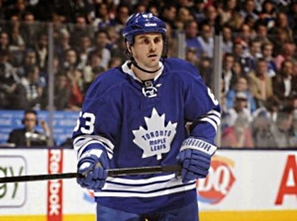
2014-15 Season Preview: The Atlantic Division

Image from Sarah Connors via Wikimedia Commons

Finishing last season with an average of 87.6 points per team, the Atlantic/Flortheast Division was the worst in the NHL. I see that gap widening, not narrowing, in 2014-15.

The battle at the top of the division will, in my eyes, come down to two teams: the Boston Bruins and the Tampa Bay Lightning. The Bruins have placed either first or second in their division (the Atlantic or the former Northeast) in each of the past four seasons. The 2nd place Lightning finished a full 16 points behind the Bruins in 2013-14, but a strong off-season combined with a full season of Steven Stamkos and rookie Jonathan Drouin potentially making an impact has them near even money with the Bruins.

Continue reading

Is it time to appoint a new jester?

Toronto -with its high profile in the media combined with some questionable management- has consistently been the brunt of jokes over blogs, message boards and twitter from other fanbases.

Recently the Toronto Maple Leafs has made a bunch of savvy, low-risk, high-potential steps both in management and player personnel to improve their team. While they are still a distance away from being a contending team, the steps taken are not those that the online hockey community has grown to love about Toronto.

With this knowledge and the offseason nearly in our rearview mirror, it is time for Hockey-Graphs to ask its analytically inclined following:

All teams in poll came from an unofficial nomination survey I conducted on twitter.

Revisiting the NHL Regression Predictions from January 1st

Photo by “User:Zucc63” via Wikimedia Commons, modified by author

If you’ll remember, one of the inaugural posts here was a regression prediction piece, using a combination of PDO and Fenwick Close to see who might improve or decline over the latter half of the season. I decided to put together a table of the teams I predicted would negatively or positively regress, just using the aforementioned data:

If you’ll remember, I pegged Anaheim, Colorado, Montreal, Phoenix, Toronto, and Washington for negative regression, and Florida and New Jersey for positive regression. So, even with really rudimentary predictors, this season I was able to be fairly successful building predictions from a half-season sample for the remaining season. In previous years, the fancy stats folks usually picked the much more obvious targets (Toronto being the big one this year), but it’s very possible to go further if you wanted.

Outperforming PDO: Mirages and Oases in the NHL

Above is the progressive stabilization (game-by-game, cumulatively) of all-situations PDO over time for the 30 NHL teams. It’s a demonstration of the pull of PDO towards the average (1000, or the addition of team SV% and shooting percentage with decimals removed), and it gives you a sense of the end game: an actual spread of PDO, from roughly 975 to roughly 1025. In other words, if you were just to use this data, you could probably conclude that it’s not outside expectations for a team to outperform 1000 by about 25 (or 2.5%) on either side.

That’s all well and good, but PDO is a breakdown of two very different things, a team’s shooting and goaltending, two variables that understandably have very little to do with each other (they are slightly related because rink counting bias usually affects both). Shooting percentage can hinge on a number of contextual variables, though its reliance on a team’s player population usually can bring it a bit in-line with league averages. Save percentage, on the other hand, hinges on one player, and what’s more past performances suggest that a single goaltender can quite significantly outperform expectations. In this piece, I want to jump into the sliding variables of PDO, and what we can expect from teams, but first I want to begin with why I’m working with all-situations PDO.

Continue reading

Friday Quick Graph: Possessing the Puck in 1969, 1981, and 2013

Hextall OnIce.jpg

Photo by Jim Tyron, via Wikimedia Commons

Just finished tracking possession times in a November 15th, 1969 game between the Flyers and the Leafs. This game, when compared to the games from this post, fits virtually in-between them, which is interesting because, unlike with the other two games, the Flyers and Leafs were two teams on the lower end of the spectrum in the league (8th and 9th in 2pS% in a 12-team NHL). Maybe that also contributes to their average possession time of 6.08 sec (n=349) compared to the 1981 game’s 6.15 (n=364) and 2013 game’s 6.17 (n=360). Another observation among these games: the standard deviation for the 1969 and 1981 games is right around 4 seconds, where it’s right at 5 seconds for the 2013 game. I’ll save any deeper ruminations until I have a larger sample, but it’s food for thought.

Not too long ago, I decided I wanted to try out tracking time of possession in historical games, with the hope of eventually having enough data to look into things. I realized it’s going to be a little difficult to get large enough samples of singular teams, but I also realized that we could potentially compare the game as a whole in different eras. I’ve always been of the mind that the game has evolved somewhat, but at its core there are a number of best practices that have kept it pretty much the same game from around the time that the red line was introduced in 1943. I wanted to test that as far back as I could go, though, so with this possession tracking I actually tracked each individual possession rather than just a total time of possession. For this chart, I displayed all those individual possessions as a distribution, longest possessions to the shortest. These three games, the Philadelphia Flyers vs. Toronto Maple Leafs in 1969 (Toronto won 4-2), Edmonton Oilers vs. Philadelphia Flyers in 1981 (Edmonton won 7-5), and Los Angeles Kings vs. St. Louis Blues (St. Louis won 4-2), had some surprising results when compared. As you can see above, the distribution is actually quite close, with the 1981 game seeming to have shorter possessions but then moving above the others in the middle of the line. The 1969 game actually seems like a trendline of the 2013 and 1981 games. The average possession time? 1969: 6.08 seconds, 1981: 6.15 seconds, and 2013: 6.17 seconds. Obviously, I need (and want) more data, but it is a really intriguing start.

The “possession battle” results?

All Situations Possession

  • PHI (47.1%) vs. TOR (52.9%), 1969
  • EDM (53.4%) vs. PHI (46.6%), 1981
  • LAK (51.7%) vs. STL (48.3%), 2013

Possession, Score Close

  • PHI (41.3%) vs. TOR (58.7%)
  • EDM (48.7%) vs. PHI (51.3%)
  • LAK (51.2%) vs. STL (48.8%)

Friday Quick Graphs: Toronto Maple Leafs, Chicago Blackhawks, Edmonton Oilers, and Boston Bruins Shot Distributions, 5 Years

What you see above are the even-strength shots-for locations for the near-indisputable top team of the last five seasons (Chicago Blackhawks) versus the near-indisputable worst team of the last five seasons. This is a sort of visual anti-shot quality argument, a demonstration of why, across these five seasons, the indisputable #1 team would shoot 9.9% while the indisputable #30 team would shoot 9.6%. Notice the horseshoe design, about where defensemen normally sit, then jump up into the play. Notice the dense cluster around the high slot. All teams make these plays, try to make them, the difference being some are better at possessing and moving the puck to make the shot. What’s the primary difference above? The amount of shots.

None of the above charting is possible without Greg Sinclair’s awesome site, Super Shot Search. Bookmark it, use it, love it.

Oh, hey, what if I was to look at the teams with the best and worst save percentage these last five years? Would they look different in even-strength shots-against? Well, let’s see, Toronto and Boston:

There is a difference here, I think. I mean, the initial difference are the numbers, Boston’s SV% (92.1%) versus Toronto’s (89.5%). Another difference is it seems the two charts maintain roughly the same shot distributions, but flip ends of the rink. Not much to dwell on there. One thing I will say, that could relate to the SV% discrepancy, is that it doesn’t appear that Toronto records many, if any, shots from right along the boards. Now, I don’t know if this is a recorder’s error or not; it seems to me it’s pretty hard to get a shot from right tight along the boards. Maybe one recorder does it based on where the body of the skater was located, I don’t know. Or…Toronto does allow shooters to come in a little tighter, and Boston owns the center ice a bit better. Could that explain a near-3% discrepancy? I don’t think so; we know Toronto’s had worse goaltending. But it might’ve “helped.”

Should the Winnipeg Jets Hold On to Paul Maurice?

Photo by “Krazytea” via Wikimedia Commons
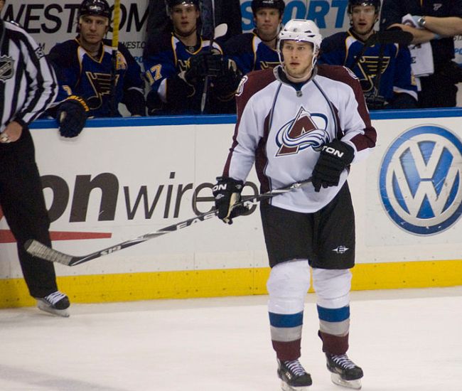
Mark Chipman, Kevin Cheveldayoff, & Co. took a huge step yesterday, firing their first choice in the new Winnipeg Jets coaching history, Claude Noel. Noel has the unfortunate (no, scratch that, earned) legacy of mediocre results, questionable lineup decisions, and the uncanny ability to look like nothing’s going on while standing in a tire fire. Whatever the case, the Jets decided to turn away from the new-coach idea towards a very-seasoned veteran in Paul Maurice. With 1,137 NHL games of coaching experience, and one trip to the Cup Finals (with Carolna in 2002), Maurice is definitely a smart choice if a team’s trying to find itself and build up from the relocation identity.

It’s also significant that Maurice has already endured the relocation process. First breaking into the league at the helm of the Hartford Whalers, he helped that team build up from a series of dismal years and a move from Hartford to North Carolina. Though he’d be fired before he could enjoy the ultimate prize of those efforts (the ‘Canes would win the Cup the year after he left), there is little doubt he has the experience for those that prize that sort of thing.

But that leaves a few hanging questions: is he a good coach? Can he make this a better team? Is there any way we can find answers to those questions?

We can, and we will.

Continue reading

Crystal Blue Regression: Leafs, Avalanche, Ducks, Among the Most Likely to Regress in 2014

Image

Picture taken by Sarah Connors, posted to Flickr – via Wikimedia Commons

With the Winter Classic coming up, or should I say the Winter Classics since the NHL handles marketing success like the kid who found the cookie jar, we also ring in the rough middle of the season. It’s a time for reflection, maybe a chance to re-assess your decisions, lifestyles; and if you’re analyzing the NHL, it’s the perfect time to recognize trends that may or may not continue. Also known as “regression,” here I’m dealing with a concept everyone understands to a degree; you invoke it when you see a friend sink a half-court shot in basketball and say, “Yeah, bet you can’t do that again.” The trend, supported by a history of not making half-court shots, suggests that it is unlikely for your friend to sink the half-court shot, even if they recently made one. In the NHL, possession stats like Corsi are considered better predictors of future success than stats that can be influenced more greatly by luck, like goals (and, consequently, wins), shooting percentage, or save percentage. Much like your friend and their half-court shot, there are teams that are defying their odds (established by possession measures) to succeed, which can easily happen with less than a half-year of performance.

Continue reading