Making Better Hockey Graphs

Visualization seems pretty easy, so it’s often left as an afterthought. But visuals can be an immensely effective—or destructive—form of communication. To that end, many, if not most, people fail to tap into its power because of they make prominent mistakes. (Sorry for the ego blow, homies.).

But that need not be the case. Although visualization is a process, not a result, once you know what to look for, you can easily cut down on those big mistakes and make graphs that—while not perfect—will be consistently good.

Here are a few things to keep in mind for hockey bloggers, adapted from Andy Kirk as well as Dieter Rams’ 10 principles of good design.

For our purposes, they can be summed up as “think about your readers while recognizing your practical limitations.”

Continue reading

Sportlogiq, Passing, and Playmaking

Embed from Getty Images

Last, week, two pieces were posted that talked about a player’s “playmaking” ability. I put it in quotes because it’s a term that gets tossed around a lot and sometimes isn’t defined by those using it. For example, in this piece from Andrew Berkshire (using data from SportLogiq), it is never clearly defined despite being in the title of the piece. Passes are categorized based on direction (north, south, east-west), zone (offensive zone, neutral zone), or some other qualifiers (to the slot, off the rush), but nowhere are they tied to shots. Passes are charted based on “successful pass volume” per twenty minutes. One can assume these are pass completions per twenty minutes. However, with hundreds of passes completed each game, many of them are simply woven into the noise of the game. We’re interested in what leads to events, specifically exits, entries, shots, and goals. Berkshire includes exit and entry passes, so at least those are present. Nevertheless, despite zero detail on what matters most – creating shots for teammates – Berkshire concludes that “we may be witnessing the beginning of the best playmaker of the next generation of NHL stars in Barkov.”

The other piece I referred to was this by Travis Yost on Joe Thornton. He clearly explains what he means by playmaker”: “To me, a playmaker in the NHL is the guy who routinely creates opportunity for his linemates.” Thornton is without a doubt a 1st ballot Hall-of-Famer and one of the best setup men in the league. It’s only natural to think of the man that once made Jonathan Cheechoo lead the league in goals as one of the greatest playmakers we’ve seen over the last decade. Yost’s definition of creating opportunities for teammates is one I would agree with.

If only there was a publicly available set of data that including passing and shot assist numbers for Barkov and Thornton. Oh, wait… All data is at 5v5 because no one cares about special teams except for Arik Parnass.

Continue reading

Redefining Shot Quality: One Pass at a Time

Shot quality has been a topic of late on hockey twitter and various sites. Only a few weeks ago, the Hockey-Graphs Hockey Talk  was centered around this topic. Shot quality is a lightning rod and much of the talking at or past one another that people often do stems from a single issue: there is no agreed-upon definition of what people mean when they say “shot quality.” Well, I like what our own Nick Mercadante had to say on the subject:

Establishing a base, repeatable skill that accounts for pre-shot movement and an increased likelihood of a goal being scored are what we need to properly analyze player contributions. Quantifying passing also gives us another actionable piece of data that everyone understands and coaches can use as well. Often, the simplest metric or method is the best. And, we should able to do that now that we’ve obtained a significant set of data. This chart may look familiar, but it’s essential to understanding how important passing is to goal-scoring. This is from all tracked passing sequences from the six teams (Chicago Blackhawks, Florida Panthers, New Jersey Devils, New York Islanders, New York Rangers, and Washington Capitals) that we tracked last season.

SH%Sequence

From this point on, I want you to forget whatever it is you think of when you hear the term, “shot quality.”

Continue reading

Special Teams Analytics in the 21st Century

BestPPPredPlot1

Despite them accounting for approximately 20 percent of NHL game time, special teams have been largely ignored when it comes to analytics. Considering the data available and its small sample size compared to even-strength, that is somewhat understandable, and there have certainly been attempts to properly quantify and assess power plays. So what do we know so far? Continue reading

Practical Concerns: Meatballs & The Art Of Deployment

dep

Last week, I dug up some old stats and posed this question to our Twitter followers and to a few people I know working in pro hockey.

Some interesting lessons were learned.

Information Underload

Marc Bergevin once said that it is difficult for fans to fully understand the decision-making process of NHL general managers and coaches because they don’t have access to all the information.

Most people I’ve talked to with at least a working knowledge of analytics were able to give very sensible suggestions on which three defense pairings to form given the available players, despite having no idea of who these players are and with only their 5vs5 With or Without You possession stats at their disposal.

Continue reading

Analyzing the Neutral Zone (and beyond!): A Call for Volunteers.

Over here at Hockey-Graphs, I’ve been taking a look at Neutral Zone Tracking and what the results of such tracking can tell us about the modern game of Hockey. My last post, for example, looked at what such tracking told us about play in the offensive, defensive, and neutral zones, and to what extent was performance in each of those zones skill or randomness at the team and individual levels. Before next season begins, I have two more posts planned: one doing further research into repeatability of various neutral zone metrics and another looking at how score effects affect neutral zone play.

The biggest weapon I’ve been using recently to do such research has been Corey Sznajder’s (aka @ShutdownLine) All Three Zones Project (the genesis of which can be found HERE).   Through Corey’s work, we have a nearly complete dataset with Neutral Zone Data for the 2013-14 season, for EVERY team in the league.  The dataset also includes to a lesser extent zone exit and zone entry defense data.  Even more, Corey is actually really close to finally finishing the tracking this summer and we’ll have a complete data set very soon.  This is an incredible resource for new hockey knowledge, and it’s available for anyone , as long as you make a $15 contribution to Corey’s GoFundMe Page, which can be found here.   I think this is an incredibly worthwhile use of funds if you can afford it, and many people have indeed actually already given.

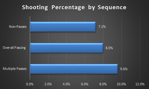
What many people haven’t done is actually taken the data and DONE anything with it.  Again, this data set was released about a year ago now, and yet very few individuals have been doing work with it at all.  This is a bit of a disappointment.  If you include the passing tracking project of Ryan Stimson (Data available here, here, and here), we now have two large datasets filled with information that could help us better understand the game of hockey.

So what I’m asking is this for volunteers to try and actually try and do some work with the data.  There are a lot of questions we can try to answer!

For example, one question someone posed to me on twitter is:

What really is the risk of a D-Man attempting to jump up through the neutral zone and carry the puck-in?  

Now we can’t answer that question fully from the data – a D Man who tries to carry the puck through the NZ and turns the puck over at the red line is making a bad play that our data can’t capture – but we can take a shot by looking at the effects on shots against of carry-ins and carry-in failures by defensemen.  And this is just one question that we can possibly look at.

Please email me at my email address (garik16 AT Gmail) if you’re interested in looking at the data, or leave comments here in the comment section.  Alternatively, if you have other questions you might like answered, please leave them in the comments as well.  Together we can hopefully learn a lot more about the game of hockey.

We are all human

Hey everyone.

A bit of a change of pace for Hockey-Graphs, here is a bit of an informal blog post. There are two separate things I want to address.

First thing:

I made a mistake.

Long ago on an article about Corsi and context, I made an error with moving the data from one spreadsheet into another. Everything in the specific article was actually correct. However, I had linked to a summarized data table on Google docs though that had some erroneous data on it.

The Google doc had summarized the average goal differentials for sets of players given their position in the depth charts and their Corsi%. What had happened is I accidentally copied 2nd line and 3rd line forwards in both their appropriate place and where 2nd and 3rd pair defenders should go. The online document has since been corrected and can be viewed here.

I made another mistake though in building an article off of that Google document. This article used the previous data in creating a quick model to estimate the goal impact difference between two players with differing Corsi percentages. The image has since been corrected.

I want to always be clear of my methods and my intentions, so this is why I wanted to post this to you.

Second thing:

Far smaller detail, the Hockey-Graphs podcast will be postponed until probably Friday. Rhys and I were not able to find a time convenient to both of us in order to record a session until then.

Sorry.
Until next time and thank you for reading and supporting our work.