Using Data to Inform Shorthanded Neutral Zone Decisions

The following is data is all at 4-on-5 with both goalies in their nets. A special thanks to Evolving Hockey for data and their scraper.

In March of 2019, Mike Pfeil coined the term “powerkill” at the Seattle Hockey Analytics Conference. It was much more of a small excerpt from his whole presentation, but it seemed to motivate Meghan Hall and Alison Lukan. In the coming months, Lukan would write about how the Columbus Blue Jackets utilized an aggressive approach in their penalty killing system, while Hall would present at RITSAC and OTTHAC before they finally came together to present at the Columbus Blue Jackets Hockey Analytics Conference in February.

Looking to continue researching this phenomenon, I set out to answer a few questions I had. In order to give shots some added context beyond what the NHL’s public data supplies, throughout the last few months, I tracked shot assists and where possessions leading to shots had started. As a side benefit, I was also able to filter out shots that didn’t appear to exist, were recorded incorrectly, or where the possession started at 4-on-4.

In 2016, Matt Cane developed a metric to approximate penalty kill aggressiveness by combining penalty kill controlled and failed entries for, and dividing them by the entries a penalty kill faces from their opponent. The theory behind that being that penalty kills that attempt to control more entries into the offensive zone are inherently more aggressive. Hall and Lukan also found that a penalty kill’s rate of controlled entries has a strong correlation to the rate at which they take shots.

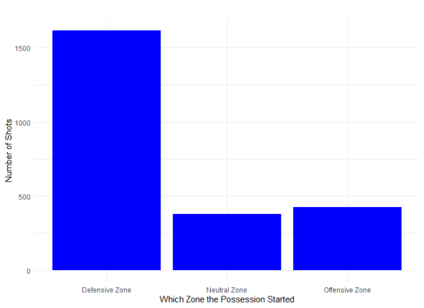
Part of the reason these two stats have such a strong correlation is that the vast majority of shots require a zone entry. Not including rebound shots, 82% of 4v5 shots stemmed from possessions starting outside of the offensive zone over the course of the 2019-20 season.

zones

Continue reading

The Launch of the Tape to Tape Project

Earlier this year, Rushil Ram, Mike Gallimore, and Prashanth Iyer launched Tape to Tape, an online tracking system that can be used to record locations of shot assists, zone exits, and zone entries. Rushil and I will be running the Tape to Tape Project in order to compile a database of these statistics with the application Rushil created. We have already had close to 30 trackers sign up from an announcement on Twitter last week.


https://twitter.com/TheShawnFerris/status/979105120129601537

Each individual will track zone exits, zone entries, and shot assists for games they sign up for. Once the games are complete, the data will be exported to a public Dropbox folder. The goal with this project is to enhance our understanding of these microstats as they pertain to coaching decisions, player performance, and wins. What follows next is a description of what we will be tracking, a brief summary of the research that describes why these specific microstats are important, and how we will be tracking these events.

Continue reading

An Introduction to NWHL Game Score

In July of 2016, Dom Luszczyszyn released a metric called Game Score.  Based on the baseball stat created by Bill James (and ported to basketball by John Hollinger) the objective of game score is to measure single game player productivity.

While it’s often easy to compare players across larger sample sizes, comparing two different players’ performance on a given night can be difficult. If player A has a goal, two shots, and took a penalty, did that player outperform player B who had two assists and one shot? Game score attempts to answer that question by weighting each of the actions of each player to give us a single number representing their overall performance in that game.

Unlike Dom, whose main goal was to create a better way to evaluate single game performance, mine was to create a better statistic to evaluate the total contributions of players. There are no advanced metrics, like Corsi For percentage, or even Goals For percentage, available at this time in the NWHL. Because of this, points are the best way to evaluate players, even though other box score stats are available.

Continue reading

Stop Worrying About Shot Parity

There has been a lot of talk about parity in the NHL lately. Specifically shot attempt parity. The dispersity of corsi for percentage is more centralized this season than any season in the past decade, and people have

https://twitter.com/JeffVeillette/status/856909962680954882

This visualization is hard to read, but if we graph the standard deviations of corsi, expected goals (Corsica), and goals, we can get a pretty good idea of the movement towards or away from parity.

Parity Continue reading

Attention: Scouts Wanted

Here at Hockey Graphs, we can be a little bit intimidating to some scouts, with our differences in approach.

Although our new additions will increase the amount of video analysis we have on this site, this is mostly an analytics site. Even though most, if not all of us, believe both stats and scouting can and should be combined to make decisions, we primarily focus on one aspect: the stats.

For players playing in juniors and in Europe, there is almost no data available besides simple box score stats like points and shots. Although we can form solid models on the little information we have available, we still need to blend in scouting. Scouts can evaluate a player’s skating, stick handling, shooting, positioning, among other things that are inputs into future production and strong advanced stats. The information obtained by scouts is vital to the drafting and signing process in order to fill in those blanks.

The goal for any person who applies math or science to sports management is to decrease human error. Scouts, like everyone, have many biases which need to be accounted for, and it is close to impossible to adjust for them. Even when people are made aware of their bias, they cannot overcome it. So it is alright to be a scout that tends to notice tall players first, we just need to find a way to adjust for that in order to get the fairest assessment.

Continue reading

Friday Quick Graphs: Navigating the Trade Deadline’s Hype

This year’s trade deadline was uneventful. March 1st was filled with a bunch of small trades that we probably made a bigger deal out of than we should have. However, just a little over two weeks have gone by and people are already looking for a winner. As a follower of analytics, it would be unfair of me to decide less than ten games in who won the deadline. Mainstream media gets a ton of clicks for those posts though, so let’s evaluate them.

A post from Sportsnet found that the last trade of the deadline held the most value. The Bruins traded a 6th round pick to the Jets for Drew Stafford. Stafford has had the worst season of his career. His -3.38 rel CF% is by far the worst of his career, his all situations 1.74 points per 60 is below career average, and he has suffered from the second lowest shooting percentage of his career. The question is: where is the value in Drew Stafford?

Continue reading