
In my last post, I based some work on The Numbers Game by Chris Anderson and David Sally. It was a fun book about analytics in soccer even though I do not have much of a background in soccer. There was one other section of the book I found particularly applicable to hockey. They created a few charts on the expected number of points a team gets depending on how many goals they score in that game. I went through every regular season game from 2007 – 2016 to produce the below version for the NHL:
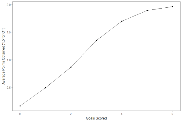
I included only regulation goals and counted games that went to overtime as 1.5 points for each team. (The discussion of skill in OT and shootouts is too involved for this post, so I treat it as pure chance.) There’s nothing shocking here, but it’s interesting to walk through the results:
- A team that scores 0 goals actually has an expected point total a little above 0 (0.16) because while it is unlikely, they could get to overtime 0-0 and potentially even get 2 points
- Teams that score 3 goals typically win or at least get to overtime
- Once a team scores 5 goals, they are very likely to win, and only a few teams have scored 6 and not walked away with a win
We can also look at the marginal points of each goal. This is basically measuring how much the line goes up from point to point in order to measure ‘how many more expected points does each goal provide’. This gives us a rough sense of a goal’s importance.
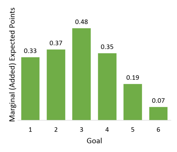
The first, second, and fourth goals are all worth about a third of a point. The third goal is the most valuable; it’s worth about half a point. The fifth and sixth goals are helpful but do not add nearly as much value as the ones before them, since the game is probably already won.
Finally, we can do a quick check to see when the value of each goal might change. Let’s take a look at the results split by season and by home/away:
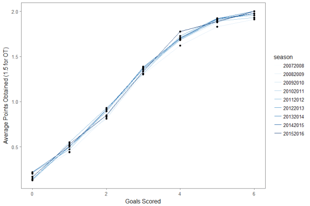
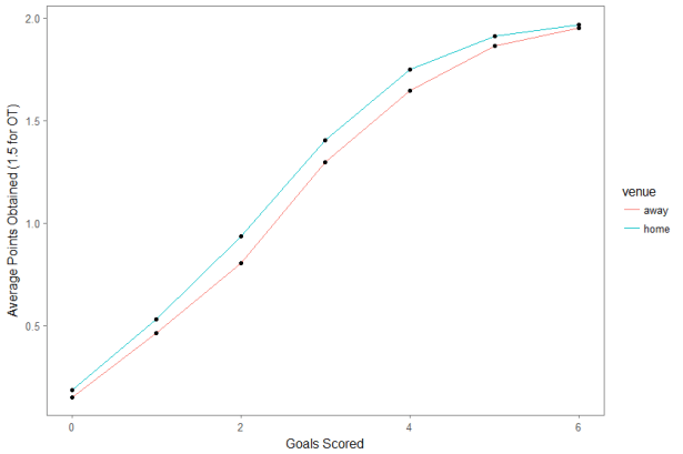
If you squint, you can convince yourself that goals have become more valuable over the past few years (a result of scoring trending down), but it’s pretty minor. The home vs. away chart is more fun, as it shows that goals by home teams are consistently worth more points than goals by away teams. This is an interesting result of the well-known home-ice advantage: the opponents of home teams (away teams) tend to score less, the home team has a higher expected point total for any number of goals.
The data used in this post is from Corsica, which you can support here. The code used to make these graphs is available here.
