Building a Shot-Plotting App in Shiny

For me at least, hand tracking is 99% of the time born out of necessity. 

The only way I am ever going to get location data for shots is if I break out a multicoloured pen and write down all the locations and numbers myself. Its isn’t however exactly the quickest process to deal with.

I actually really enjoy hand tracking is the thing, It keeps me focused on the game at hand and stops my mind from wandering. The issue comes when it’s time to digitise that information for analysis. I have written about this before over at The Ice Garden, back when I tracked an entire season of the Australian Womens Hockey League. That season it took me around an hour of straight work to plug in every piece of information so that tableau could process it and as my life got busier, the amount of free time I could dedicate got less and less. 

The idea to force a shiny app to do something it has no right to do came out of necessity. Partially because I wanted to be able to show heat maps to the Head Coach of the local team I work with during intermission, but mostly because my Masters project consists of getting school kids ages 11+ involved in sports analytics and I really wanted them to be able to produce their own heat maps and yet I really did not want to attempt to explain the complexities of Kernel Density Charts to a collection of 12-year-olds.

So here we are. 

The Hockey Plotter 1.1

Continue reading

Chatter Charts – Visualizing Real-Time Fan Reactions

Today, I’ll explain the methodology behind Chatter Charts and show you how I use statistics, R and Python to analyze hockey from a completely unexplored angle: your point of view.

I. Introducing Chatter Charts

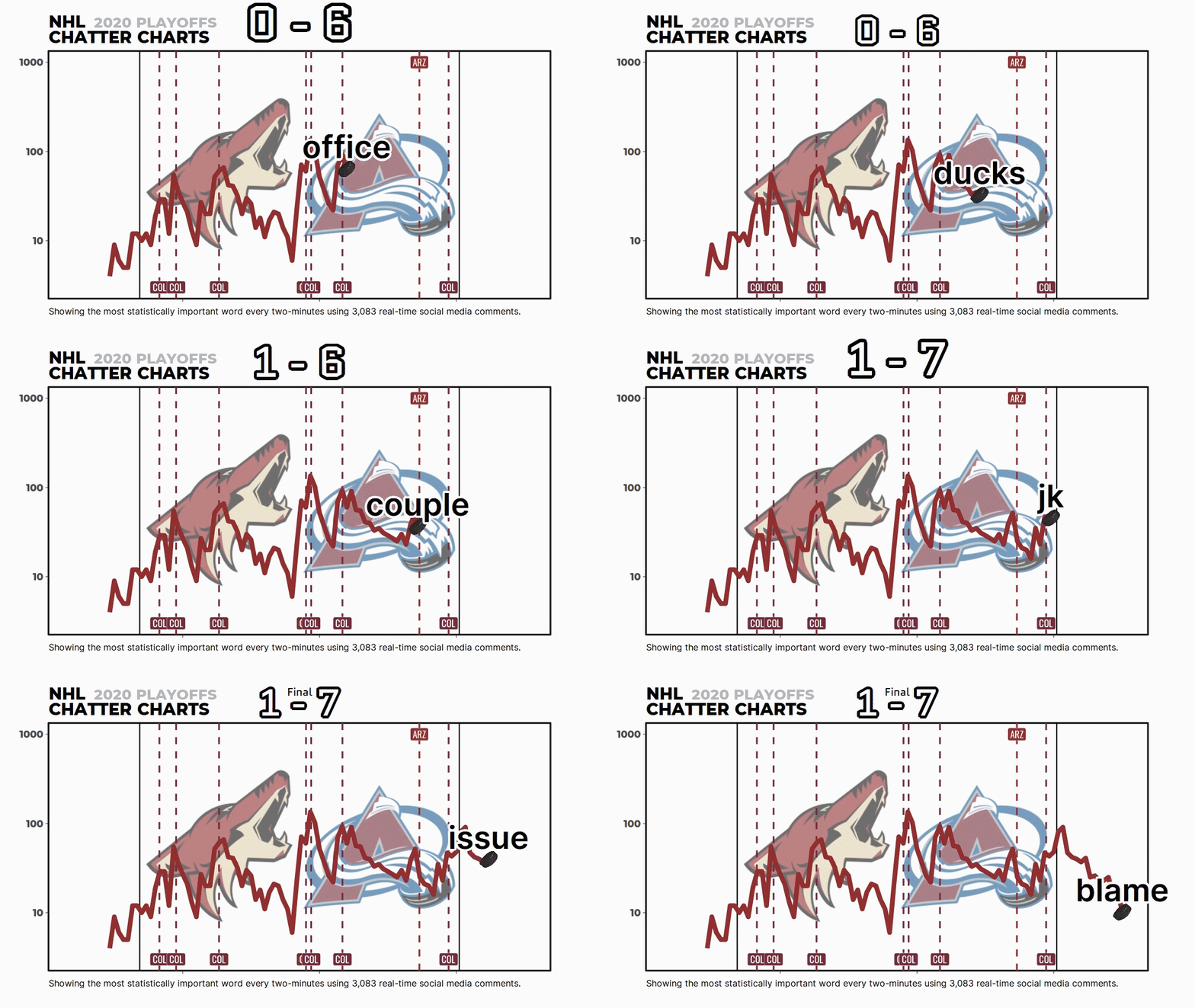
Chatter Charts is a sports visualization that mixes statistics with social media data. And unlike most charts, it is specifically designed to thrive on social media; it is presented in video and filled with volatility, humour, and relatable moments.

It assumes a game is like a linear story—filled with peaks and troughs—except every story is written by fan comments on social media. It actually tries to recreate the emotional roller coaster fans tend to experience when watching sports.

Image for post

But most people don’t know about the math and code behind Chatter Charts. It isn’t just me picking words I think are funny or a simple word count—it uses a topic modeling technique called TF-IDF to statistically rank them.

I want to go through that with you today.

Continue reading

Data Viz in Excel – Tips & Tricks

These days, everyone and their mother is going to tell you to learn to code if you want to jump into sports analytics. And while I’m not going to say “don’t do it,” I am a petty betch who really hates being told what to do (see: my on-going resistance to yoga).

Also, I’m busy, and learning to code is a whole thing that takes time. You are also probably busy, or maybe just starting to dip your toe into sports analytics as a hobby. Maybe you’ve tried learning to code and it just doesn’t make sense to you.

None of that should discourage you from playing around with hockey data and writing up what you find. In fact, there’s a perfectly good tool you can use to visualize most of the basics. Excel!

Excel gets made fun of for many reasons, but what I see most often is cutting comments about its basic visualization tools. To put it nicely, they’re…rough.

But making pleasing, easy-to-understand viz with Excel is possible! I’ve done it! Multiple times!

So, I’ve written down some of my best tips, most of which are applicable when you’re using a more powerful program, too.

1) Know what you want to show and why you want to show it. 

Continue reading

Practical Concerns: Analytics Resolutions For 2016

arena021_crop.JPG

Just a few hours into 2016, I had already received an email from a colleague in NCAA Division I hockey program, asking for my feedback on a specific area of analytics.  It goes to show that those who enjoy thinking the game never stop doing it, even on days when they should be giving themselves a little time off.

Since everyone is making New Years’ Resolutions, allow me to share the two things I will be working on this year:

Continue reading

Practical Concerns: Can Accuracy Be Coached?

CWZCY3zXIAAhKPi

A few weeks ago, I was playing in a weekly beer league hockey game with some McGill University staff members. At one point, I came down the left wing with the puck, looked off a defender and whipped a wrist shot high, far side.

However, instead of the puck going bar-down as I had (ambitiously) hoped, it caromed off the glass and went all the way around the rink for an odd-man rush against. When I got back to the bench, someone said something to the effect of: “Stop missing high and wide. You’re just helping the other team break out of their zone.”

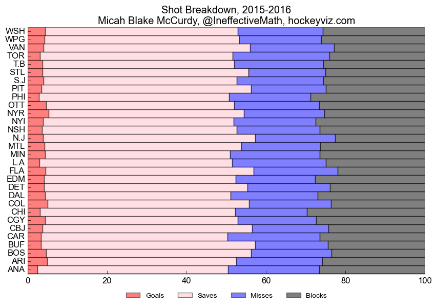
It was a light-hearted chirp – we weren’t playing for the Stanley Cup, after all. But it got me thinking about coaches who yell up and down the hall when their teams don’t “put the puck on net.” Is it really something that some teams do better than others?

A few days ago, our friend Micah Blake McCurdy did some work in an effort to answer that question. He took a look at the proportion of goals/shots on net/missed shots/blocked shots for each NHL in the past two seasons. Here is what he found: Continue reading

Why I’m Supporting Micah Blake McCurdy’s Work at Hockey Viz

//platform.twitter.com/widgets.js

A couple days ago, Micah Blake McCurdy made his first step towards The Great Unknown. It’s a decision hanging on a number of questions we always ask ourselves in the analytics community: What is my work worth to me? What is my work worth to others? For as much time as my spend on it, how can I make sure my work means something, and my time rewarded? How do I make sure my work stays exactly that: mine?

For the past decade, a number of powerful minds have navigated The Great Unknown, finding that apprehensive teams were only willing to commit peanuts and, on rare occasions, real salaried work after a partnership of a couple years. What made The Great Unknown even more of a mystery was the disappearance of sites, and data, and “stats” groups peddling other people’s work (usually in poor or incorrect fashion), and the discovery by some stats analysts that teams had been tracking data in ways that were curious, tedious, unhelpful. When the so-called Summer of Analytics occurred, The Great Unknown had the curtain pulled back a little bit: we started knowing who was getting hired where. But that peek exposed the still-immense uncertainty of the work available with some teams, and opened a new area of intrigue: analytics writing.

So why is what Micah is doing so important?

Continue reading