
Today, I’ll explain the methodology behind Chatter Charts and show you how I use statistics, R and Python to analyze hockey from a completely unexplored angle: your point of view.
I. Introducing Chatter Charts
Chatter Charts is a sports visualization that mixes statistics with social media data. And unlike most charts, it is specifically designed to thrive on social media; it is presented in video and filled with volatility, humour, and relatable moments.
It assumes a game is like a linear story—filled with peaks and troughs—except every story is written by fan comments on social media. It actually tries to recreate the emotional roller coaster fans tend to experience when watching sports.
But most people don’t know about the math and code behind Chatter Charts. It isn’t just me picking words I think are funny or a simple word count—it uses a topic modeling technique called TF-IDF to statistically rank them.
I want to go through that with you today.
Understanding TF-IDF
For stats nerds, TF-IDF calculates the relative word count in an interval—Term Frequency—and weights it based on how often that word appears throughout the entire game—Inverse-Document Frequency.
To put it simply, if a word appears many times in an interval, TF, and rarely anywhere else, IDF, that word will receive a high ranking, TF-IDF.
The two data frames below show how TF-IDF excels at finding relevant words compared to raw counts.
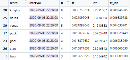
TF-IDF does two things well: i) punishing common words such as “the,” and ii) allowing modifying words to outperform their subjects where “hooking” or “dive” are able to outrank “penalty.”
This is also why cuss words like “f**k” are rare sightings—they are commonly used throughout the entire game. IDF punishes this. People often ask me why the chart isn’t only swearing, now you can understand why.
Meanwhile, words like “blood” will receive a high rank because it requires certain in-game events to occur for blood to be mentioned.
Here’s a glimpse at Chatter Charts’ final data frame. It’s a bit easier to see the math from TF-IDF at work.
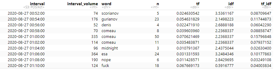
Let’s examine row one with “scorianov.”
TF = 0.0246 since 2.4% of words in the interval were scorianov
IDF = 3.536, signifying a rare word because scorianov is only said when Gurianov scores
TF-IDF = TF multiplied by IDF
With that explained, you can see how TF-IDF excels at prioritizing topical terms. And sports games are full of them.
This is why TF-IDF is the statistical methodology behind every Chatter Chart word. You can read more about TF-IDF from its Wikipedia page.
II. Getting Quality Hockey Comments
The challenge for every data science problem is finding quality data.
For Chatter Charts to work, I combine two sources where fans gather to talk about sports during the game: Reddit Game Threads and Twitter hashtags.
Reddit Game Threads
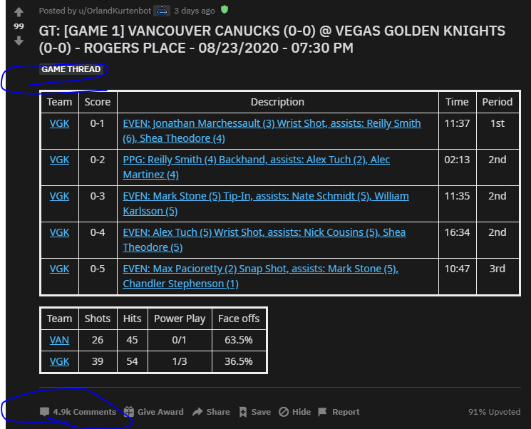
A game thread is a time-gated forum where subreddit members can talk about a live game. Every sports team has their own subreddit. Some are larger than others, but members here are obviously hardcore fans.
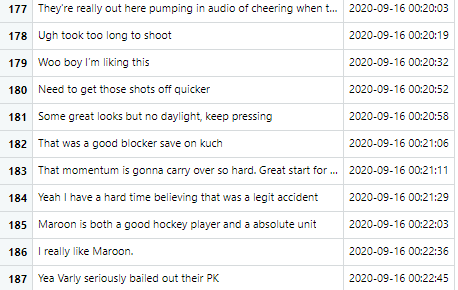
There is no shortage of collective reactions to events—like r/Canucks’ “WIN DA TURD” second intermission chant. They can be quite crass.
For Reddit, I scrape all game thread comments and their timestamps using Python’s {PRAW} package. All you need is the thread’s URL.
import pandas as pd
import praw

### WEB APP = replace with <your own info>
reddit = praw.Reddit(client_id=<client_id_reddit>,
                     client_secret=<client_secret_reddit>,
                     user_agent=<user_agent_reddit>)

### URL
submission = reddit.submission(url=<reddit_url>)

### EMPTY DICTIONARY
topics_dict = {"body":[], "created":[]}

### SCRAPE THREAD
submission.comments.replace_more(limit=None)

#### APPEND COMMENT ELEMENTS INTO DICTIONARY
for comment in submission.comments.list():
  topics_dict["body"].append(comment.body)
  topics_dict["created"].append(comment.created)

### CONVERT TO DATA FRAME
topics_data = pd.DataFrame(topics_dict)
Note: You’ll need to create a Reddit Web app to use {PRAW}.
Twitter Accounts, Hashtags, and Keywords

Twitter has a large professional presence. Pundits, fan blogs, and beat reporters share their game insights here.
To find quality team-related tweets, I leverage a few techniques.
First, I store a list of team-specific keywords, accounts, and hashtags to search each game. For example, these are the terms I use to find Toronto Maple Leafs tweets:
@MapleLeafs, #TMLTalk, #LeafsForever, #GoLeafsGo, #MapleLeafs, #LeafsNation, #leafs, leafs, TML
Second, I search a game-specific hashtag like #TORvsDAL. I can’t hard-code these, so I write a dynamic line of code to create it every game.
Lastly, I have a VIP list of Twitter accounts for each team. This is comprised of accounts who tweet a lot about their team, but might not use keywords or hashtags all the time. I scrape their timelines directly and add it into the data.
To build a VIP list, I search team hashtags for active tweeters in the community and simply ask them to nominate the other fan accounts they enjoy following.

Twitter data collection is possible thanks to the R package {rtweet}’s search_tweets() & get_timelines() functions.
library(tidyverse) # for basic manipulation
library(rtweet) # for twitter queries

tweet_keywords <- "@MapleLeafs OR #TMLTalk OR #LeafsForever, #GoLeafsGo OR #MapleLeafs OR #LeafsNation OR #leafs OR leafs OR TML"

### QUERY
tweet_df <- search_tweets(tweet_keywords,
                          type = "recent",
                          include_rts = FALSE,
                          retryonratelimit = TRUE,
                          token = twitter_token) %>%
  select(screen_name, status_id, created_at, text)

vip_df <- get_timelines(vip_list,
                       n = 50,
                       token = twitter_token) %>%
  select(screen_name, status_id, created_at, text)

twitter_df <- tweet_df %>%
  full_join(vip_df) %>%
  group_by(text) %>%
  filter(row_number() == 1) %>% # remove duplicate entries
  ungroup() %>%
  mutate(created_at = with_tz(created_at, tzone = "America/New_York"))
Note: You’ll need a Twitter developer account to get access to API calls and make requests using {rtweet}.
Together, these sources net me a few thousand comments. I like to have at least 5,000.
III. Creating the Charts
I started this project only focusing on the Toronto Maple Leafs so I had many variables hard-coded into my workflow. But as I scaled out, I needed to make it more robust.
An Efficient Workflow
Below, is my current command center. When I fill out all these variables, I can produce an animated Chatter Chart in R.
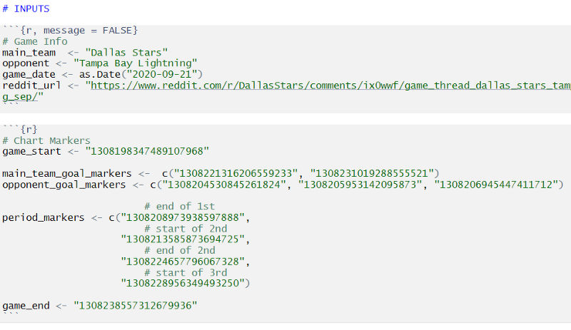
In the first chunk, team-specific data is pulled using the main_team and opponent variables.
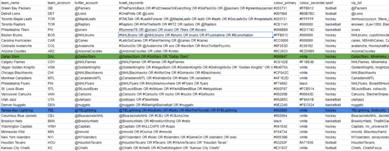
My script consults a team_metadata.csv which pulls team colours, social media info, and my VIP list—think of this as a static database, where team_name acts as a primary key.
Essentially, I need to enter four inputs in the first chunk to get all my team metadata and social media comments.
Now if you look at the second chunk of my workflow, you’ll see lots of numbers. These numbers correspond to Twitter URLs.
- https://twitter.com/<account>/status/1300474445925167104
I have to manually go to the team’s official Twitter account to copy them. Then my script uses those numbers, also known as the status_id , to look up a tweet and grab its timestamp.
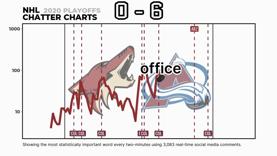
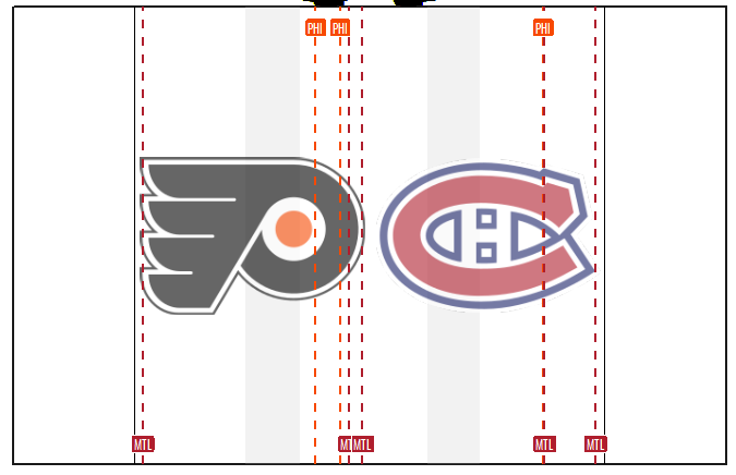
It sorts these timestamps accordingly and plots them in the correct position. Right now, I grab game start/end, intermission start/end, and goals for each team. You can see all these markers are assigned a different appearance in the image below.
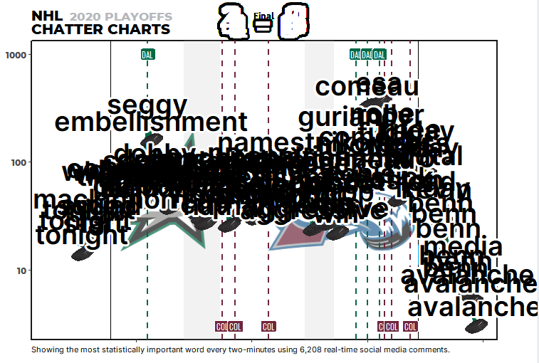
Adding all my additional features and styling, the Chatter Chart looks like the image below before its animation:
Animating the Plot
However, the R package that does the animating is {gganimate}. I use the transition_reveal() function because it calculates the distance between two points and creates filler frames. By assigning this to the interval column, I can build dynamic features into the chart.
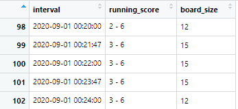
For instance, my scoreboard grows whenever someone scores. And it works similarly to markers in Adobe After Effects. When transition_reveal hits an interval, it will update the other columns.
Here, when the score changes the board size will be increased to 15 for a few intervals, then return back to 12.
And yeah, check out the code. It’s only a single line to add animation along with a few arguments about how to render the video.
animated_plot <- base_plot +
  transition_reveal(interval) # animate over interval

animate(plot = animated_plot,
        fps = 25, duration = 35,
        height = 608, width = 1080,
        units = 'px', type = "cairo", res = 144,
        renderer = av_renderer("file-name.mp4"))
Thanks & Stay Tuned for More
I hope this provides a better grasp on what’s going on behind the scenes of a Chatter Chart.
As of now, it takes me 30 minutes to create a single Chatter Chart. That is filling out the inputs, scraping the data, QA checks, and video rendering. It’s about 15 minutes of manual labour. I’m always looking to improve it.
Of course, I invite you to join the Chatter Charts community either on Twitter or r/ChatterCharts. I do lots of ad-hoc work and have a promising new visualization called SNAPSHOT you should check out.
Lastly, if you want to collaborate with me—content creation, articles, or podcasts—email: chattercharts@gmail.com. I’ll see what I can do.
