
Today, I’ll explain the methodology behind Chatter Charts and show you how I use statistics, R and Python to analyze hockey from a completely unexplored angle: your point of view.
I. Introducing Chatter Charts
Chatter Charts is a sports visualization that mixes statistics with social media data. And unlike most charts, it is specifically designed to thrive on social media; it is presented in video and filled with volatility, humour, and relatable moments.
It assumes a game is like a linear story—filled with peaks and troughs—except every story is written by fan comments on social media. It actually tries to recreate the emotional roller coaster fans tend to experience when watching sports.
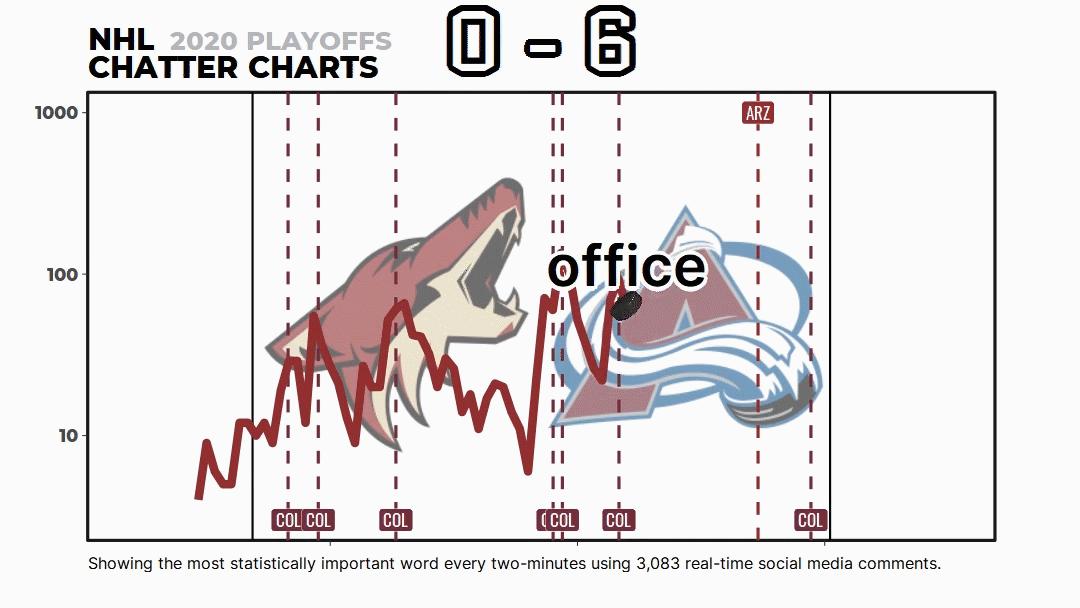
But most people don’t know about the math and code behind Chatter Charts. It isn’t just me picking words I think are funny or a simple word count—it uses a topic modeling technique called TF-IDF to statistically rank them.
I want to go through that with you today.
