
These days, everyone and their mother is going to tell you to learn to code if you want to jump into sports analytics. And while I’m not going to say “don’t do it,” I am a petty betch who really hates being told what to do (see: my on-going resistance to yoga).
Also, I’m busy, and learning to code is a whole thing that takes time. You are also probably busy, or maybe just starting to dip your toe into sports analytics as a hobby. Maybe you’ve tried learning to code and it just doesn’t make sense to you.
None of that should discourage you from playing around with hockey data and writing up what you find. In fact, there’s a perfectly good tool you can use to visualize most of the basics. Excel!
Excel gets made fun of for many reasons, but what I see most often is cutting comments about its basic visualization tools. To put it nicely, they’re…rough.
But making pleasing, easy-to-understand viz with Excel is possible! I’ve done it! Multiple times!
So, I’ve written down some of my best tips, most of which are applicable when you’re using a more powerful program, too.
1) Know what you want to show and why you want to show it.
This should help you pick the kind of chart you are attempting to make. Excel isn’t a particularly great tool to show more than two or three variables. In general, you’ll be using Bar Graphs or Scatter Plots. While Pie Charts and Radars are available, they should be used sparingly, as they’re often a case of “good intentions gone bad.”
“What you want to show and why” is the key to ensuring that your viz, whether crafted in Excel or something fancier like ggplot or Python, is clearly understood. Until you can articulate that to yourself, don’t make a viz.
TIP: Most of the time, we’ll have way more data than we need. It can be very tempting to throw everything you know into a single chart, but remember, the more elements you have, the less likely people are to understand why you made the chart in the first place. For example:

Chart created by Petbugs, who edited this article and recommended its inclusion.
This chart has a ton of information on it. But it also means that it’s hard to understand what the point is. If Petbugs wanted to make a point about how teams perform trailing by 2, the chart should only focus on that data. With all of the score states on here, it’s difficult to read, and requires even more elements (trendlines, r-squared values) for any point to come across.
2) Only have a single aesthetic focus.
This is a general design element thing, not Excel specific, but is particularly important to remember when working in a basic viz-making tool. Excel likes to make everything a bright color, especially on bar graphs, and that is confusing to the eye.
If you look carefully, you’ll notice the default text color on Excel charts isn’t black; it’s a dark grey. This is because text is generally less important, visually, than what’s going on in the graph. If you’re adding things like standard deviations or other guidelines, use them sparingly and in light colors/fonts/line-weights.
TIP: Play with the opacity settings of your colors! Not only is this a great way to de-emphasize less important information, but it also means text or other visual elements are still visible underneath that design element.
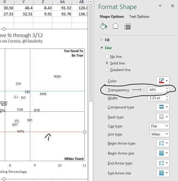
Opacity can also be a fun “hack” for adding more information to a graph. To create the gradient effect for these “in-between” TOI players, I simply duplicated the data point in the yellow column into the red column. The overlapping dots were now orange! *jazz hands*
TIP 2: Consider yourself aesthetically challenged? Pull a color palette from classic art! Try to have high contrast between the two opposite ends of your color spectrum.
You can also pull from the ol’ standby: the color wheel! Typically most “good/bad” color schemes go blue vs red (not green vs red, which is a color-blind trap), but if you’re just trying to illustrate a difference, and not a “moral” dichotomy, maybe purple vs mustard is the way to go.
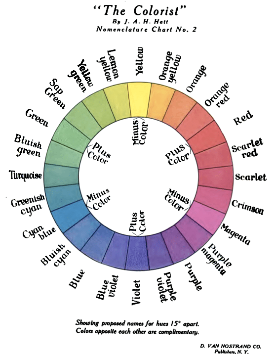
J. Arthur H. Hatt – The Colorist (Public Domain)
3) Stop expecting the graphing function to do all the work.
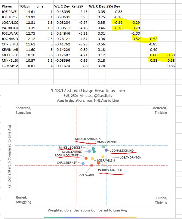
Much of the reason that people malign Excel is because it can’t handle all of what you can do with a piece of custom programming. And that’s very true! The graphing function doesn’t deal well with multiple variables, and as mentioned, isn’t aesthetically pleasing at its default. But working around its limitations just means using the other tools Excel already has, like the “shape tool” to add extra lines or boxes.
I forget where I heard it, but a woman who worked for 538 gave a talk on how they create their viz: they mostly use R, but they put their finishing details on in Photoshop!
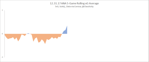
TIP: Sometimes, this means manipulating your data table to get the visual impact you desire. See the difference between these two charts?
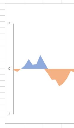

Without adding a “line break” when I switched from a negative value to a positive one, my two areas overlapped. By adding the line break (after all the values have been tabulated) I’m not making any meaningful changes to the data, only making it easier to understand.

TIP 2: Abuse the “Group” function! It was specifically created to keep many separate parts (such as a line, a box, and text) all in their same respective places as you manipulate the data. You can even group two separate graphs, like in this viz:
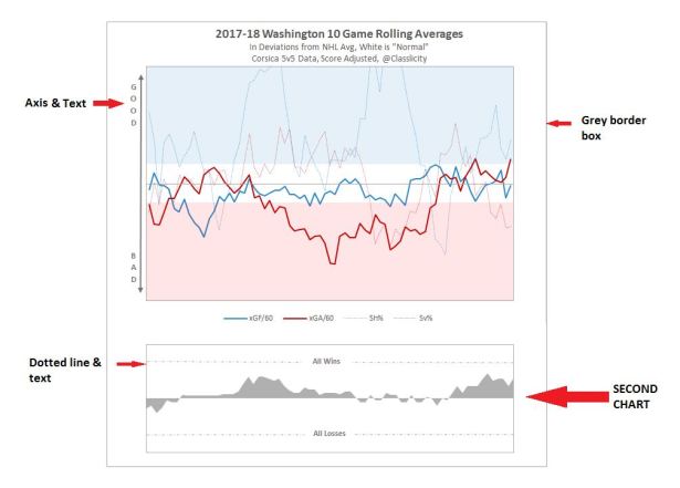
4) Don’t be afraid of negative space.
Often the white space around your information tells as much of a story as the data itself. There are several generic rules that can help you get comfortable with white space such as “set your axes at 0,0 when applicable” but also there are a few Excel-specific things you should know.
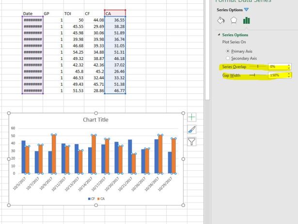
TIP: You can change the area between bars or groups of bars! This helps communicate whether the variables should be analyzed as part of a whole (close together), or individually (spread apart).

TIP 2: Axes are often optional! Unless you have a clear need for numbers, giving exact values can make people miss the bigger picture. This is especially true for things expressed in Standard Deviations. Outside the range of ‘normal’, more good vs more bad is generally better understood visually than numerically. Consider getting rid of extra visual clutter by paring down or removing unnecessary axes & labels.
5) Get feedback.
Not sure if you’re actually showing what you want to show with your chart? Ask a friend! Ideally, ask a friend who has no idea what you’re working on. Remember, the goal of a viz isn’t to be pretty, it’s to communicate clearly. Aesthetics help, but all flash and no substance is the opposite of what you want.
Frustrated that Excel isn’t doing what you want it to do? Ask a friend! Ideally, ask a friend who knows Excel. But if you’re scared of looking uncool to your R-using mates, just google it. Trust me, Excel users are still out there documenting what they do.
