
Intro
In the last post, we introduced a new expected goals (xG) model. It incorporates pre-shot movement, which made it more accurate than existing public xG models when predicting which shots would be goals. However, we use xG models for far more than looking at individual shots. By aggregating expected goals at the player and team level, we can get a better sense of how each of them performs.
Teams
First, let’s look at each team. By adding up the 5v5 expected goals for and against each team, we can see each team’s total performance. This combines both how many shots the team gets and how dangerous those shots are. Note that all of the values here are 5v5 and not score adjusted. Here is the xG% ranking in those games:
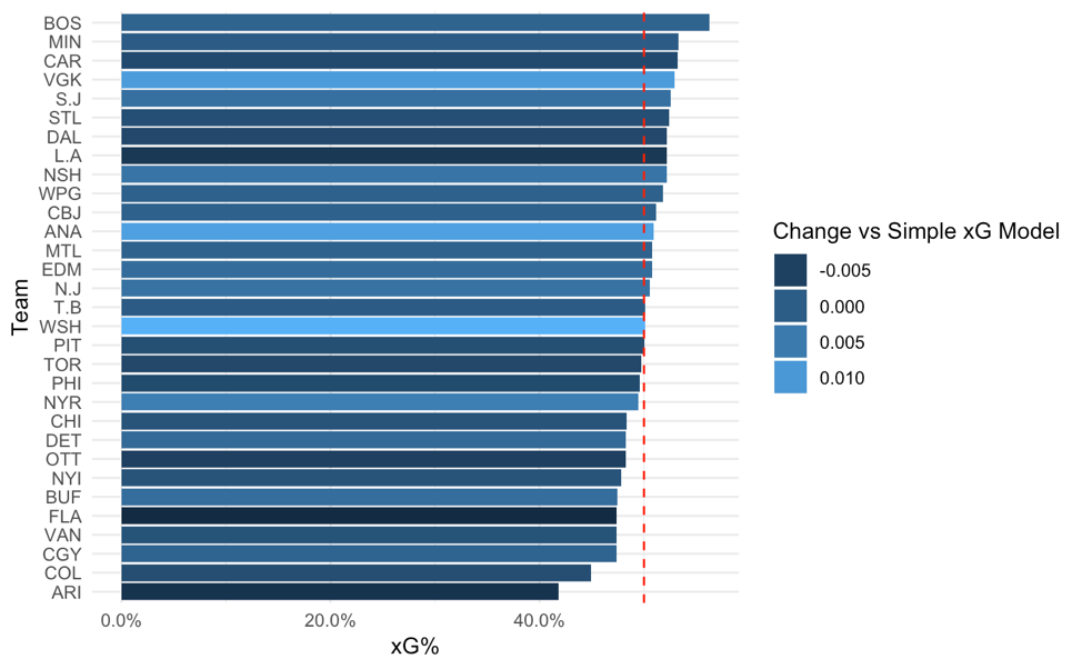
The bottom of the rankings has teams that have generally struggled the past few years. Arizona looks notably atrocious in this sample, getting just over 40% of the expected goals in their games.
Keep in mind that this data comes from roughly half of the 2016-2017 and 2017-2018 seasons. At the top, we have teams that are generally considered to perform quite well by analytics standards: Boston, Minnesota, and Carolina top the rankings. These scores look particularly good in light of this year’s playoffs; all four conference finalists are in the top six. That said, there is quite a lot of luck that went into that, especially considering that the data comes from before this season, so a victory lap isn’t really fair.
The graph is also colored to show the difference between the team’s score in the pre-shot model and what it would have been in the simpler model that only includes traditional play-by-play models. Light colored bars – like Las Vegas, Anaheim, and Washington – mean that the team did notably better when passing information for and against is included. These teams may have been underrated by more standard metrics. In contrast, darker colored bars like L.A., Florida, and Arizona look worse when we incorporate passes.
Las Vegas is a particularly interesting case. While the Golden Knights’ performance was surprising to pretty much everyone, the model has them near the top of the league. In addition, Vegas does better in the pre-shot model than the simpler model. This is a positive sign for the model; the difference suggests that it can capture important parts of VGK’s play that standard analysis may have missed. This also helps explain Vegas’ success: they appear to be a particularly strong team when it comes to making their offense more dangerous with passes, and preventing their opponents from doing the same.
That said, we should not oversell the differences between the pre-shot model and its predecessors. Here’s a graph that shows each team’s xG% in each of the two models
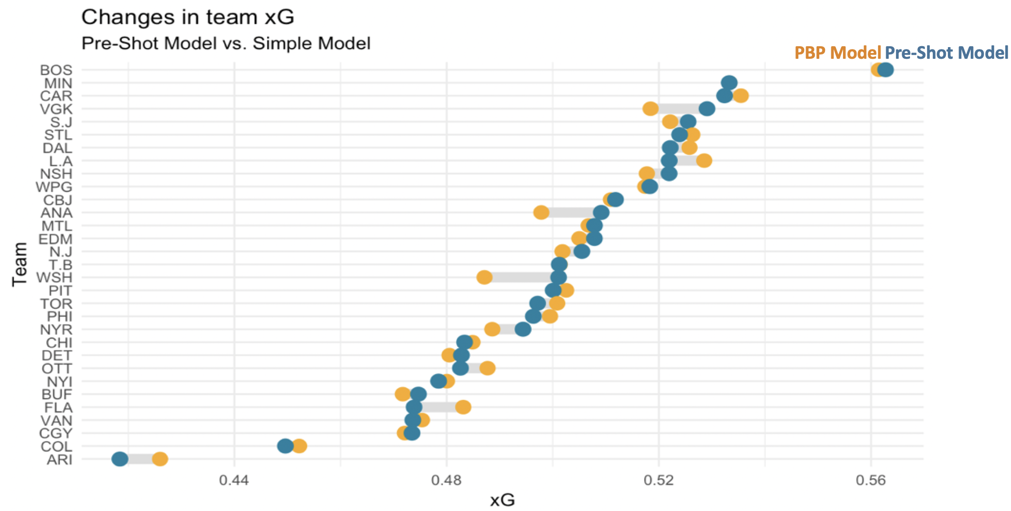
Some teams have meaningful differences between the models – noted by the distance between the two dots on its row. But these differences are much smaller than the variation between teams within the same model. That is, how a team performs is generally pretty similar between the two models, and that performance matters more than the tool we use to measure it.
Before we move on from teams, we can drill in a bit deeper into each one’s quality per shot. The above charts looked at total xG. This gave us a solid view of their overall performance, but not how that ranking came about. If we split the expected goals into for and against and then look at the average per shot, we can get a better sense of each team’s shot quality.

Here, we are ignoring shot volume and just looking at the average quality of each shot for and against. Teams far to the right of this graph, like Winnipeg and the New York Ranger, have particularly dangerous offensive changes. Meanwhile, teams at the bottom of the chart like Buffalo and Dallas tend to give up less dangerous shots on average.
Ideally, a team would want to be in the bottom-rish of this chart. Only one team really accomplishes that: the Wild. This is a positive sign for them, but ultimately, this chart does not have everything that goes into winning. Success requires combining this with shot quantity as well as shooting and goaltender talent.
It’s interesting that the average xG for and against appear to be correlated. Intuitively, it makes some sense that teams that take dangerous shots may be playing a riskier, more aggressive style that leads them open to more dangerous against. However, this relationship is still much stronger than I would have expected, and it may be worth further investigation.
Deep Dive Case Study: Washington Capitals
After looking at shot quality, we can continue to understand teams by looking at the individual metrics that went into the model. For example, the Washington Capitals were in the middle of the pack when it came to xG rankings, but they were much notably better in the model that includes passes. Why is that? If your team was playing against the Capitals, what would your scouting report include about their passing tendencies?
Here are some of the stats we have for the Capitals offense along with how they rank across the league:
| Stat | # / % | NHL Rank |
| Passes per Shot | 1.27 | 1st |
| Offensive Zone Passes per Shot | 0.91 | 3rd |
| % of Shots from Scoring Chance Area | 39.5% | 1st |
| % of Shots with Royal Road Passes | 6.8% | 2nd |
| % of Shots off Oddman Rush | 3.9% | 10th |
| % of Shots with Screens | 5.1% | 16th |
| % of Shots with Pass from Behind Net | 6.7% | 20th |
| % of Shots with Stretch Passes | 2.6% | 22nd |
| % of Shots with Low-High Pass | 13.7% | 24th |
The Capitals did a few things particularly well. They completed a ton of passes before taking shots, forcing the defense and goaltender to move. They also made particularly dangerous passes: they passed a lot in the offensive zone, especially across the “royal road” just in front of the net. This likely led to them being able to take almost 40% of their shots from a scoring chance area.
On the other hand, there were some pass types that Washington did not prioritize. They were near average at generating shots off of oddman rushes and at getting screens in front of their shots. And they were towards the bottom of the lease at passing from behind the net, completing stretch passes, and moving the puck from low-to-high
This is actionable information for teams. Looking at this, I would suggest that the Capitals opponents prioritize getting bodies in the slot area and carefully marking against forwards to limit passes in front of the net. This can come at the cost of conceding the area behind the net because the Capitals tended not to generate much offense from that area. Obviously this is not a complete scouting report, but it is useful information that can complement existing knowledge.
Skaters
Next, let’s look at skaters. We don’t have time to look at every single skater, but I’ve provided a link at the bottom of this article where you can see that stats for each player. For now, let’s take a look at the players that have the biggest differences in their on-ice xG% as measured by the two models. This will help us see which players are getting a particularly large or small amount of value out of passing plays when they are on the ice.

Each of the above players gets a lot of results (or prevents results from their opponents) through passing. This is particularly interesting because it may suggest plays that the market undervalues. The top results here certainly suggest that. Vegas players like Nate Schmidt and Jonathan Marchessault are playing key roles on a top team, and this explains how they may have been undervalued by their previous team.
We can also look at which players may be overrated when passing information is not taken into account:

I don’t have much commentary about this except to point out Brent Seabrook’s inclusion.
Goalies
Finally, we can conclude by going into our most dangerous territory yet: goaltending. Rather than looking at the expected goals a player generates, we can use this metric to see how many expected goals a goaltender faced. We can then compare this to their actual goals allowed to see how well they performed given the difficulty of the shots they faced. Finally, we’ll convert this number of goals saved above expected to be out of 1,000 shots in order to normalize goaltenders with different workloads. Here’s how they turn out:


Full Data
Tomorrow, I’ll share an update showing this data for the games we have tracked for the 2018-2019 season. In the meantime, you can see the stats for the two prior seasons here.
Part 1: Introducing the Model
Part 3: 2018-2019 Results and BOS/S.J Style Comparison
Part 4: Feature Interpretation
