
A little while ago I wrote an article at SensStats discussing score effects and suggesting a new formula which we might use to compute score-adjusted Fenwick. This article addresses several interesting questions and new avenues that were suggested to me by various commenters.
- The method in the above-linked article simultaneously adjusts for score and for venue (that is, home vs away). It’s interesting to estimate the relative importance of these two factors. As we’ll see, it turns out that adjusting for score effects is dramatically more important than adjusting for venue effects.
- We might consider adjusted corsi instead of adjusted fenwick; it turns out that adjusted corsi is a better predictor of future success than adjusted fenwick at all sample sizes.
- Most interestingly, we might consider how score effects vary over time, and see if we can create a score-adjusted possession measure that takes this variation into account. We find here that performing such adjustments is indistinguishable in predictivity from the naive score-adjustments already considered.
Several people have pointed out that score effects have a strong time-dependence. At least as far back as 2011, Gabriel Desjardins (@behindthenet) noted the effect and readers with keener memories than me will no doubt remember still earlier examples. Just last week, Fangda Li (@fangdali1) wrote an article arguing that score effects play virtually no role outside of the third period. This article will show that, while score effects are magnified as the game wears on, time-adjustment for possession calculations is not justified.
First, to show how score effects change over time, consider the following chart, where we have broken down the game into five-minute bins. Within each bin, we plot the share of Corsi events generated by the home team, broken out by home-team lead. Bins with fewer than 750 events over the course of the last seven years are not shown. As you can imagine, not very many teams were down three in the first five minutes of the first period, even over several years.
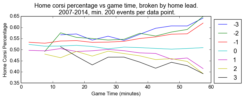
This plot repays close inspection for many reasons. First, note that the home-team share of the shots when tied drifts down slowly from ~53% at first to barely over 50% at the end of the game. Second, note that score effects are stronger when the home team is losing. In the last five minutes, for instance, the home team generates between 62% and 65% of the events when losing, where the road team generates between 58% and 61% when losing. Home-ice advantage, it seems, applies in all score situations, although not evenly at all times.
Using the method in the above-linked Senstats article, one can compute score-adjustment coefficients for all times and for all score situations. For example, when the road team is leading by one, we count their corsi events using the following table:
| Game Time (minutes) | Coefficient |
|---|---|
| 0-5 | 1.066 |
| 5-10 | 1.057 |
| 10-15 | 1.077 |
| 15-20 | 1.081 |
| 20-25 | 1.065 |
| 25-30 | 1.067 |
| 30-35 | 1.075 |
| 35-40 | 1.100 |
| 40-45 | 1.114 |
| 45-50 | 1.139 |
| 50-55 | 1.142 |
| 55-60 | 1.239 |
Note that the values are all greater than one (the road team is leading and expected to sit back), are largely stable through two periods and then rise dramatically through the third.
In this way, we form a notion of “Score, Venue, and Time adjusted Corsi”. For the bins wherewe do not have 750 total events to compute coefficients, we pretend that the event happened later in the game, in the earliest bin for which we have a data point. An analagous computation produces a suite a coefficients that we can use to form a notion of “Score, Venue, and Time adjusted Fenwick”. Our central interest is in predictivity—our intuition is that good notions of possession are good predictors of winning. For completeness sake, we compare these two new notions to several others: raw Corsi and Fenwick, so-called “Fenwick Close” and “Corsi Close” (discounting events except when the score is within one before the third or tied in the third), Score adjusted Fenwick and Corsi, and Score-and-Venue adjusted Fenwick and Corsi. We test in two ways:
- By taking each of the last six non-lockout seasons and testing the randomized split-half R^2 between each of these measures and themselves, each of these measures and 5v5 goal percentage, and each of these measures and win percentage.
- We repeat the same three sub-tests for the past six non-lockout years with a forward-looking calculation, examining every initial segment of the seasons and calculating the R^2 with the relevant item for the remainder of the season.
Evaluation
Time-randomized split half tests
First, we compute the split-half time-randomized R^2s between each stat and itself. This measures repeatability, and high values indicate things which can be considered skills.
| Possession Measure | Abbreviation | Fenwick R^2 | Corsi R^2 |
|---|---|---|---|
| 0.662 | 0.689 | ||
| Close | CLOSE | 0.614 | 0.665 |
| Score Adjusted | SADJ | 0.693 | 0.732 |
| Score and Venue Adjusted | SVADJ | 0.705 | 0.743 |
| Score, Venue, and Time Adjusted | SVTADJ | 0.704 | 0.742 |
The abbreviations will be used in plots later in this article.
Note that:
- Both of the “close” measures are less repeatable than the raw measures.
- The new “Time” adjusted measures are indistinguishable from the score-and-venue adjusted measures.
- The score-only adjusted measure is nearly as good as the score-and-venue adjustment.
- More broadly, corsi is more repeatable than fenwick, at every measure.
Second, we consider the predictivity between our possession measures and goal percentage.
| Possession Measure | Abbreviation | Fenwick R^2 | Corsi R^2 |
|---|---|---|---|
| 0.214 | 0.233 | ||
| Close | CLOSE | 0.196 | 0.222 |
| Score Adjusted | SADJ | 0.227 | 0.249 |
| Score and Venue Adjusted | SVADJ | 0.231 | 0.252 |
| Score, Venue, and Time Adjusted | SVTADJ | 0.232 | 0.254 |
Once again, we see:
- That Corsi is always better;
- That the “close” measures are worse even than raw, let alone adjusted measures;
- That score-adjustment is more important than venue adjustment;
- and that time adjustment has no discernable effect.
Third, let’s turn to predictivity between our possession measures and winning percentage, where we consider shootouts as ties:
| Possession Measure | Abbreviation | Fenwick R^2 | Corsi R^2 |
|---|---|---|---|
| 0.089 | 0.084 | ||
| Close | CLOSE | 0.077 | 0.076 |
| Score Adjusted | SADJ | 0.096 | 0.092 |
| Score and Venue Adjusted | SVADJ | 0.109 | 0.106 |
| Score, Venue, and Time Adjusted | SVTADJ | 0.111 | 0.106 |
For a third time, we see:
- that the “close” measures are worse even than raw, let alone adjusted measures;
- and that time adjustment has no discernable effect.
However, it now appears that Fenwick is a slightly better predictor than Corsi, in every type of measure, although the difference is very small.
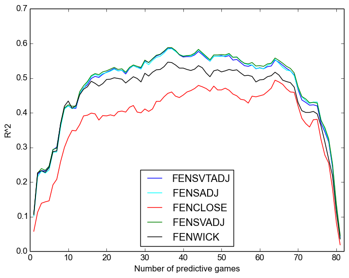
Chronlogical predictions
Moving on to non-time randomized measures, let’s examine how initial segments of seasons predict the remainder. Instead of a single R^2 value, like above, this produces a graph for every measure, all following a predictable shape: early in the season, starting from very small samples, predictivities are all vanishingly small, similarly at the end of the season when one is attempting the very difficult task of predicting the result of very few games. However, for each possession measure we can identify a useful set of games for optimal (or acceptable) predictivity. Just like in the previous section, we take our data from 2007 to 2014, excluding the 2012-2013 lockout year.
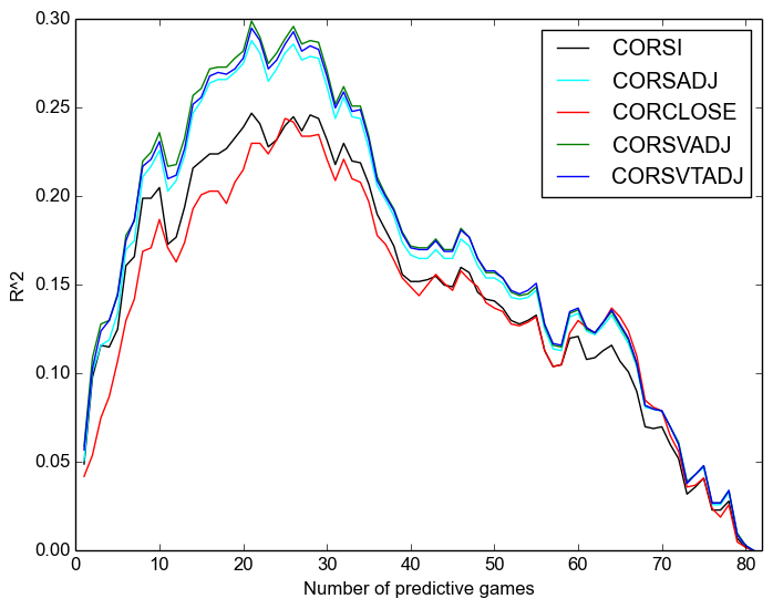
We will consider separate plots for Corsi and Fenwick. First, repeatability:
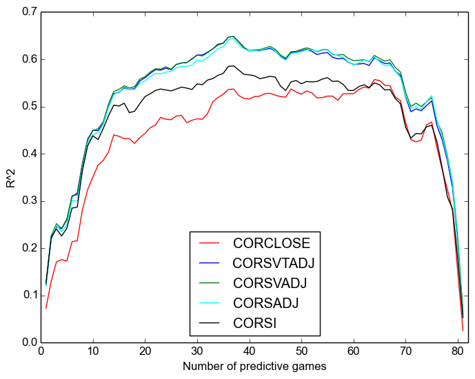
Once again, we see:
- that Corsi is always better;
- that the “close” measures are worse even than raw, let alone adjusted measures, except after around sixty games when they are not appreciably worse;
- that score-adjustment is more important than venue adjustment;
- and that time adjustment has no discernable effect on repeatability.
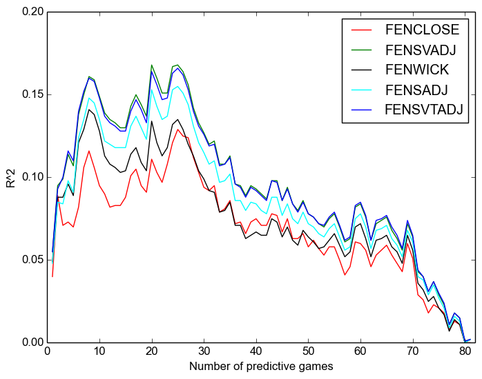
Next, we consider predicting future goal scoring at 5v5:
Once again, we see:
- That Corsi is always better;
- That the “close” measures are worse even than raw, let alone adjusted measures, except after around sixty games when it is somewhat better than raw;
- That score-adjustment is more important than venue adjustment;
- and that time adjustment has no discernable effect.
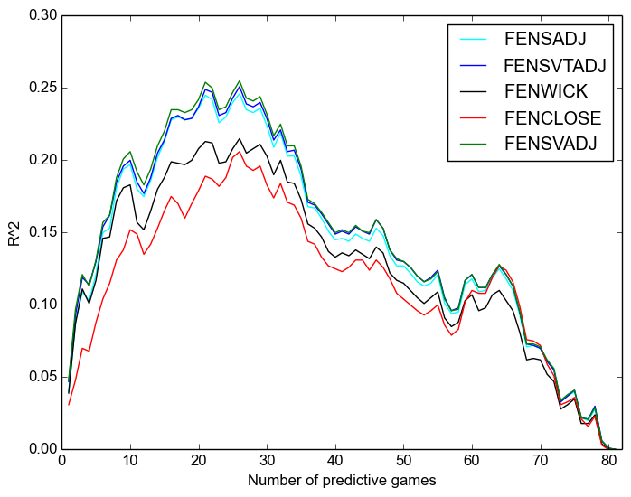
Finally, we look at predictivity between possesion and winning percentage:
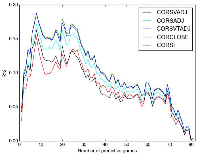
One final time, we see:
- that Corsi is always better;
- that the “close” measures are worse even than raw, let alone adjusted measures,except after around twenty or thirty games, after which it is much the same as raw;
- that score-adjustment is more important than venue adjustment;
- and that time adjustment has no discernable effect.
Conclusions
Least controversially, score-adjustment produces substantially better measures, and further venue-adjustment somewhat better still.
Somewhat more surprisingly, there role of time in score-adjustment is curious and subtle. There is clearly a non-trivial time-dependence to score effects, as the opening plot shows. However, from a modelling point-of-view, adjusting for this time-dependence gives no improvement, and thus cannot possibly justify the 12-fold increase in complexity from 14 adjustment coefficients to 168 coefficients. There is an obvious temptation to tinker with the gradation of this time-dependence; I investigated 20,10,5,4,2,1, and 0.5 minute bins, none showed any discernable improvement over score-and-venue adjusted measures with 60 minute binning, that is, with no adjustment for time effects.
Modelling complex systems is fraught with uncertainty and the information density of what can be extracted from seemingly endless data is at times distressingly small. Dredging through ever more data in search of more predictivity is fraught with ill-advised ideas. Many effects are similar to what we have learned here about time-adjusted possession measures: they are clearly visible effects, the knowledge of which adds essentially nothing to our ability to make predictions.
Finally, and least obviously, we see that score-close possession metrics are utterly indefensible for any purpose at any time. Raw measures are preferable for conceptual clarity and for predictivity at almost all sample sizes, and adjusted measures are superior for predictivity at all sample sizes. It is difficult to overstate how important it is that they be purged from the lexicon of all right-thinking people. They purport to distill the essence of possession when in fact they do great violence to data by censoring large tracts of meaningful information and magnifying a smallish portion. Adjusted measures, by contrast, apply small nudges to the raw data—their seeming complexity masks how much closer to raw data they are than ‘close’ measures.
We can use the time-variation of possession (that is, the first plot in this article) to help us understand how we were led astray: one of the central flaws in ‘close’ measures is that they ignore the -1/+1 states in the third period, and playing well or playing poorly in these states makes an enormous difference in one’s ability to win. There are many other (smaller) conceptual flaws, but the evidence is clear: ‘close’ possession measures are misguided and must be done away with.
So, an investigation intended to add a stat to the arsenal of analysts has instead removed one, or, so I hope.
Speculative postscript
All of the graphs in the chronological section, for almost every measure, show a spike around 9-12 games played followed immediately by a dropoff, rising somewhat later to a maximum. What on earth is going on here, to make the league as a whole suddenly more chaotic for a few games? Is it, perhaps, related to the 9-games-played window for players on entry level contracts, where suddenly rosters have to re-shuffle themselves, making good teams temporarily worse and/or bad teams temporarily better? Frankly, I am mystified. A thread for another day.

Raw corsi/fenwick includes all pk/pp situations?
No. Literally everything in the entire article is 5v5. Special teams are a whole other kettle of fish.
The x-axis on your graphs is “number of predictive games”. Does that mean that score-adjusted corsi stats through a team’s first 20-30 games is the best indication of how a team will finish the season?
similarly – as the season progresses, does that mean a team’s corsi numbers will have less of a predictive value? I guess i am asking how to read the x-axis on the graphs, essentially.
Your question speaks to sample sizes and the law of large numbers. On the far lefthand side of the graphs, predictive ability is low because the data source from a small sample of games. It’s hard to draw conclusions about things that you have only observed once or twice. Any conclusion you draw at the beginning of the season, based on limited data, is going to be worse than one made with a bigger body of evidence on which to rely. So, predictive power (r^2) is low at the beginning of the season, when you are forced to extrapolate only a few games’ results into predictions about the rest of the season.
Moving right along the x axis (i.e., progressing through the season), gives you more events (shots) from which to make inferences that allow you to predict future events in terms of goals scored or games won. In short, moving from left to right on the graph pulls in more and more data over time allowing for better bases to make more accurate predictions (higher r^2).
As for the right side of the graph, we need to consider that in this experiment we are thinking of corsi as our “best guess” and that we are using it to make predictions about future events. These predictions, as it turns out, tend to be correct relatively often (reflected in high R^2), because a) there exists a real link between a team’s corsi and its performance and b) over many simulations/games, statistical tendencies are borne out in the game outcomes.
Consider flipping a coin 10 times. Maybe you get heads 7/10 times, and tails 3/10 times. Does that mean the odds of flipping the coined are slanted in favor of heads? Probably not. Flip the same coin 1,000,000 times and the odds are more likely to look 50/50 between heads and tails. This phenomena of random events revealing their true tendencies over many trials is described by the law of large numbers. Similarly, the predictive ability of corsi stats is more likely to be observed if you look at the outcomes of more games, versus just one or two.
So, consider the far right side of the graph. What this analysis has done is to gather corsi data on, let’s say, the first 70 games of the season, in order to make predictions about the last 12 games of the season. Fair enough, you might say, what’s true over 70 games will be true over 12 games. And while the same tendencies for a team generating shots may still be there, the outcome, being random, could come out as a win or a loss. If you’re a good team with strong Corsi numbers, the outcome is more likely to be a win, but it could still go either way — losses just happen less often.
So, all of this is to say that if a team is has very strong corsi numbers over 70 games, they are likely to win the majority of the remaining 12 games. The majority, though, is not all 12. Let’s say they lose 1 game, and it happens to be the last game of the season. So, we say, corsi’s predictive power on wining percentage is quite high for this team by their 70th game. BUT, what if it’s the 82nd game of the season in this example? The team’s corsi numbers suggest a high probability of a win, but the opposing goalie stands on his head and steals a win. On the right side of the graph, we would see the the predictive power of corsi by the 81st game is quite bad at predicting the outcome of the 82nd game (low r^2).
BUT, if we were to extend the season by an additional 82 games, that graph of predictive power is going to shoot back up to the mid-season levels shown above, because over the course of many more games, the random game outcomes will trend in line with what the corsi numbers would suggest — that is, a given team’s true ability. So, over the short term (end of season) predictive power is quite low, but in the long term (mid season) predictive power is quite high. And, necessarily, predictive power at the end of the season is quite poor, since it’s tough to be correct about a specific trial or two of a random experiment, even when it’s easy to be correct about that same experiment’s outcome in general over many trials.
Remember, on the far right side of the graph, the author here has used a whole season’s worth of data to predict the outcome of only a very small number of games. Given the small number of games, we would expect a high degree of variability, which would go hand-in-hand with the low predictive power or R^2 shown above.
that makes a lot of sense. thank you for taking the time to explain everything; it was very helpful!
Great job! Wonderful article indeed…
How long before we see score-adjusted measures on Naturalstattrick & similar Extraskater heirs? 🙂
Why nobody includes PP and PK time when testing the predictive power of Corsi/Fenwick? Would be really insightful to see their impact…in the end those are areas where good teams make a difference, isn’t it?
And…what about a “trade deadline” effect on the right side of the plots?
Keep it up!
I’ve made some prediction models using PP and PK time and found that their impact is much, much smaller than 5v5, quite a bit smaller than I expected. There might be something to learn there but I’m not sure. In the end, good teams make a difference by having the puck 5v5.
As for a trade-deadline effect, it could well exist. I’ve never looked at it before.
Wonderful web site. Plenty of useful info here.
I’m sending it to a few pals ans additionally sharing in delicious.
And certainly, thank you to your sweat!
What i do not realize is if truth be told how you’re now
not really much more well-favored than you may be now.
You’re so intelligent. You already know therefore
considerably in relation to this matter, made me personally believe it
from numerous numerous angles. Its like women and men aren’t involved until
it’s something to accomplish with Woman gaga! Your individual stuffs excellent.
Always care for it up!