
Visualizing passes isn’t easy in hockey. In any given KHL game, there are between 700 and 900 Passes. Somewhere between 65% to 85% are successful*. If you wanted to focus on just the successful ones, you’d have to find a way to meaningfully and concisely represent 500-700 events. Let’s start with something simpler: the Power play. If we further restrict our target to passes by single teams during 5v4 power plays in the OZ, we still get between 40 and 50 passes per game per team. Looking at two random KHL games, you can see that this is still quite a lot of passes:

There are some trends to be picked up on, but it’s not very clean. And any semi-serious opposition scouting (especially of special teams) will take into account multiple games, which then leads to an unidentifiable mess when plotted.
Clustering to the rescue
Soccer analytics identified a potential solution to this predicament. I came across the idea of clustering passes by reading “Finding the Best Pass in the Bundesliga” on Statsbomb. Wikipedia defines cluster analysis as the “task of grouping a set of objects in such a way that objects in the same group (called a cluster) are more similar (in some sense) to each other than to those in other groups”. In the examples above, there certainly are passes that are similar enough to each other that can reasonably be grouped together and summarized.
For those interested, I describe my clustering method for InStat data from the 2017/18 and 2018/19 KHL seasons in the next segment. If you only care about passing plots, please skip ahead.
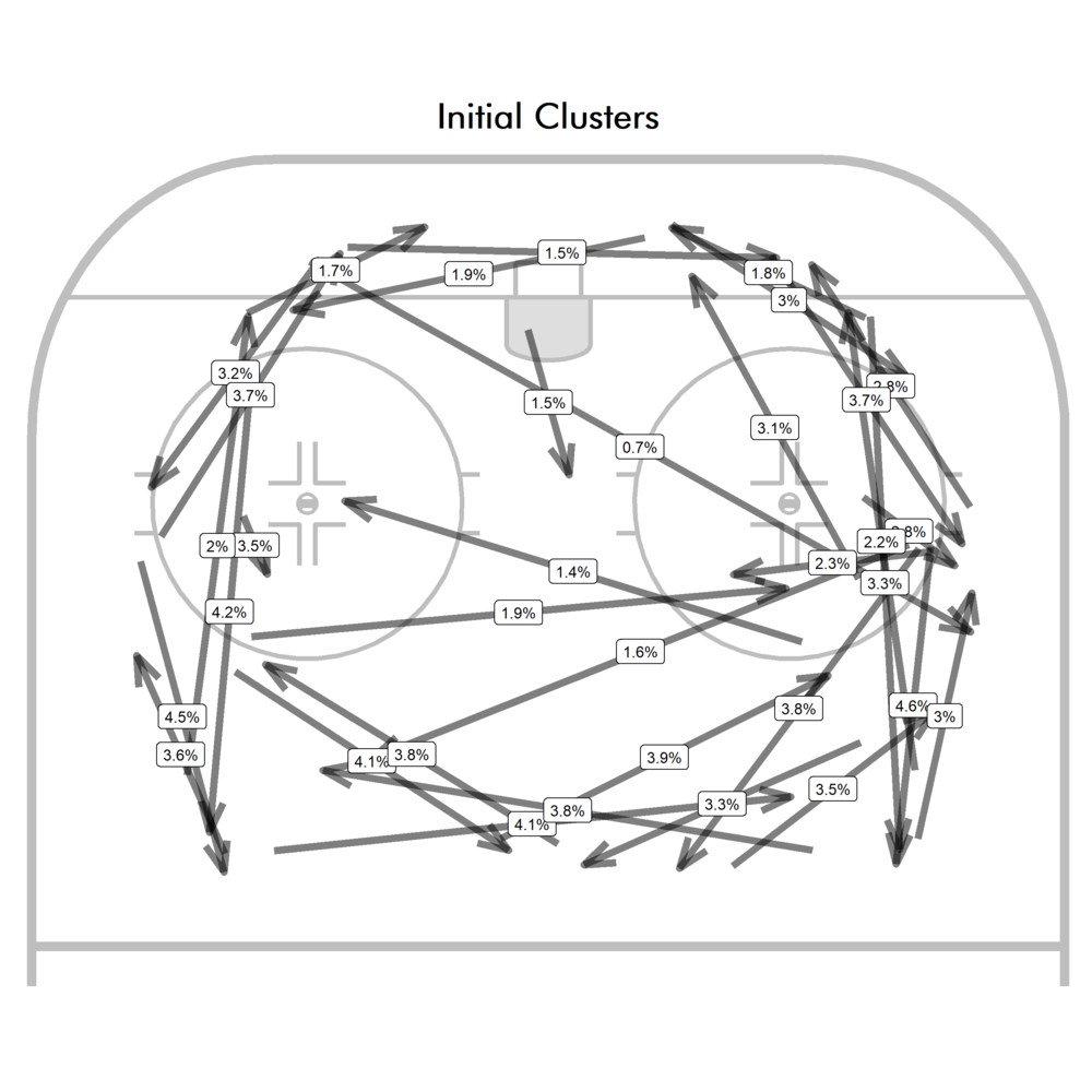
The basic process I used for developing pass clusters produced reasonable clusters. Since k-means clustering can lead to somewhat different random results depending on how the algorithm picks initial values, I first do a few rounds of k-means clustering based on start and end locations of passes. This is to get a sense of what kinds of pass types exist. You could skip this step and just draw the kinds of pass types you think exist in any given situation (which is essentially what the Passing Project did, they decided on some pass types to track) and leave it at that. But I believe that using clustering methods can show you where distinguishing between passes might be useful.
Other, more complex clustering methods might not require this, but since k-means clustering tends to lead to similarly sized clusters, you can get both 1) unnecessary splitting of high frequency clusters and 2) lack of low frequency clusters.
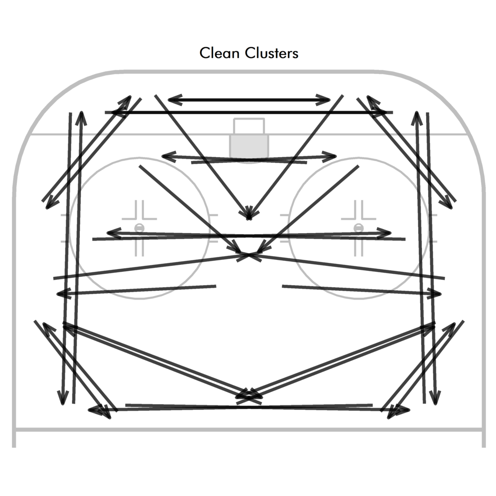
From there, I take all the clusters I think are reasonable to include and clean them up, which simply means making sure they’re symmetrical on both sides of the ice. For instance, in the example above, the outside set up passes are well covered, but there are very few variations of slot passes. But on the powerplay, you might not actually care all that much about set up passes but care a lot about the low frequency, high leverage passes to dangerous areas, so those need to be added manually.
After setting up the clean clusters, I then use them as training data to assign cluster types to the full dataset with the k-nearest neighbor algorithm (k-NN). k-NN calculates the distance between every pass and all the passes in the training data and selects the cluster of the closest pass (I set it to choose only the closest, but, as the name of the algorithm suggests, you can base it on the k-closest vectors and set k to whatever you’d like). The distance between passes is calculated by start/end locations, angle towards goal and overall length of the pass.
In order to exclude passes/shots on the rush, only passes and shots that occur 4 or more seconds after an entry are used. Four seconds after an entry or an initial puck recovery (off a dump in) should be enough time to assume that the team is in its PP setup. My chosen clusters look like this:
For a more concrete example of how these passes are clustered, here are three randomly selected passes of each cluster (blue) and the cluster representative (black). I only plotted clusters 1-17 since 18-34 are just 1-17 mirrored around the central axis:
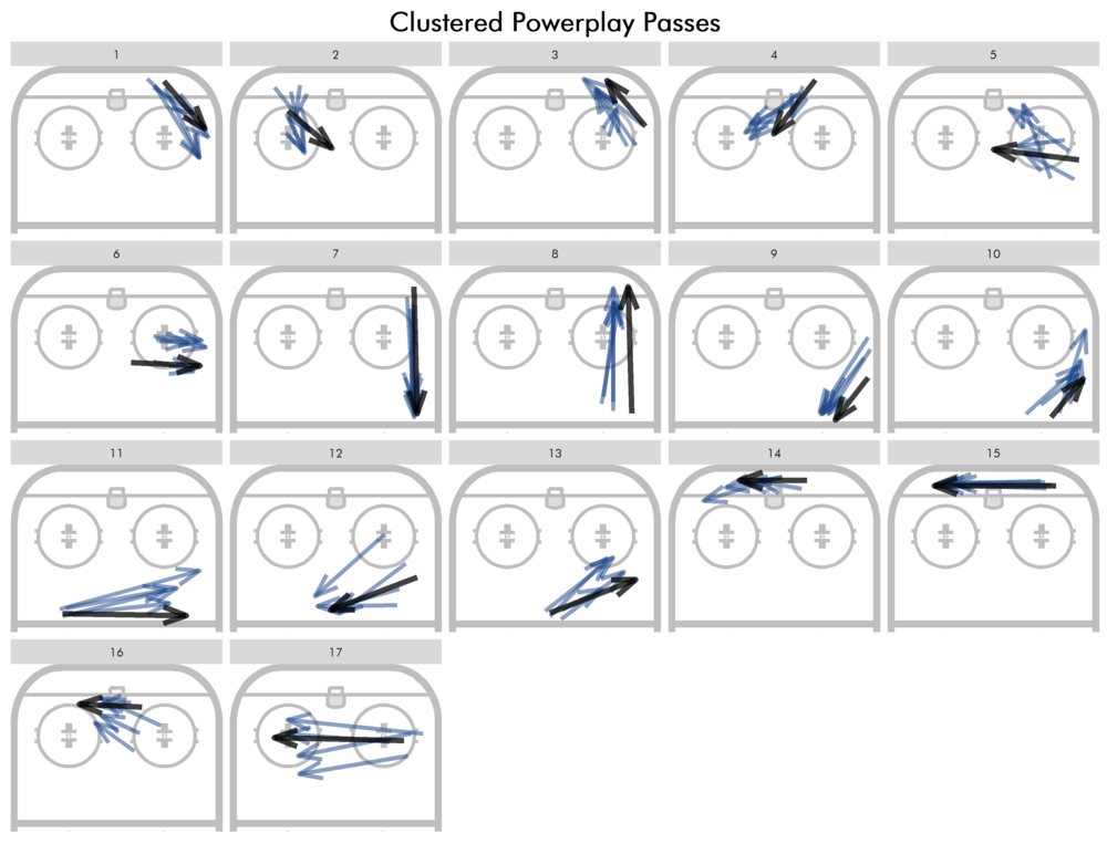
While certainly not perfect, I think it’s reasonable to say that most of the blue passes are at least somewhat similar to each other and to the black passes representing their cluster. From here, we can check which passes are played and with what frequency (to avoid overlap, passes are labelled closer to the end of the pass):
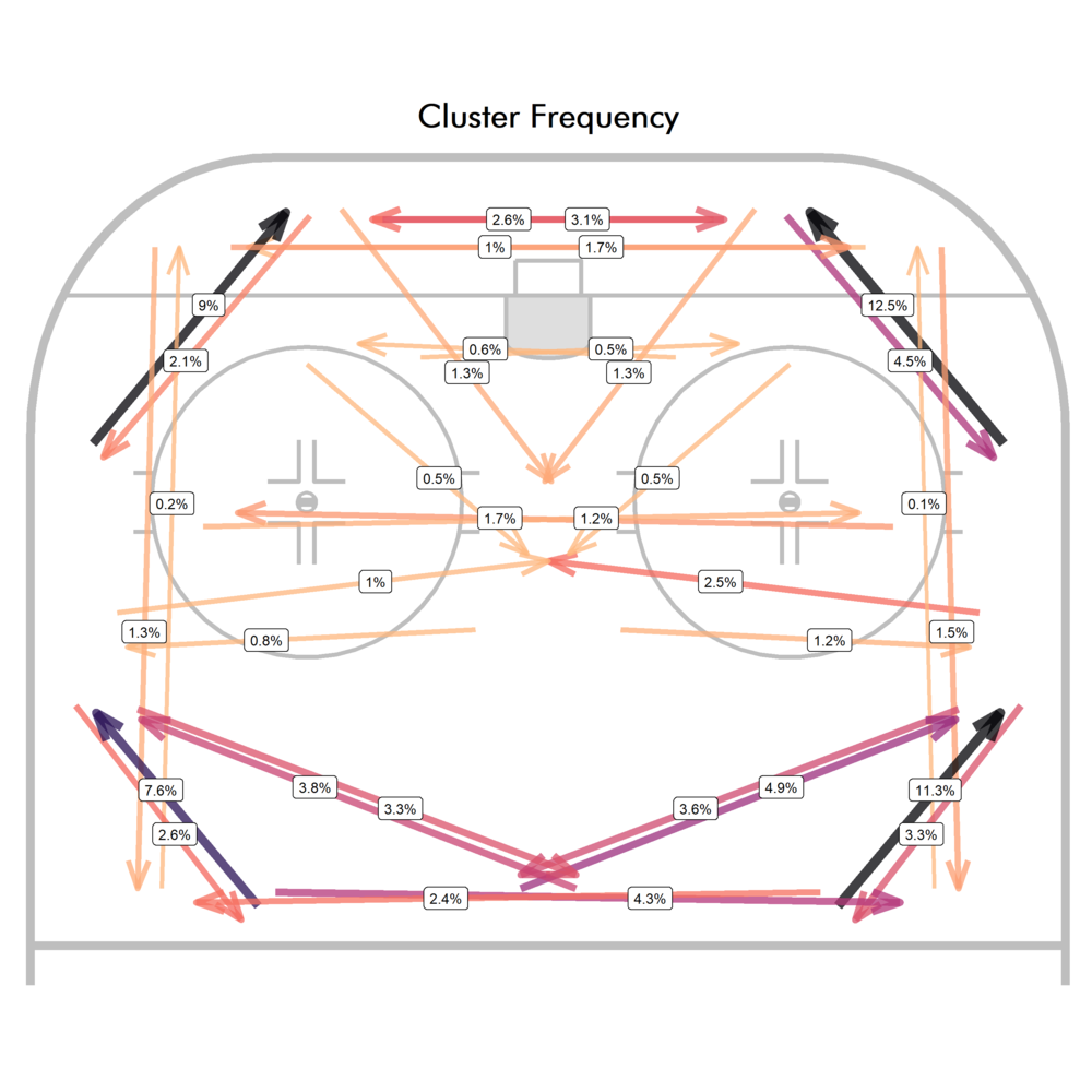
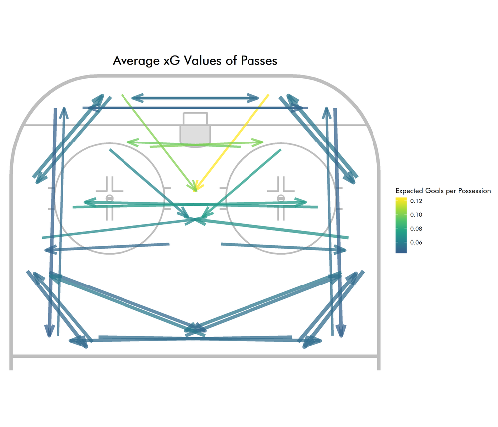
This certainly looks like mostly 1-3-1 powerplays, based on the distribution of set up passes and the most frequent slot pass being to the high slot from the half wall. While we’re here, we might as well check which passes are the most dangerous. So let’s calculate the average xG of each pass cluster and plot that:
Profiling Player Roles
One possible use for passing clusters would be to improve on the existing play-by-play-based power play roles (from what I’ve seen, Micah McCurdy currently provides the gold standard). Plotting shots along with the most frequent passing clusters gives some more information about a player’s actions on the PP. Let’s start with some more well-known KHL players:
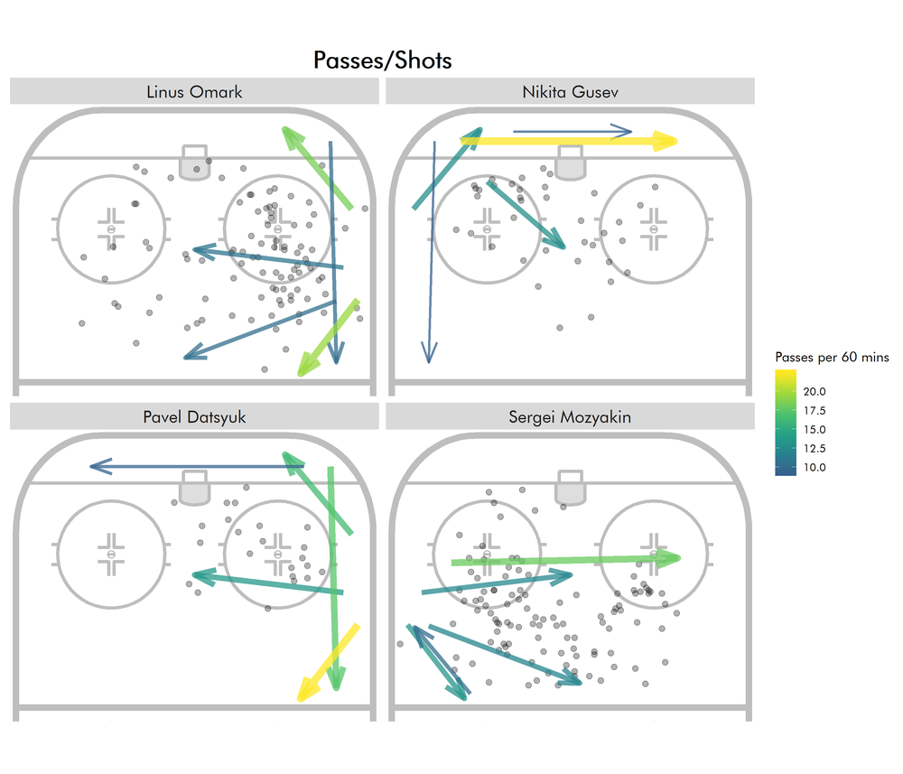
Based on the shot locations alone, you’d never know of Gusev’s role of setting up behind the net.
Although, instead of passes and shots by a player it would probably be of interest to see which passes are most frequently played to a player alongside the shots he takes. After all, those are the passes the player received before taking the shot.
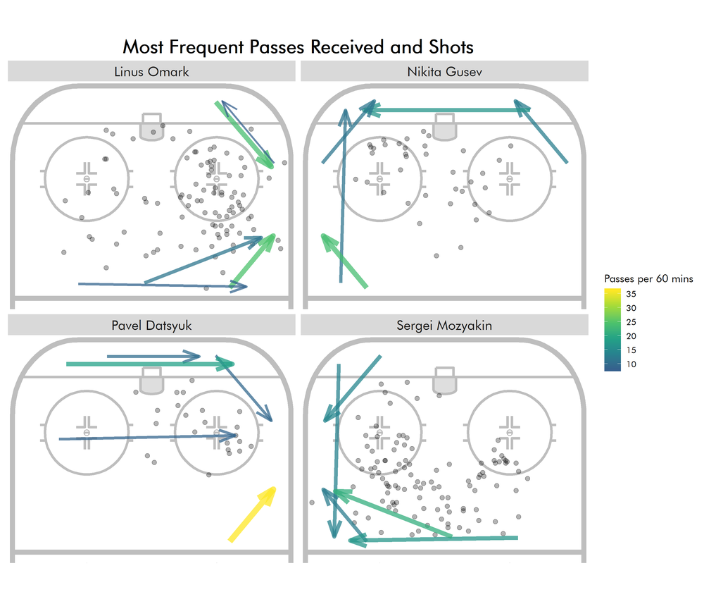
In a similar fashion, we can also combine the passes a player plays most frequently with the locations of the shots he set up via primary assist:

In fact, we can plot both the passes played/shots set up and passes received/own shots side-by-side for some of the PP1s of the KHL (2017/18):

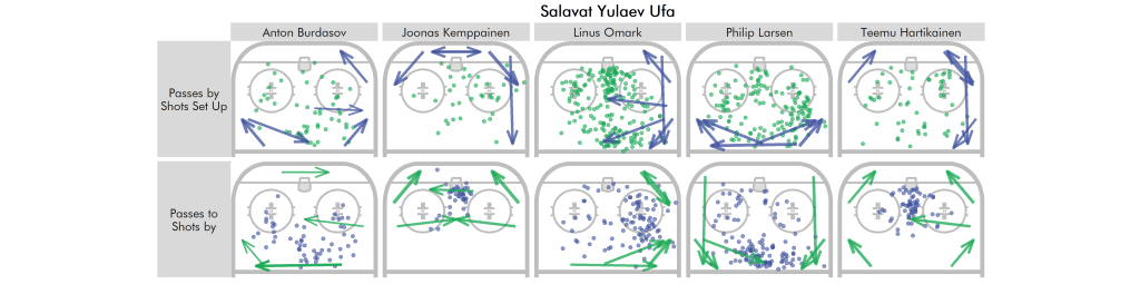
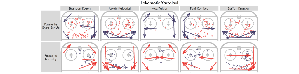

These certainly take a while to read, but they do a reasonable job at condensing a player’s role.
Future Work
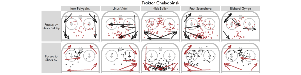
In this article, I focused on describing a player’s role but clustering passes this way can be used in various other ways as well. For instance, using just primary and secondary shot assists gets closer to how teams actually create their shots:
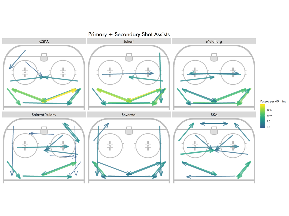
As you can see, SKA St.Petersburg’s PP looks like it was created in a fancystat lab. The Gusev/Datsyuk behind the net set up could have given a few NHL penalty kills some trouble. While this pairing is now disbanded with Datsyuk playing for Avtomobilist, maybe Gusev can bring some of those PP skills to New Jersey.
Similarly, Linus Omark’s outsized role in creating offense from the right half wall/corner for Ufa (Salavat Yulaev) is also visible with the team passing focused on passes to the slot from the right side.
Finally, another approach would be to cluster these pass distributions much like Ryan Stimson did here to develop distinct classes of power plays/PP roles.
*I personally tend to favor a stricter tracking standards focused on process, so a bad pass that misses its target but gets picked up a few seconds later by a teammate still counts as a failed pass. In reality, this is harder than it looks, since you often have to gauge the intent of a player. There are arguments to be made for focusing on the outcome instead and if a player of your own team gets to the puck, then the pass is not bad.

Very good work. I am interested to see where it goes.