
Every once-in-a-while I will rant on the concepts and ideas behind what numbers suggest in a series called Behind the Numbers, as a tip of the hat to the website that brought me into hockey analytics: Behind the Net.
As the hockey analytics community pushes for validation of current metrics and their value, I think it is sometimes lost that we do understand these statistics have their weaknesses. We do wish and try to improve upon these weaknesses.
I also think an often underlooked fact is that each incremental improvement diminishes the potential value from every subsequent improvement.
Let’s take a look at what I mean…
A Short History
A long time ago there were a few bloggers that wanted to know more about the sport they enjoyed watching.
Before this the public did not have much to go on. There were the watered down comments from players, managers, and coaches. There were also your standard boxscore stats listed in the paper. That was about it.
These bloggers knew players provided value aside from their point totals. Almost anyone can see this when they watch the game, and the talking heads discuss these attributes all the time. The traditional +/- statistic was often cited as evidence for discussion on a player’s contributions aside from scoring, but ultimately failed due to some exceptional errors inherent to +/-‘s construction.
This led to Corsi. Corsi was never intended to be a holistic, all-inclusive statistic. It was just suppose to pickup players that help their teams beyond looking at their scoring totals. It was not to be the whole picture, but to display a part we did not have before. Corsi was noticed to have predictive value in detecting teams likely to fall or rise in the standings and undervalued by the NHL free-market.
This information led into fascinating research on things like score-effects and player deployment usage. After all, it’s not just the player that impacts these results, but also the environment they create these results within.
The next step came from adjusted Corsi, which further improved the tool we were using.
There were still two issues: there was the problem with deployment usage confounding and also the statistic led some to be unsatisfied with a popular and useful statistic not accounting for everything.
From this outcry came research on relative metrics, usage adjusted, quality adjusted, and other metrics. DTMAH’s XPM model was just one such adjusted metric that attempts to adjust for all of these factors. There are other models like expected goals that attempts to adjust for shot quality and also models looking at just particular situations in a player’s performance.
Also, we started to look more into player tracking, with things like zonal transition and shot-passes. This allowed us to look into the underlying reasons and causes for players to garner the results they do.
Improvements and Diminishing Marginal Returns

Graph above taken from this Expected Goal post.
I like the above image because it helps illustrate my point and what we’ll often see moving forward.
Corsi and other similar basic shot metrics were the first step forward, and a large one at that. It improved upon goals by a great deal. It was a far cry from the whole picture, but it covered more of the picture than goal metrics.
Then came expected goal models.
The model from the above graph adjusted shots based on multiple factors like shot distance, shot angle, shot type, rush shot, rebound shot, and whether the shot was on a winger’s natural or off wing.
Again, this did not cover all the factors that impact shot quality. It misses shot accuracy, shot speed, puck movement prior to shot, where everyone is on the ice, and all the other variables but it covered more than we ever had before.
In addition, DTMAH and Asmean added a “catch all” with adjusting for regressed shooter history. Players who historically score more than expected typically do because they are good at the previously stated and other missed factors.
This made an improvement, although you will notice the jump was less noticeable.
One possible reason for why this is and also why this will likely be the case moving forward is due to diminishing returns in more information.
For the most part, being a good hockey player means good things will tend to happen with you on the ice. Good players make good things happen. Players or teams who are good at one thing are likely good at other things as well. By measuring one area a player or team impacts the game in a positive fashion, you will garner some of the value they impact the game in other areas. Players may have individual strengths and weaknesses, but typically speaking the best will be better than the worst for more than one reason.
For example: there’s a relationship to between a player’s impact on shot quantity and quality. Pearson’s r between 2007-2017 a player’s on-ice Corsi events for per hour and on-ice Corsi percent is 0.28. The Pearson’s r on the defensive end with Corsi events against and on-ice save percentage is much smaller but still exists at 0.07. (Note: we expect the defensive relationship to be weaker due to larger variety in goaltender skill behind a player versus goaltender faced against a player)
By looking at shot quantity talent, we were already grabbing a bit of shot quality talent. They are different skills, hence why accounting for both will be superior to not. Still, players who are good at hockey are good at hockey.
You increase the areas you account for, you likely decrease the incremental value added to be gained from the next addition.
Imagine one of those ugly multicolored pie charts where the whole pie consists of all potential knowledge and measures of player performance, whether currently known or unknown, and each slice is one area of the game. If you accounted for one slice, you’d also be accounting for a sliver of many of the other slices. The size of each remaining unknown slice decreases with each additional area we are accounting for.
Add a few more slices, and you’d be accounting for even more slivers of the other slices… just like when cutting a slice of pie, you may pull bits from the adjacent slice… I’m probably just overly hungry right now…
WAR (And other one number metrics)

As we get better and better at measuring the different areas a player impacts the game, we also will try to get better at combining these areas.
It’s the holy grail of one number statistics.
There’s value in knowing the individual strengths and weaknesses of each player, but it becomes increasingly more difficult to determine which players are relatively better than others as you increase the number of areas we can look at. It takes a lot more than just counting how many different stats Player A is better in than Player B. Player B could be better in fewer areas but the areas that have the greatest impact. Things are easy with the extremely weak and strong players, but in the middle it becomes a lot tougher.
This is where holistic models like WAR, Game Score, Point Shares, and GVT come into play. Their whole purpose is to estimate how all these different areas come together. How well they accomplish that goal can and will differ.
They will be imperfect, as they combine multiple imperfect metrics together. They are not intended to be all things, be the start and the end of the story, as noted by the two FanGraphs quotes everyone should read in this piece. They are a good starting place, however.
Their value is in their ability to improve upon our current methods and numbers, incremental and marginal improvements they may be. If they are an improvement, they have value.
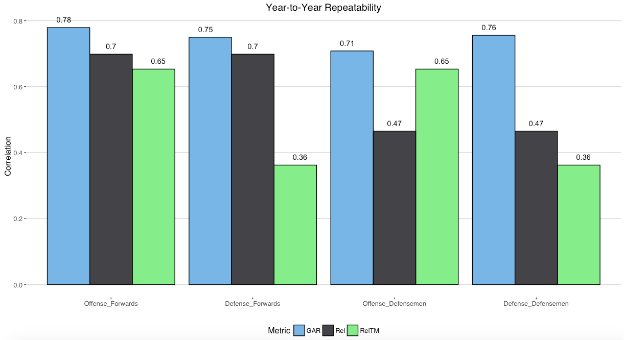
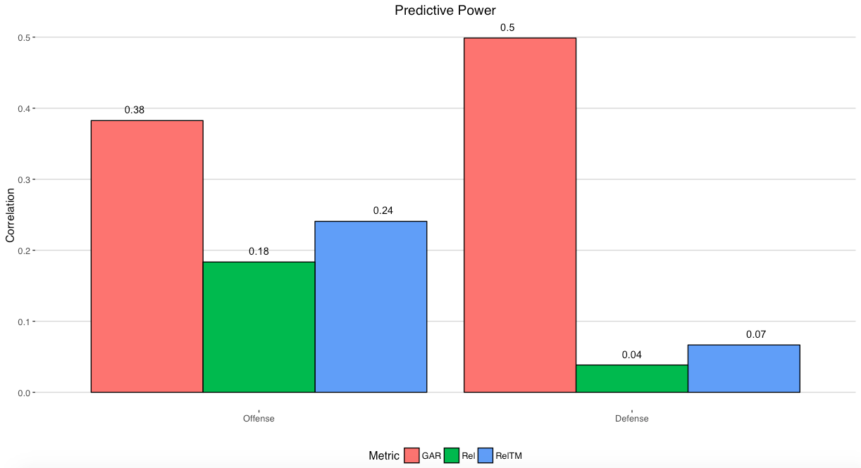
DTMAH’s WAR model, for example, was shown to be more repeatable and predictive than Rel and RelTM metrics many use.
Are they perfect? No. Will any number ever be perfect? No. Are they an improvement on what we have in allowing us to do more than we could before? Yes.
WAR is already useful in giving us a general sense of value and allowing us to tier players. However, due to it’s imperfect nature we will always have to look at the model’s components and inputs, as well as qualitative information, when comparing players rated of similar value.
WAR will also be improved upon as we continue to test and use better methods, as well as garner better and more granular data moving forward with projects like that of Corey Sznajder or Ryan Stimson.
Statistics don’t paint the whole picture, but they do show you a lot about what a team and a player does. What we have now carries a lot of utility and value, even though we know that the future holds even more value. We will improve and continue to strive to improve, but we are unlikely to find revolutionary changes in the future as well. We will also show that what we have is worth recognition and use as well.
Closing Note: A bulk of this post touches on some of the history within Hockey Analytics. That said, I want to note that I’m missing a very large portion of that history. This is not meant to be a thorough history post. There are things that have been trialled multiple times, with similar and different methods. There are other similar statistics and models that exist and may even predate those I have listed here. However, this does give you an idea of what I am talking about.
