
The holiday season is here and as my gift to you, I am offering a series of graphs that show how all 30 teams around the NHL are performing. I know this might not be a particularly good gift. But it’s the best I can do.
We last checked on these numbers in November. Feel free to glance back over that post so that we can see how things have changed since that time. The goal with this post isn’t to do any sort of in depth analysis but rather to take a quick overview of the league and see if we can find anything that might be worth investigating further. All numbers in the post are from corsica.hockey and are adjusted for score and venue. To start, let’s look at 5v5 shot differential.
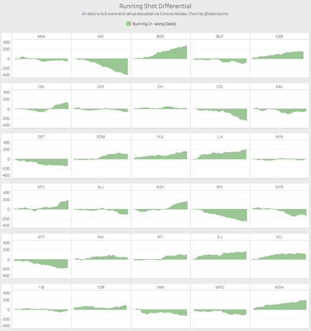
We can see some obvious things here. Arizona is bad. Washington is good. Neither of those should be surprises. The more interesting teams to me are the ones where we see distinct changes in the trend. Nashville started slowly but has become one of the better teams in the league in terms of shot differential since the middle of November. Everyone’s favorite mystery, the Columbus Blue Jackets, continue to trend in the right direction. And the Edmonton Oilers are showing signs of improvement in-season as well.
Shots give us a good idea of how a team is playing. But expected goals give us a little more context about the likelihood of those shots becoming goals. And for that reason, I like to compare expected goals to actual goals and see if we can spot some teams who are are either far outperforming or underperforming their expected results.
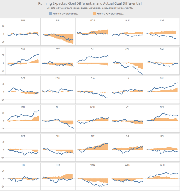
Chicago, Montreal, Minnesota, and our friends in Columbus seem to be well ahead of where we would expect to find them in goal differential, which could be a sign that those teams are riding some good luck and shouldn’t be expected to continue at this pace. Conversely, Florida, Toronto, and Carolina seem to be underperforming and might be due for some improvement in results.
When we see a gap between expected and actual results, the first place to look is PDO. And unsurprisingly, all of the teams mentioned above as outperforming their expectations have a high PDO and the opposite for the underperforming teams.
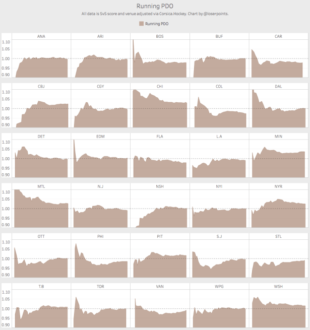
Chicago, Montreal, and Minnesota are all seeing their PDO kept higher than normal due to goaltending. And that suggests that their ability to continue to perform at their current pace depends heavily on the ability of their goaltending to continue at this level. For a team like Montreal, that might be possible given that Carey Price is one of the best goalies in the world. For Minnesota, that seems less likely given that Devan Dubnyk doesn’t have the same track record of success.
While 5v5 stats are generally the best indicators of how a team is playing, special teams is also important. The following graphs show each team’s penalty differential compared to their special teams goal differential. We would expect teams that draw more penalties to have a better special teams goal differential while teams that take more penalties would have a worse special teams goal differential.
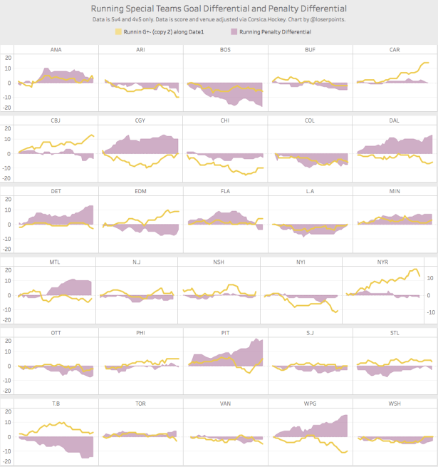
The Rangers, Blue Jackets and Hurricanes all stand out as having excellent results on special teams while Chicago and Dallas sit at the other end of the spectrum. This graph doesn’t tell us anything about whether those results are sustainable but it does suggest that those teams are being impacted more heavily than others by their special teams play.
As a final view for this piece, let’s look at change from last season. I find it interesting to compare where teams are today to where they were at this time last year. These graphs show the running difference between last season and this season over the same amount of games both in terms of shot differential and expected goal differential.
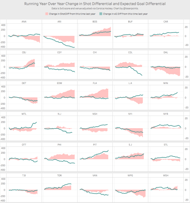
Boston, Toronto, and San Jose are all performing better than last year at this time. So is Pittsburgh but that would be expected given that we’re comparing the team under Mike Johnston to the team under Mike Sullivan and Sullivan’s success in improving the team has been well documented. The Coyotes, Islanders and Red Wings are all struggling compared to this time last season. Two teams of interest to me are Edmonton and Dallas. Both have seen a big change in their shot differential but not much change in their expected goal differential. That suggests that whatever has changed in terms of how they control the pace of play hasn’t necessarily translated into things that would be expected to impact the score line.
As we approach the end of December, most teams are beginning to settle into clear spots in terms of what should be expected from them. But we do still have mysteries. Can Montreal play like this for a full season if Carey Price stays healthy? How much of Columbus’ recent results are driven by genuine improvement compared to good goaltending and shooting luck? And when we revisit these charts in a few weeks, we might be able to get some answers to those questions.

I’m having a hard time understanding your graphs and I believe the problem is that I don’t understand some of your terms. You employ different terms in your text from those directly above the charts. I’m a Rangers fan and conversant with advanced stats, but understand them better in words than pictures. I realize they’ve been a poor possession team since the end of October, and that goaltending and special teams have inflated their PDO and actual record above what the underlying numbers indicate. Is this an accurate takeaway? Thanks for your work and your patience.
Thank you for pointing out those inconsistencies. I will do a better job with the labels and the terminology next time. Your takeaways are accurate. They have been outshot pretty heavily over the last six weeks or so and while I don’t show it in this post, most of their early success was due to a high shooting percentage.