
As a person who learns best by looking at visual representations of data, I have a couple of statistics that I check on a regular basis to hep me calibrate my interpretation of what’s happening around the NHL. I’m going to start sharing them in a regular series that I hope will give a quick overview of how teams are performing around the league. The goal is for this to be a high level view of the basic trends for all 30 teams that will draw attention to specific areas that might need to be explored further. The charts in this article are up to date through last night’s games. All data is via corsica.hockey.
Everyone has their own idea of where to start when trying to see what’s happening in the league. For me, that place is shot differential. I want a quick view of which teams are generating more shots than their opponents and which ones aren’t. While we have a ton of new and exciting research that is introducing new statistics with significant potential to improve our ability to forecast how teams will perform in the future, shots have the longest history and most well established value among those that are easily accessible to the public. So that’s where I like to start.
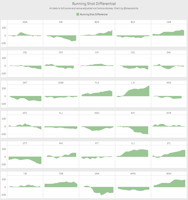
Right away, we can identify some teams playing well and some teams not playing so well. The Kings are doing their normal thing, the Sharks look great, Washington is gaining steam. At the other end of the spectrum, the Islanders appear to be falling off a cliff.
But shots don’t tell the whole story. No individual stat does. So the next stop I like to make on my journey across the vast expanse of hockey analytics is at expected goals as calculated by Emmanuel Perry at corsica.hockey. For context, I’ve also included each team’s actual goals. Expected goals and actual goals generally align well by the end of the season so any big differences here would be an indicator of a potential for change.
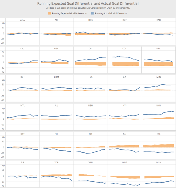
Montreal, Chicago, and Minnesota are all outperforming their expected goal differential and thus, it would be reasonable to think that they might slide back down from where they are currently. Conversely, Winnipeg and Washington fans should be comforted by the thought that their teams shouldn’t underperform their expected goal differential by this much for very long.
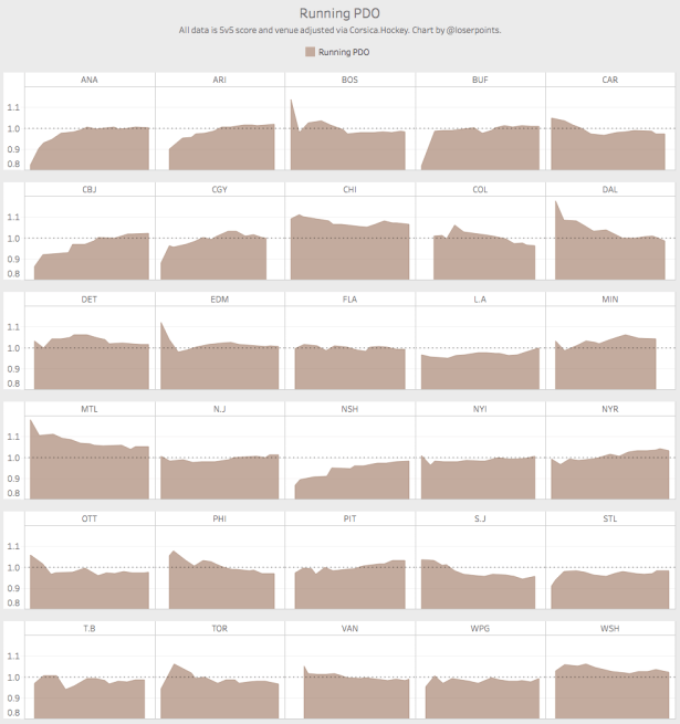
And lastly for 5v5 stats, everyone’s favorite: PDO. On the chart above, Montreal and Chicago were both far outperforming their expected goal differential. PDO gives us an immediate hint as to why that might be happening. Both teams are well-above 1 and since most teams will drift toward 1 over time, it seems likely that Montreal and Chicago will do the same likely bringing their goal differential more in line with their expected goal differential as part of that change.
Thus far, all of the stats we’ve looked at have been using only 5v5 data. But special teams is an important part of the game so we’ll look at that next. As an overview, I like to look at team penalty differential compared to special teams goal differential. For consistency, I’m only looking at 4v5 and 5v4 data here.
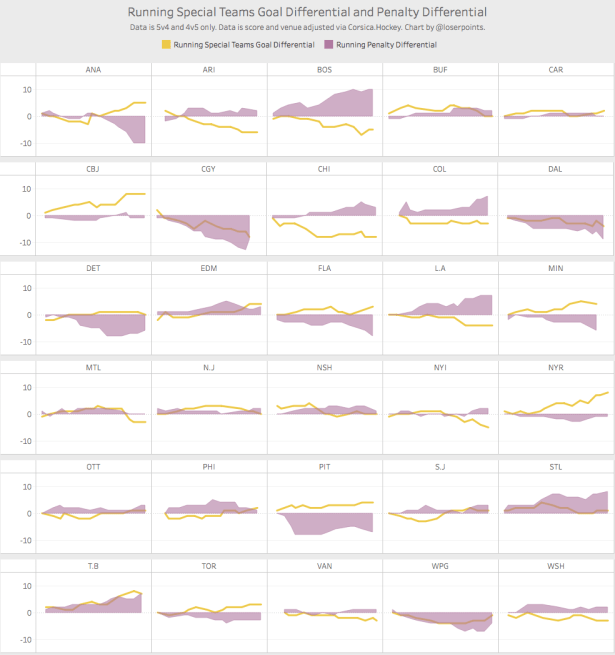
Logically, we would expect teams’ goal differential to align with their penalty differential. Examples of teams that jump out to me here are Chicago and Pittsburgh. Chicago’s goal differential is well below what would be expected based on their penalty differential while Pittsburgh is the inverse.
As a final look at each team thus far this season, the below graph shows shot and expected goals for and against for each team relative to their totals from last year’s regular season. The per 60 stats are shown as a variance of the counts while the percentage stats are shown as a variance to the percentage. So to clarify, the Kings’ CF% is 5.59% better than last year because they’re generating 8.94 more shots per 60 and giving up 3.55 less shots per 60.
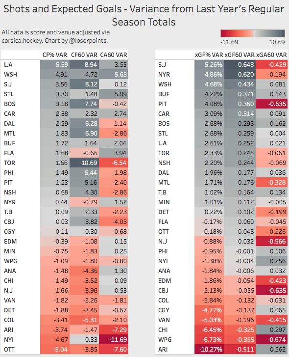
Washington, which was one of the best team’s in the league last year, is somehow improving on the numbers they put up last season. Toronto is an interesting team. They are generating over 10 more shots per 60 minutes than last season but also giving up over six more shots per 60 minutes. So they’re showing a net improvement in percentage of shots for and playing at a much faster pace. At the bottom of the tables, we see the Coyotes and Canucks as two teams who are performing much worse than they did last season.
My intention is to revisit these same reports at regular intervals throughout the season to see how teams’ performance changes over time. And by doing so, provide a high level view of the league-wide trends that can be used to dive deeper and identify their causes.
