
The NHL season is a long and grueling affair and most teams will experience some ups and downs over the course of 82 games. Even a team that had a 67% chance of winning every game it played, would still have a 20% probability of putting up a five-game losing streak. And this is just straight probability theory with fixed probabilities. What happens when you consider all of the factors that go into determining the probability of winning an individual game, let alone predicting performance over an entire season?
Well, I’m not here to answer that question.
What I am here to do is to try to apply an analytical technique that was developed in the 1950s for the purposes of quality control in industrial and manufacturing processes to the game of hockey.
It’s quite common to see and hear hockey analytics people talk about process; that if you worry about the process, the end results will take care of themselves. Thus we rely on and analyze various measures, the most common being shot attempts, to understand how the process is working. And when we build more complex models, we similarly utilize a variety of metrics that represent inputs and other measures of process to help us predict the outcomes or results.

But what if we also monitored the results to help us identify (a) structural flaws that require us to check our assumptions and re-calibrate our models, and (b) significant changes in performance as indicators that something has changed with the process. When looked at from this perspective, it’s clear that there is room to apply some process control techniques to the evaluation of hockey as a process.
The Cumulative Sum Is Greater Than The Whole
Now, while I do have an engineering background, it’s not in process control and I am certainly no expert in the field. But I have had the occasion to use CUSUM in a non-process control application, and I believe it may have even wider applicability to the field of hockey analytics. The website for the Minitab statistical analysis package has a pretty good description of the traditional application of CUSUM:
A CUSUM chart is a time-weighted control chart that displays the cumulative sums (CUSUMs) of the deviations of each sample value from the target value. Because it is cumulative, even minor drifting in the process mean will lead to steadily increasing or decreasing cumulative deviation values. Therefore, this chart is especially useful in detecting slow shifts away from the target value due to machine wear, calibration problems, and so on. If a trend develops upward or downward, it indicates that the process mean has shifted, and you should look for special causes.
In this traditional application, when the CUSUM exceeds a certain threshold, a change is detected and, depending on the parameters of the process, it might indicate a control failure that requires corrective action. So, for example, if the CUSUM exceeds the standard deviation of the points predictions, we might determine that our model is not accurately accounting for one or more elements of a particular team’s performance.
But CUSUM can also be used to assess performance against expected results, and in this use case what you want to watch is the slope of the CUSUM curve. A sustained change in slope indicates a material change in performance. So if the deviation between actual and predicted points is simply a modeling bias, we should expect the slope of the CUSUM to remain fairly constant. But any sustained change in slope will be the result of a change in actual team performance.
The key then is to look for those definitive changes in slope in the CUSUM graph. Look beyond the little jagged game-to-game changes and look at the overall trend. Once a sustained change in performance has been identified, we can try to correlate with a change to the team. Perhaps it was a key injury, trade, or other roster decision. Maybe it was a change in system or strategy. Or perhaps it was even a new coach altogether.
In order to apply CUSUM in this manner, we need a predictive model to evaluate against. Micah Blake McCurdy (@IneffectiveMath) consistently creates some of the best public models we have and he was kind enough to provide me with the full-season game-by-game points predictions to start the year. I then graphed the predictions for each team against actual results and plotted the CUSUM as well.
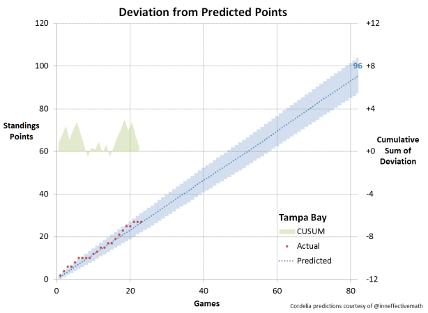
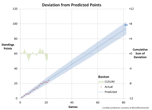
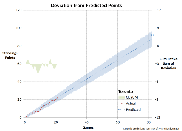
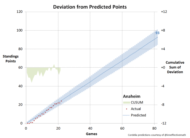
Reading the Charts

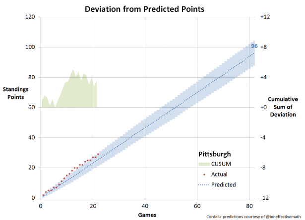
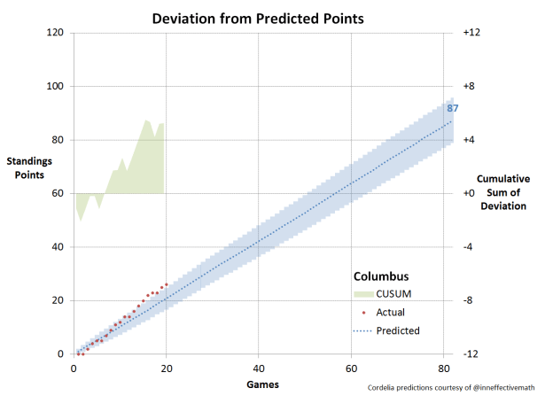
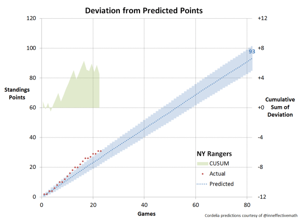
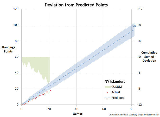
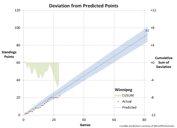
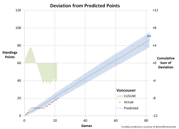
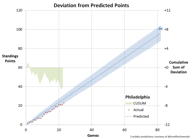
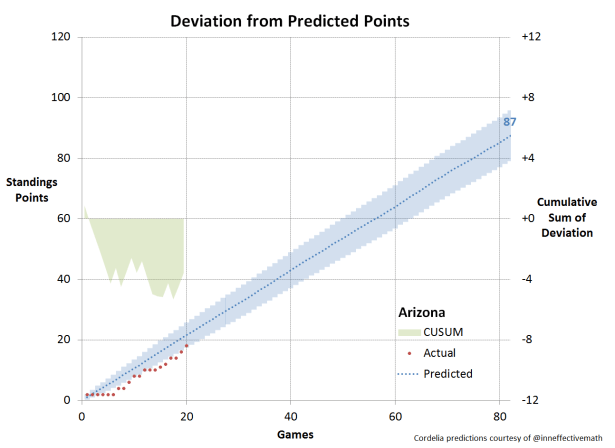
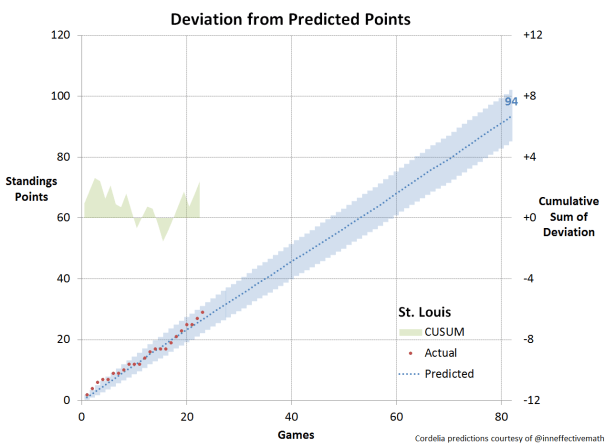
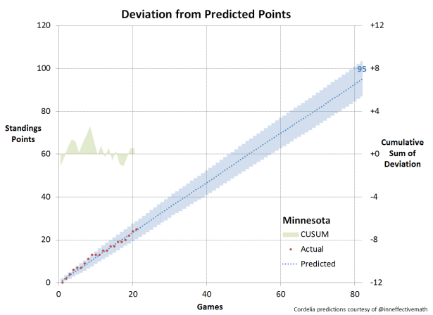
Predicted points: the blue dotted line represents the Cordelia points predictions for each team over the 2016-17 season. The points prediction for season end is shown in blue at the right edge of the chart.
Simulation uncertainty: As the points predictions are based on a one million run Monte Carlo simulation, there is a “spread” to them that is shown by the blue band surrounding the dotted line, which is two standard deviations wide. Thus approximately 2/3 of the simulation runs for each team fall within that predicted points band.
Actual points: the red dotted line represents the actual standings points to date.
CUSUM: the cumulative sum of the difference between actual and predicted points is shown by the green area plot on the centre line of the chart, and the values are read off the right vertical axis.
Analyzing the Results
This is intended as mainly an introduction to the CUSUM concept. As such I intend only to provide the charts for each team over the first quarater of the season (about 20 games for each team) as well as some general observations.
The Overachievers
There are six teams that outperformed their predictions through the first quarter of the season. Of these, all but one have since plateaued. Columbus continues on an upward trajectory and has broken outside the bounds of one standard deviation. Whatever the reason for this early season performance, it remains unabated.
Montreal, Chicago, Pittsburgh, Washington, and the NY Rangers have also outperformed expectations early but have since cooled off. The Capitals are borderline overachievers, just at the outer edge of standing deviation. Meanwhile, the Penguins clearly got a boost from Sidney Crosby’s return to the line-up but are now being pulled back within the expected range.


The Underachievers
At the other end of the performance curve, there are six teams that have been unable to meet even sometimes lower expectations. The Islanders were in free-fall through the first twenty games and seriously in need for something, anything, to change. The Flyers were in the same boat, to some extent, but the slope of their decline was not as drastic. The Flames bottomed out at about the 15 game mark and started to make up lost ground.

On Track
Through the first quarter of the season, there have been ten teams that have basically been right on track with their predicted performance. Of course, meeting expectations isn’t always enough, and sometimes you get fired anyway.


Conclusion
As we develop more complex predictive models for NHL hockey games, there may be opportunities to apply a variety of statistical and analytical methods that have been developed for other uses of the years. The process control field has many such techniques that could prove useful for identifying and perhaps even diagnosing performance issues at an early stage.
CUSUM is one such technique that can both help determine the accuracy of our models, as well as identify changes in performance trends. Understanding when a change occurs and correlating it with a system, roster or on-ice change can help to assess what’s working and what isn’t.
In future posts, we will take a more in-depth look at CUSUM and how it can be applied to evaluate performance.
While we have applied this method to evaluating standings points vs. predictions, this and other process control techniques could similarly be applied to a variety of other process measures and metrics used to track and monitor on-ice performance.
You can read more from petbugs here, or follow on Twitter: Follow @petbugs13
