
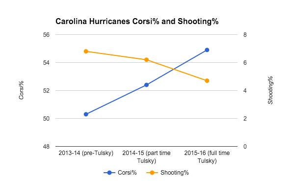
On November 21st a similar version of the above graph was published displaying that Eric Tulsky’s addition to the Carolina Hurricanes may have improved their shot differentials, but harmed their shooting percentage.
No longer though:
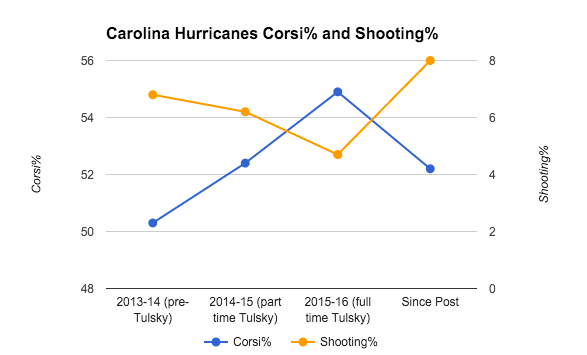
Tulsky has not only caused the team’s shooting percentage to rise to new heights, and without sacrificing as much Corsi as the previous trend was indicating needed.
Way to go Tulsky!
Now, to be fair and more serious, Johnson did cap off his article with advisory warnings of small samples. And, there is a completely real and legitimate negative correlation with team shooting percentage and shot differentials –in part due to score-effects and in part due to teams being pinned in their own zone have a high percentage of their own shots being rush shots.
Not only do we have correlation, but we have a theory that makes sense for some causation, but the impact is far lower. The true relationship between the two variables is much smaller than what is shown in these graphs. (Edit: 2007-2015, n=240, r=-0.17, r^2=0.03)
To also be fair to Tulsky, we have no idea what freedom he has with the team’s decisions, and how each decision with player acquisition, roster selections, player deployment, and ice time have combined to make the results we see here.
Sometimes things are not always as they seem.
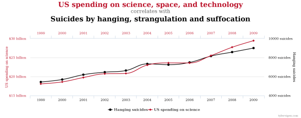
Visual source: http://www.tylervigen.com/spurious-correlations

“Johnson did cap off his article.”
Who is Johnson?
Can’t tell from this.
You are a smart guy. I’m sure you can figure it out with the graph, content, and date all combined there.
😉
I’m glad to see you edited the article to provide a link to the source.
Thanks.
Squeaky wheel gets and all.
In any event, thanks.
I take solace in the fact it took you longer to write this pointless post than it took me to read it.
Want to bet?
Consider: Garret was using your approach…