
A picture is worth a thousand words. Yes, it’s a cliché, but when it comes to visualizing data, an individual can tell a story via the choices they make when presenting their data. One of the most common visualizations is a plot showcasing the frequency and distribution of an event. Data like this are often presented in a histogram or box-and-whisker-plot. However, a limitation of both of these types of plots is that neither shows the individual where each data point falls. On the other hand, a beeswarm plot allows the user to see where each individual point falls across a range. A random jitter effect is applied to maintain a minimum distance between each point to minimize overlap.
Inspired by the wonderful graphs from Namita Nandakumar and Emmanuel Perry, I thought I would attempt to visualize how goaltenders have fared in goals saved above average over the course of their careers.
Methods
I collected data from 1955 to 2019 using Hockey-Reference’s Goalie Statistics page. I manually added in the season for each player for that year in such a manner that 1955 represents 1955-1956, 1956 represents 1956-1957, and so on and so forth.
Goaltenders are notoriously difficult to evaluate, especially when we look to evaluate goaltenders of the past. I selected goals saved above average as the metric to use for comparison given that we have data going back to 1955 and it at least provides some context for how a goaltender stopped the puck relative to the quantity of shots faced. However, it does not provide us with any information on the quality of shots faced. For that additional context, we could look to metrics like goals saved above expected, which can be found on evolving-hockey.com as far back as 2007-2008.
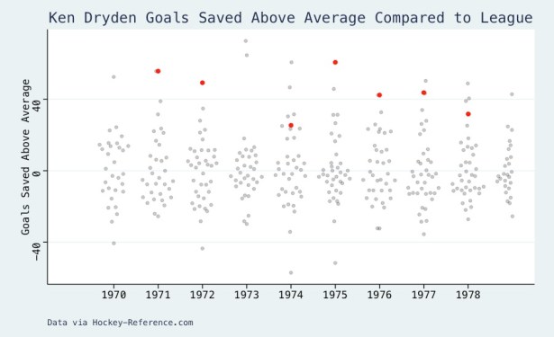
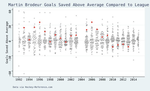
I selected four of the most prominent goaltenders to start my comparison. Using R’s ggbeeswarm package, I created beeswarm plots to visualize how each goaltender compared to their contemporaries. Shown below are the plots for Dominik Hasek, Martin Brodeur, Ken Dryden, and Patrick Roy.
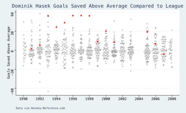

Bottom line – Dominik Hasek was pretty good.
If you’re interested in viewing the code for this or seeing the data, I’ve made both available at the link below.
